Sber. Premium elements
Context
Sber has three premium segments of clients that includes several distinct audiences with different values and expectations. Our goal was to design a system that speaks to each of them while keeping a clear and consistent premium identity. Instead of dividing them only by income, we focused on creating separate visual environments for each group within one unified framework.
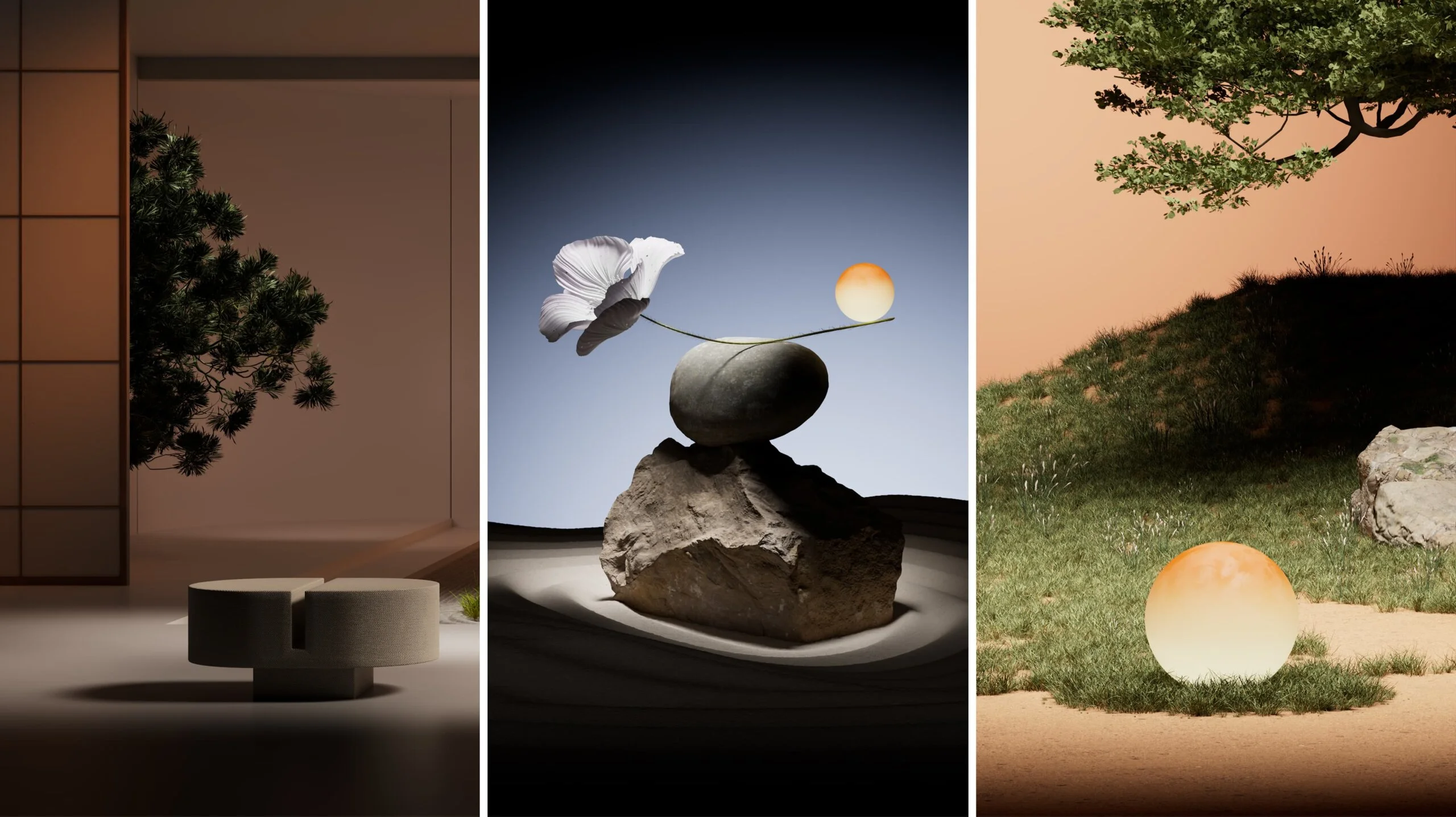
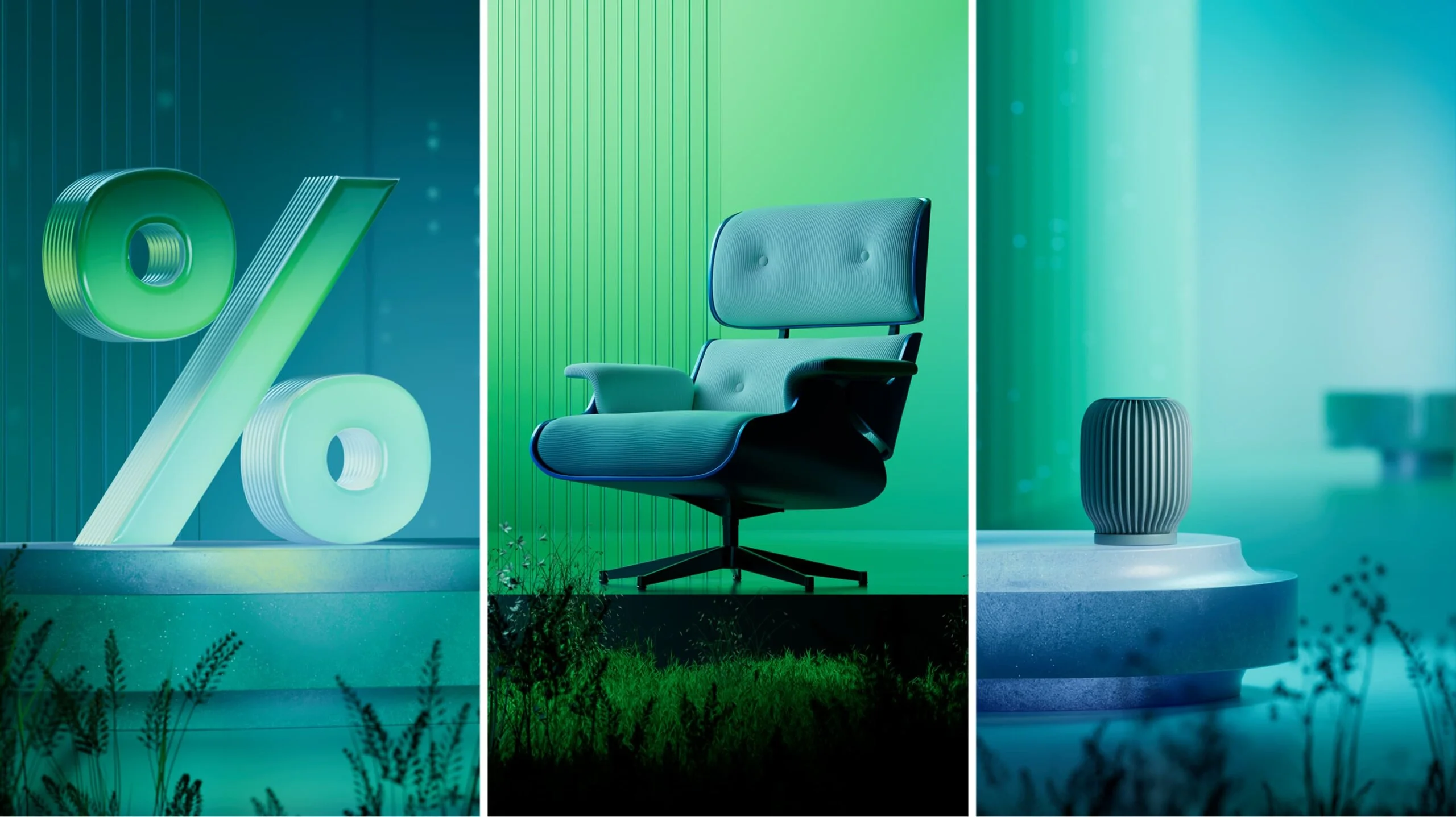
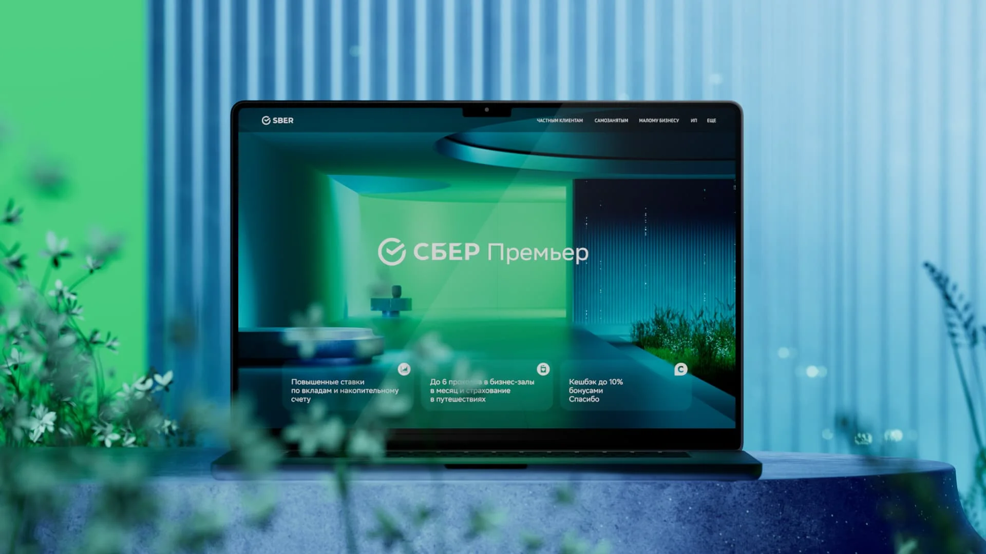
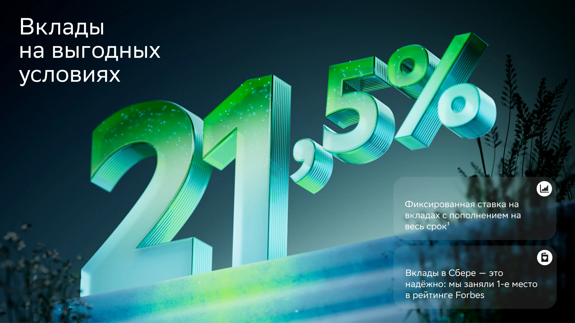
To bring everything together, we introduced a shared narrative based on elements and spatial metaphors. Each segment is expressed through its own atmosphere: Sber Premier is connected to air and a sense of open, cosmic space, Sber First is built around water, and Private Banking is defined through light.
Sber Premier
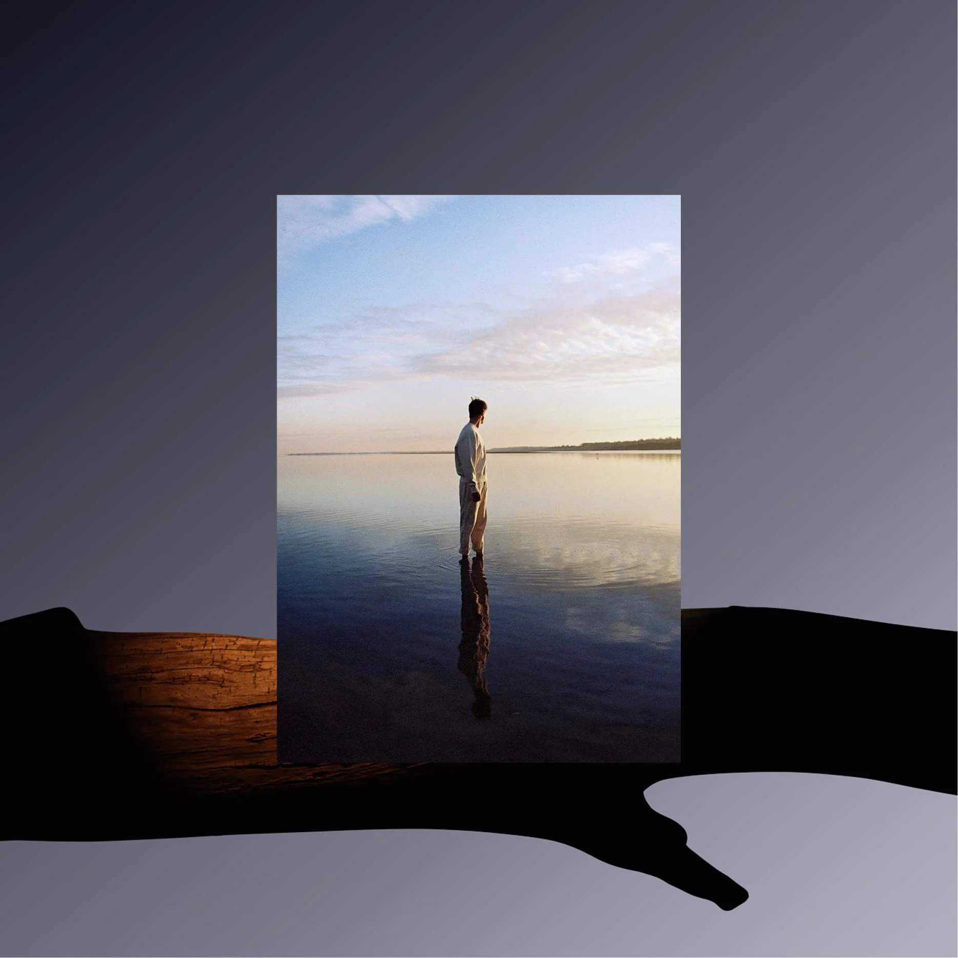
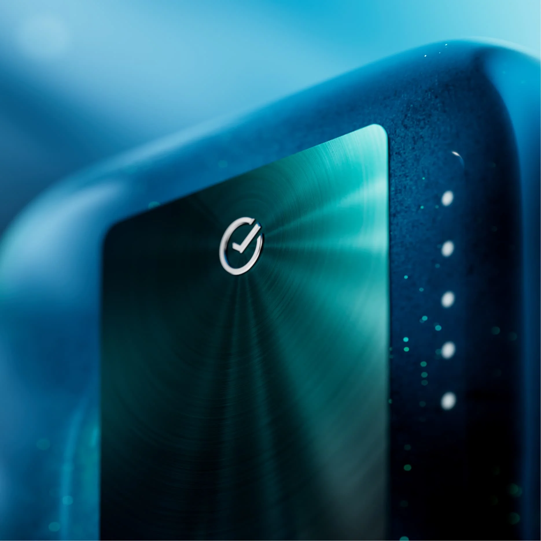
Sber Premier is the entry level of the premium segment. Its audience is just moving from the mass segment into premium, so the transition needed to feel smooth and natural. We kept a familiar visual base, close to Sber’s main identity, and adjusted it with slightly darker and more muted tones to signal a shift without breaking continuity.
Sber Perviy
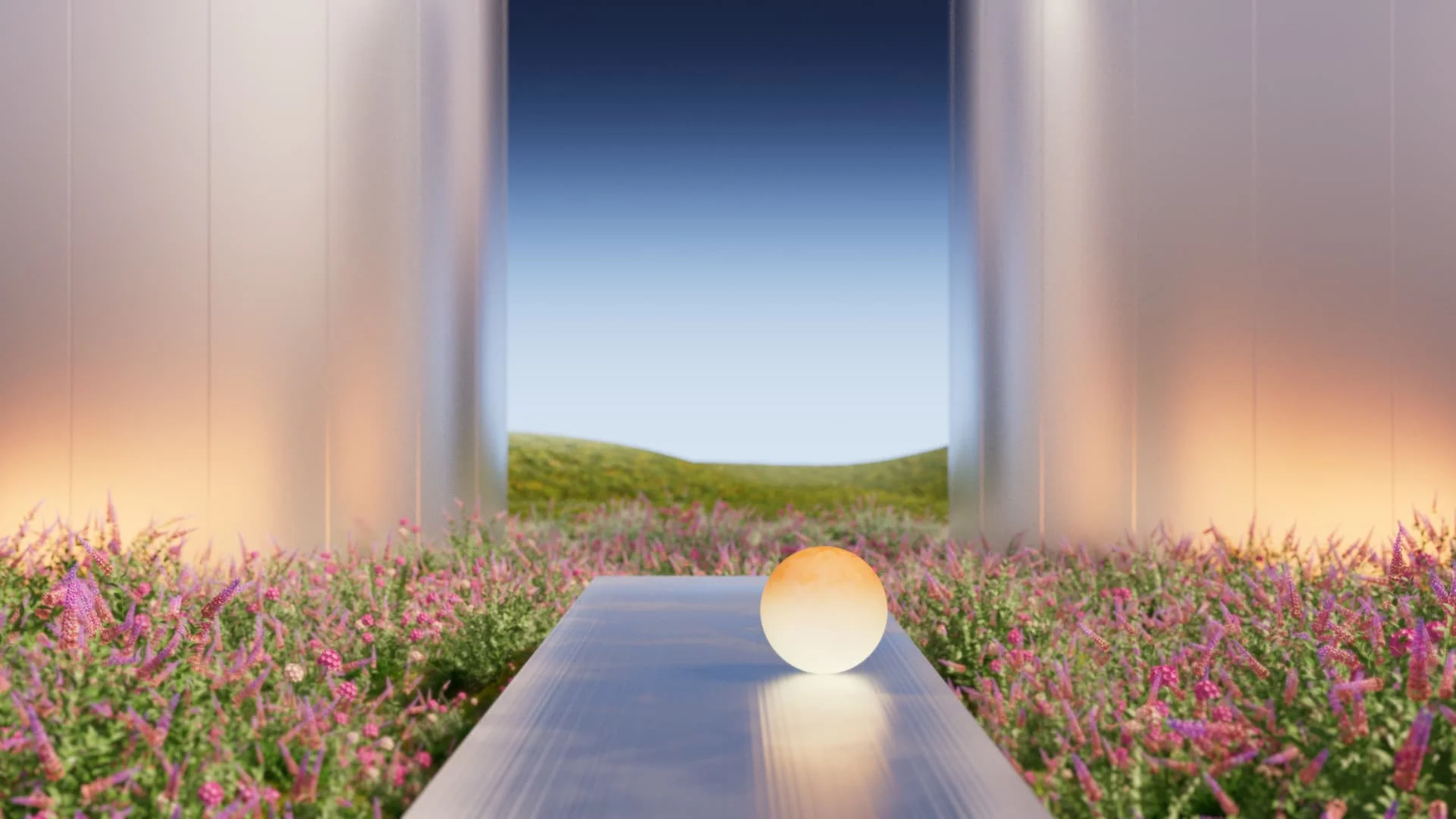
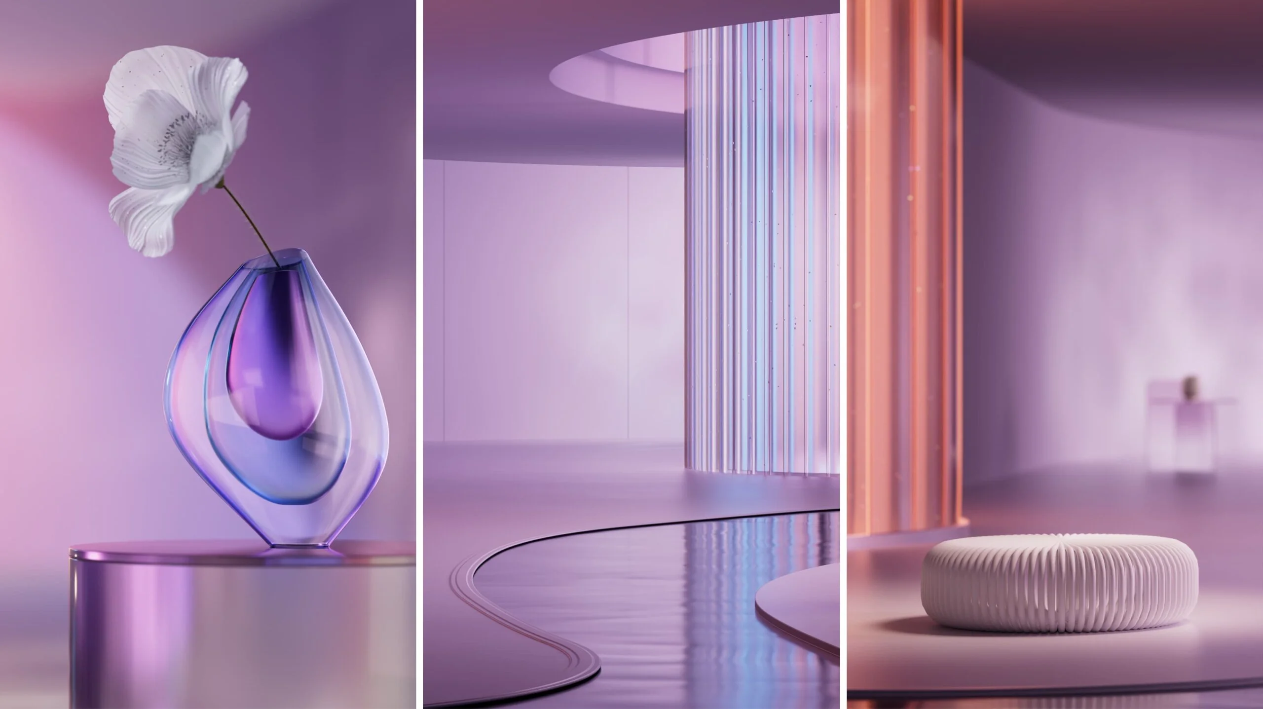
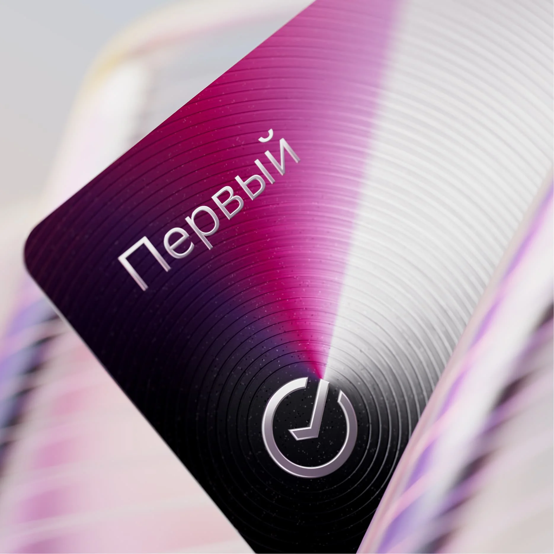
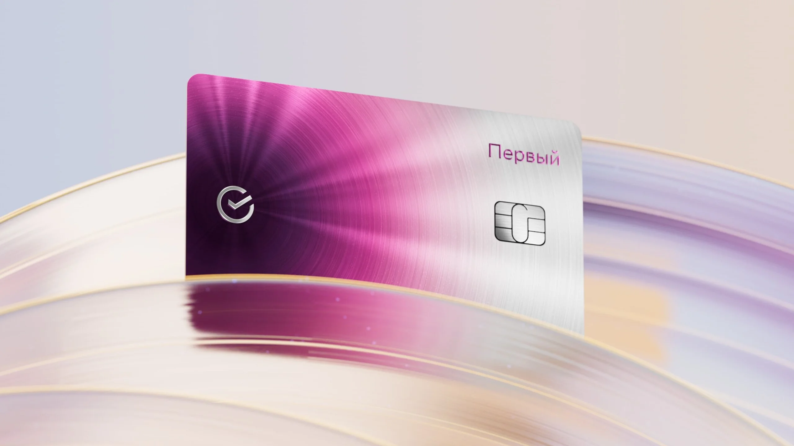
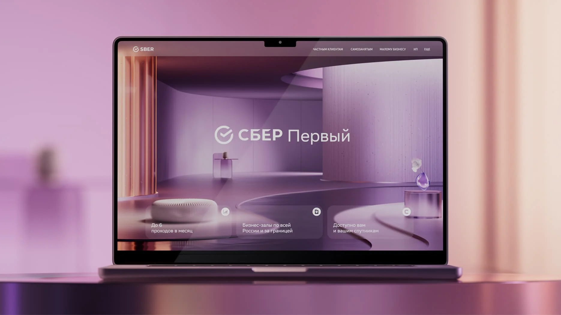
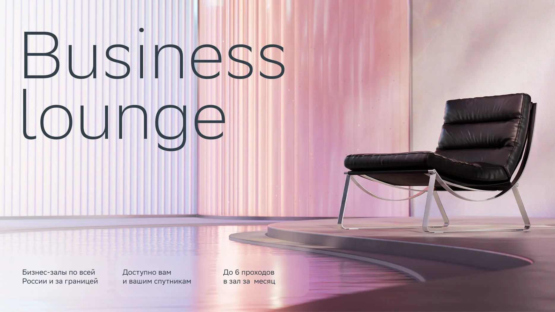
Sber First is the largest segment within the premium tier. Here, we work with the element of water, which defines the visual language. The forms are more fluid, with smooth transitions and a sense of flow. We use lighter, more transparent materials to create a calm and refined atmosphere.
At the same time, we aimed to make the visual identity more universal. The updated color palette is balanced and neutral, so it works equally well for both female and male audiences. This helps move away from the previous perception of the brand as overly pink and limited in tone.
Sber Private Banking
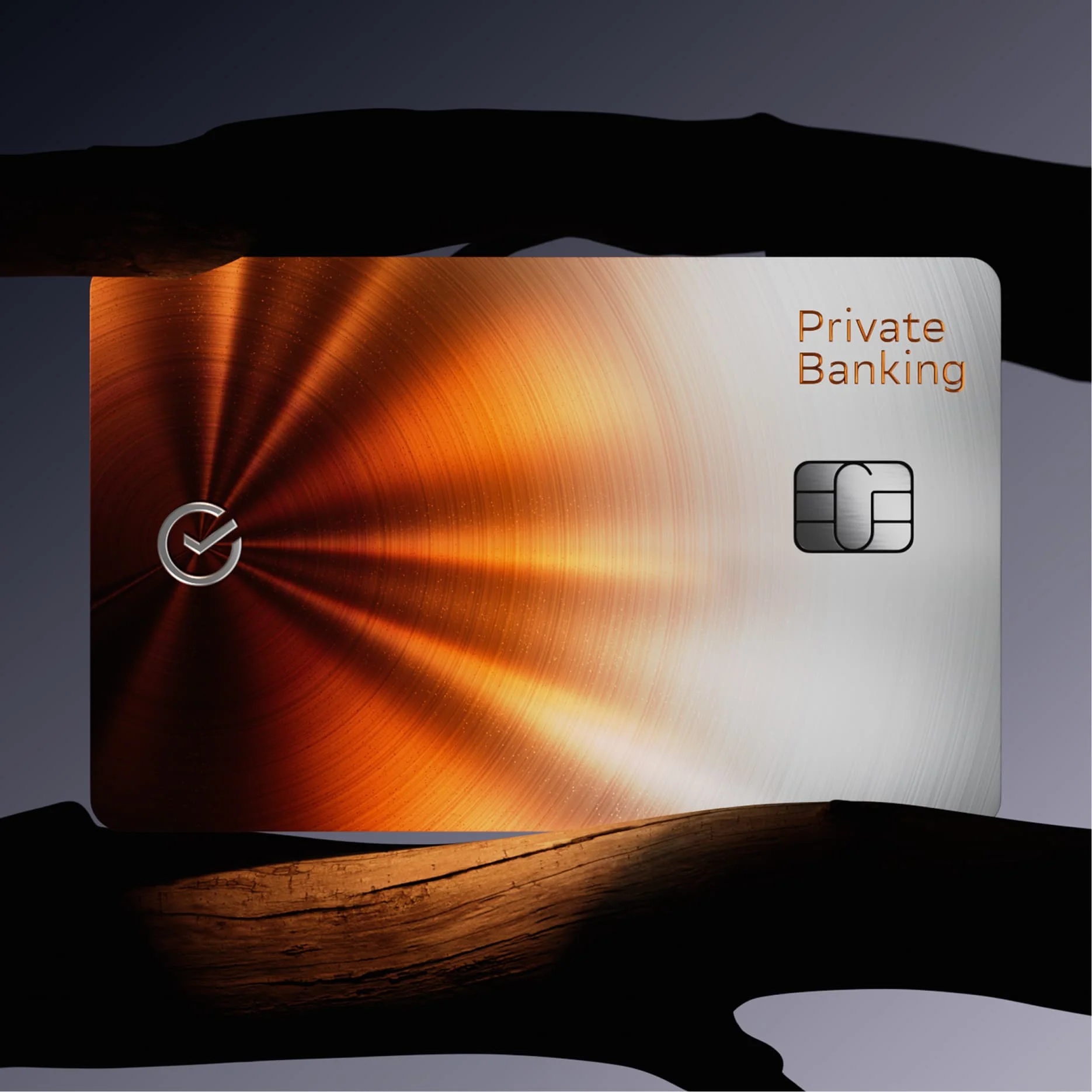
Private Banking stands apart even within the premium segment. It serves a much smaller audience with a very different level of expectations, where a highly individual approach is key. The visual concept reflects this exclusivity and focus on personal experience.
We created a space built around light, inspired by the atmosphere of a zen garden. It is calm, minimal, and centered on the idea that true wealth is time — time for reflection, for slowing down, for being present. The environment is composed of simple, natural materials like stone, wood, and plants, creating a quiet and balanced setting.
Within this restrained scene, light becomes the main expressive tool. It introduces the brand’s new signature color — a rich, saturated orange — not as a surface, but as a glowing presence that shapes the space and adds a subtle emotional accent.