Amedia TV. Channels identity
Context
Amediateka's streaming service includes four television channels broadcasting live content. Our task involved creating broadcast design for each channel—developing animation intros, logo shots, and transitions that viewers see between content blocks. Here, we focused less on creating unique identities and more on forming visual shells that emphasize each channel's distinctive character.
Animation. Dynamics & Materials
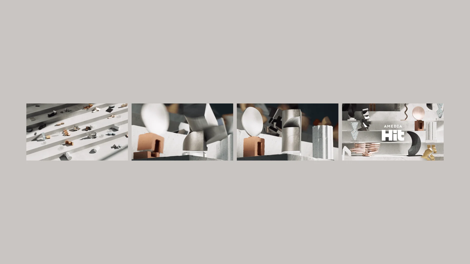
We developed unique animation mechanics for each channel that highlight their individual personalities. A1 features strict, sharp movements following precise rhythms. A2 employs smooth, light transitions that appear to float in space. Premium creates an immersive depth effect. Hit showcases flowing forms that reflect multi-genre content.
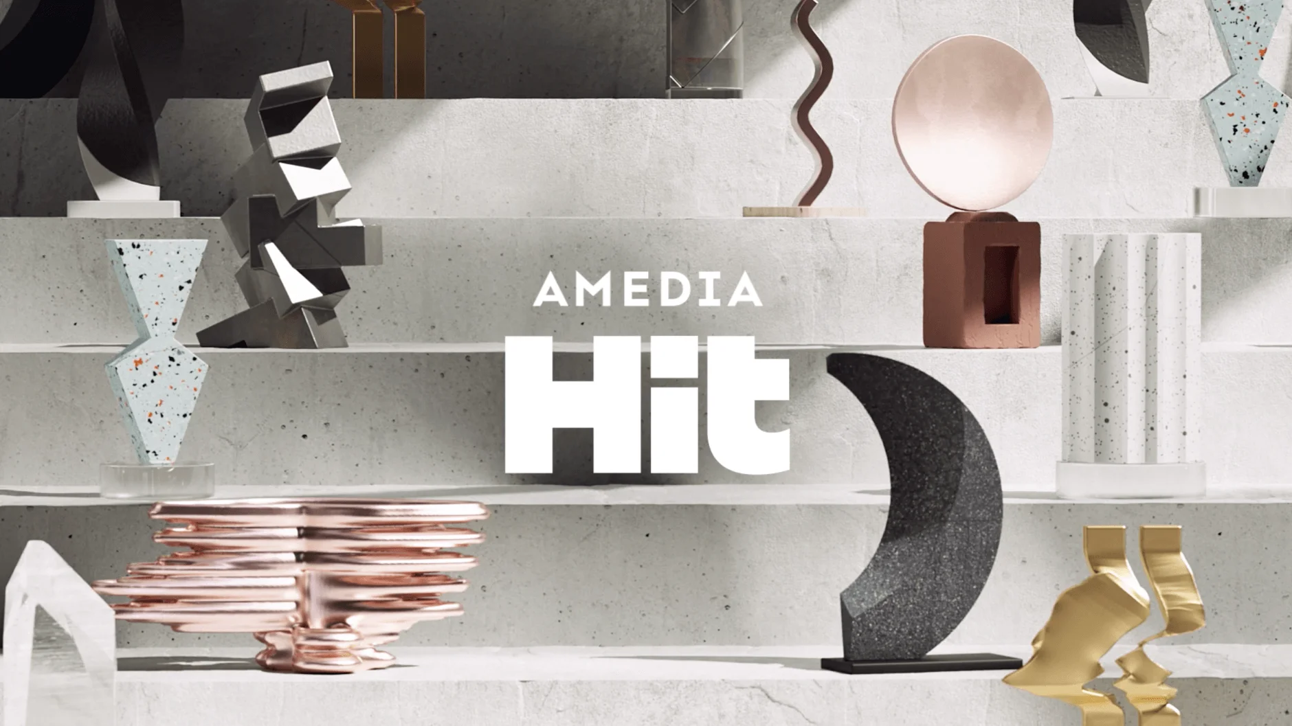
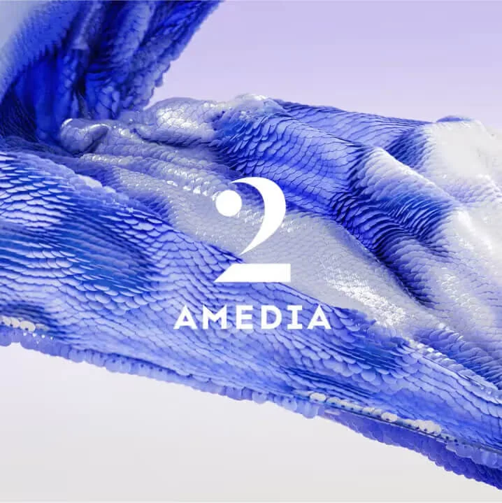
Each logo exists in two versions—a compact corner broadcast mark and a larger transitional logo shot. These design elements had to harmonize with the overarching Amedia descriptor logo while maintaining their distinct characteristics.
A1: strictness, structure, metal
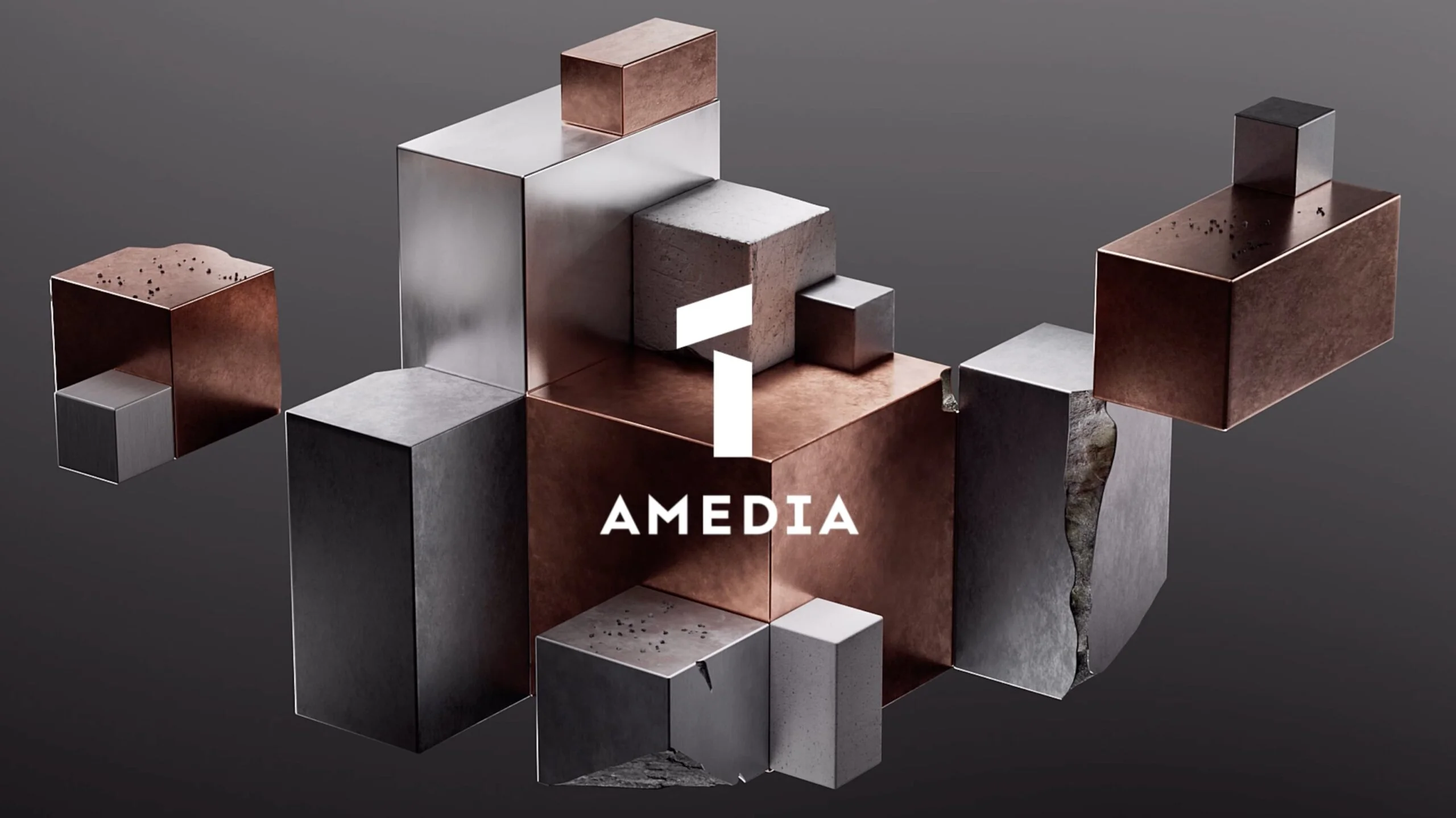
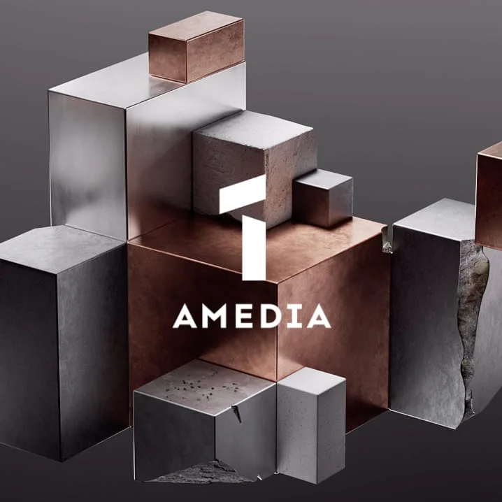
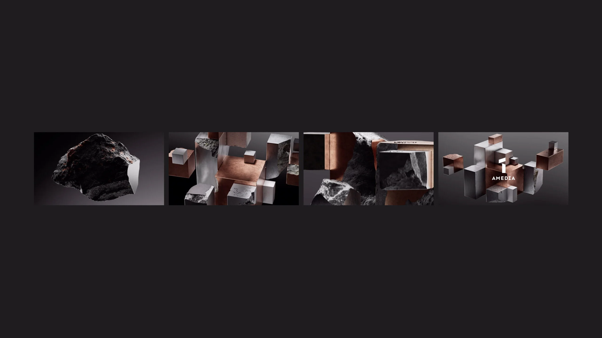
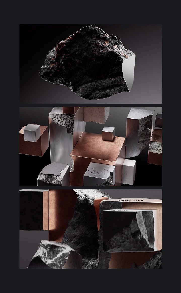
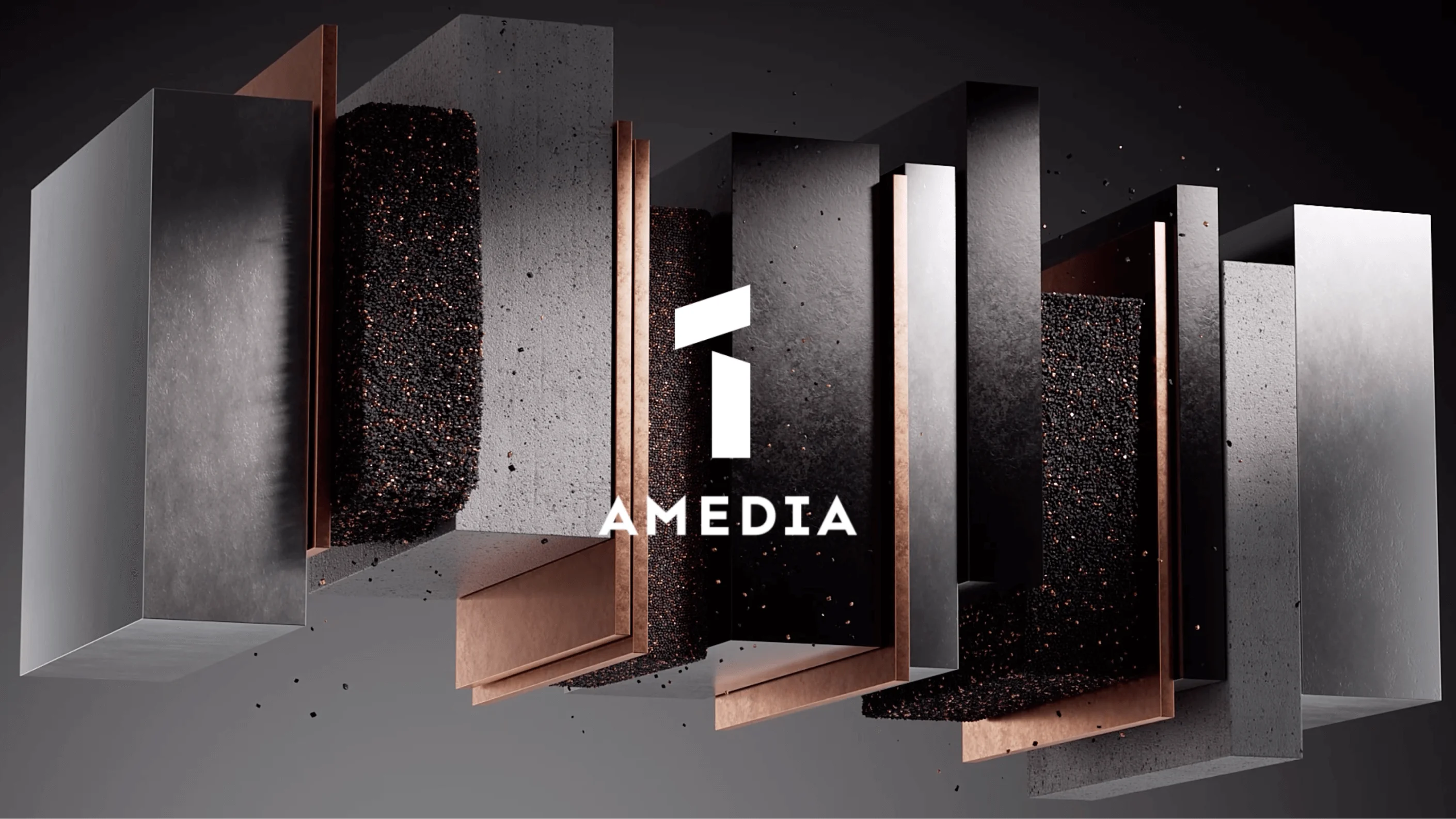
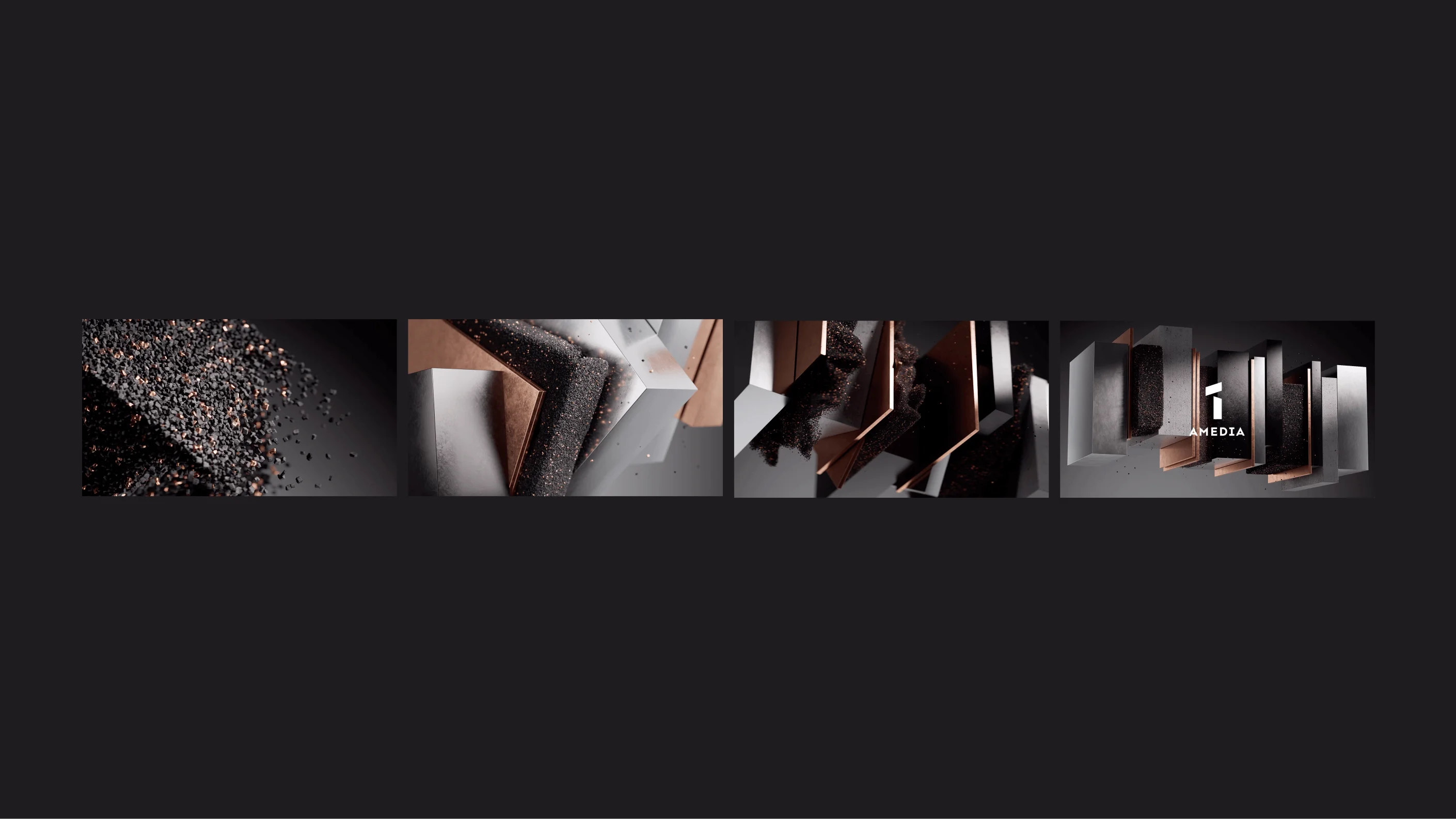
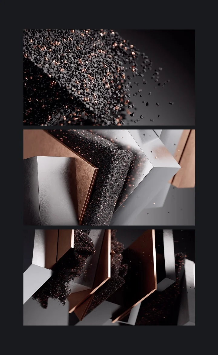
A1 targets a primarily male audience. We conveyed its character through rigid, angular forms, strict compositions, and metallic materials. In animations, the logo assembles from sharp fragments, as if being tempered through construction. The intros emphasize structural integrity—elements connect purposefully, creating a sense of strength and solidity.
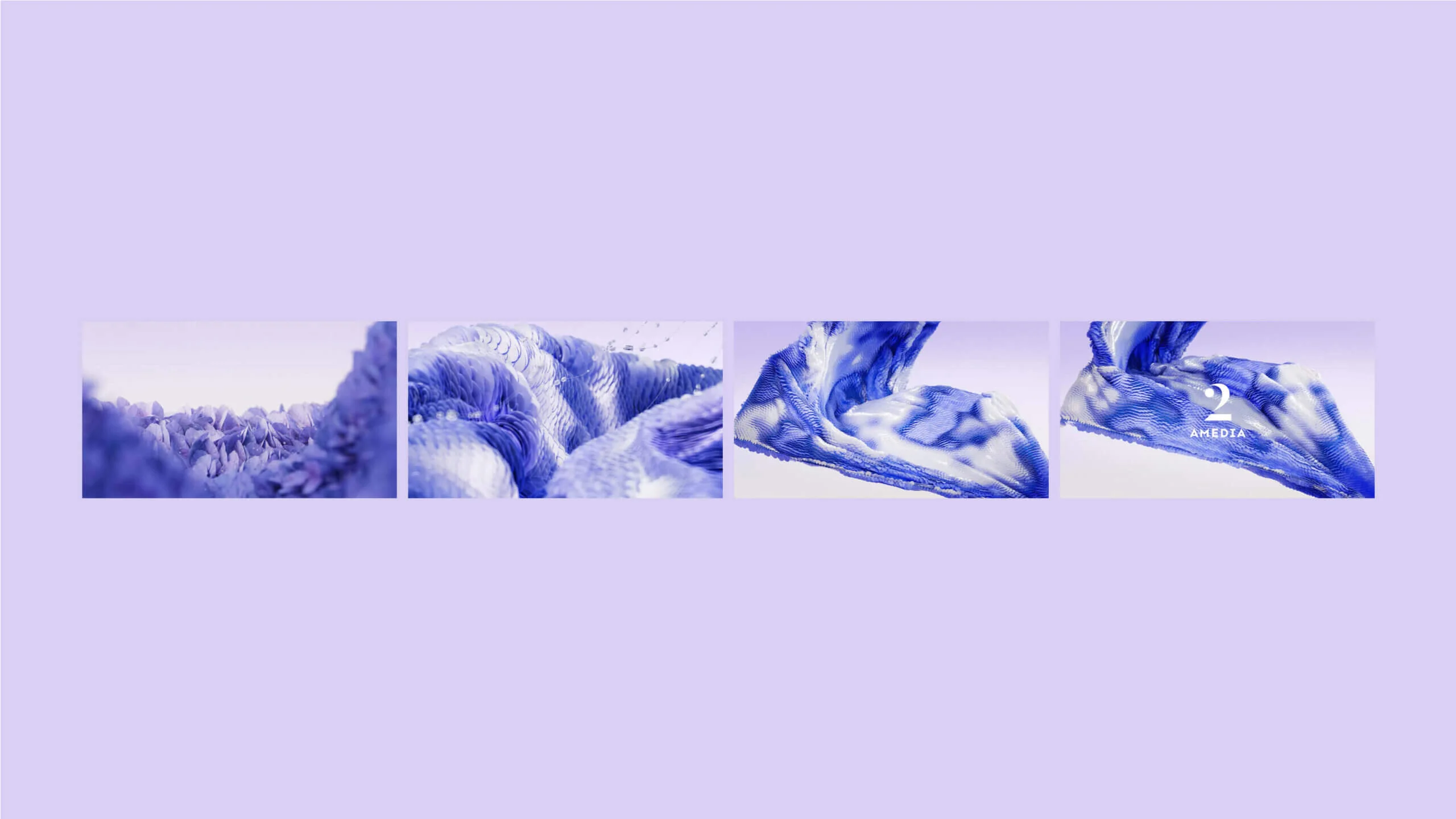
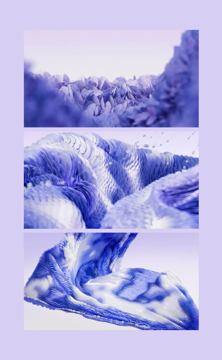
A2: lightness, airiness, glamour
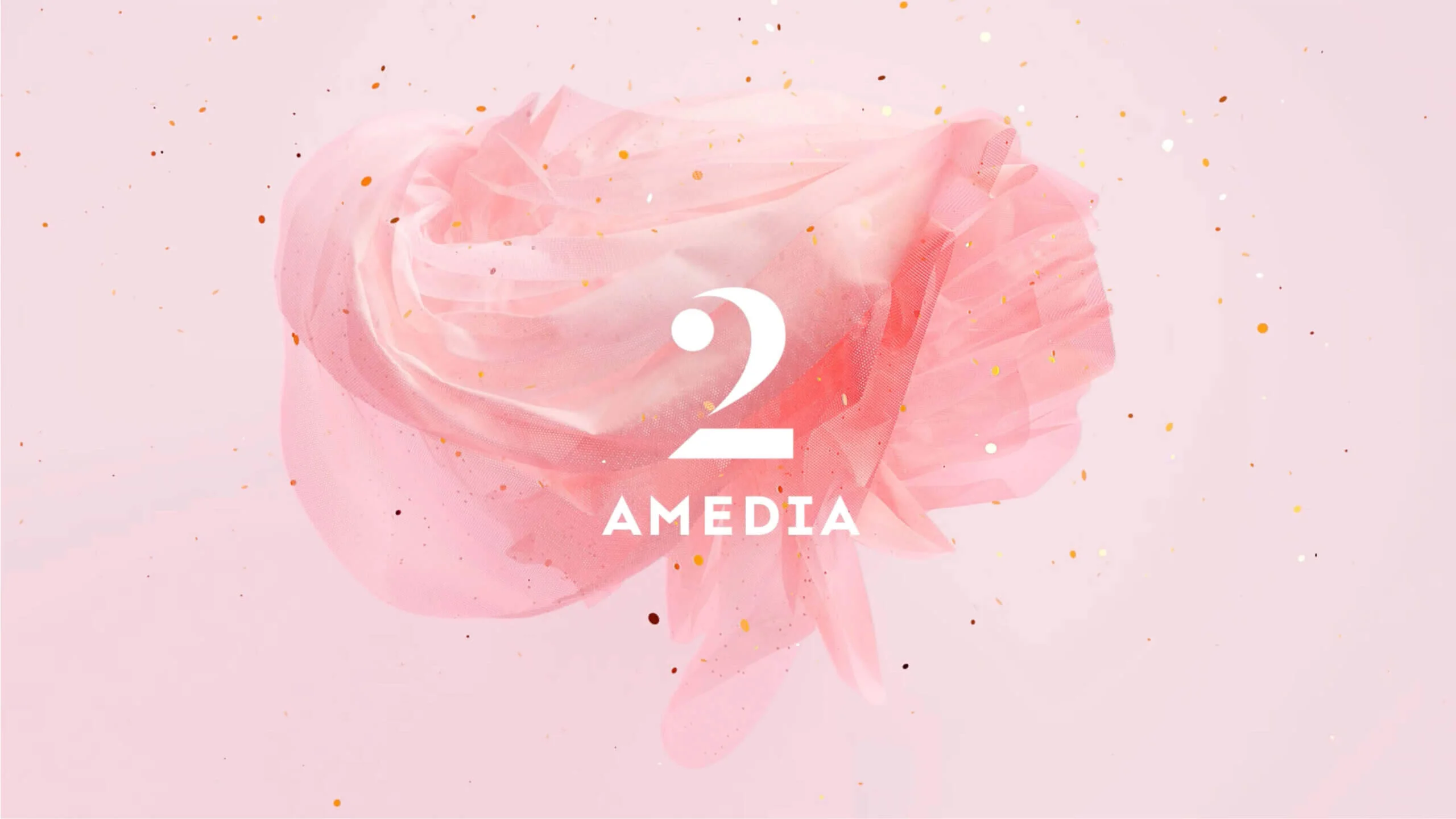
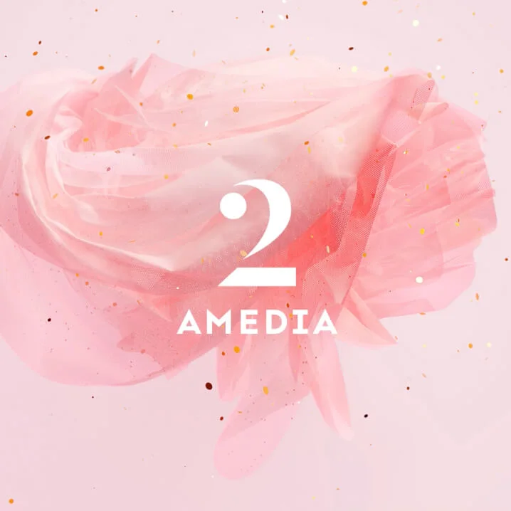
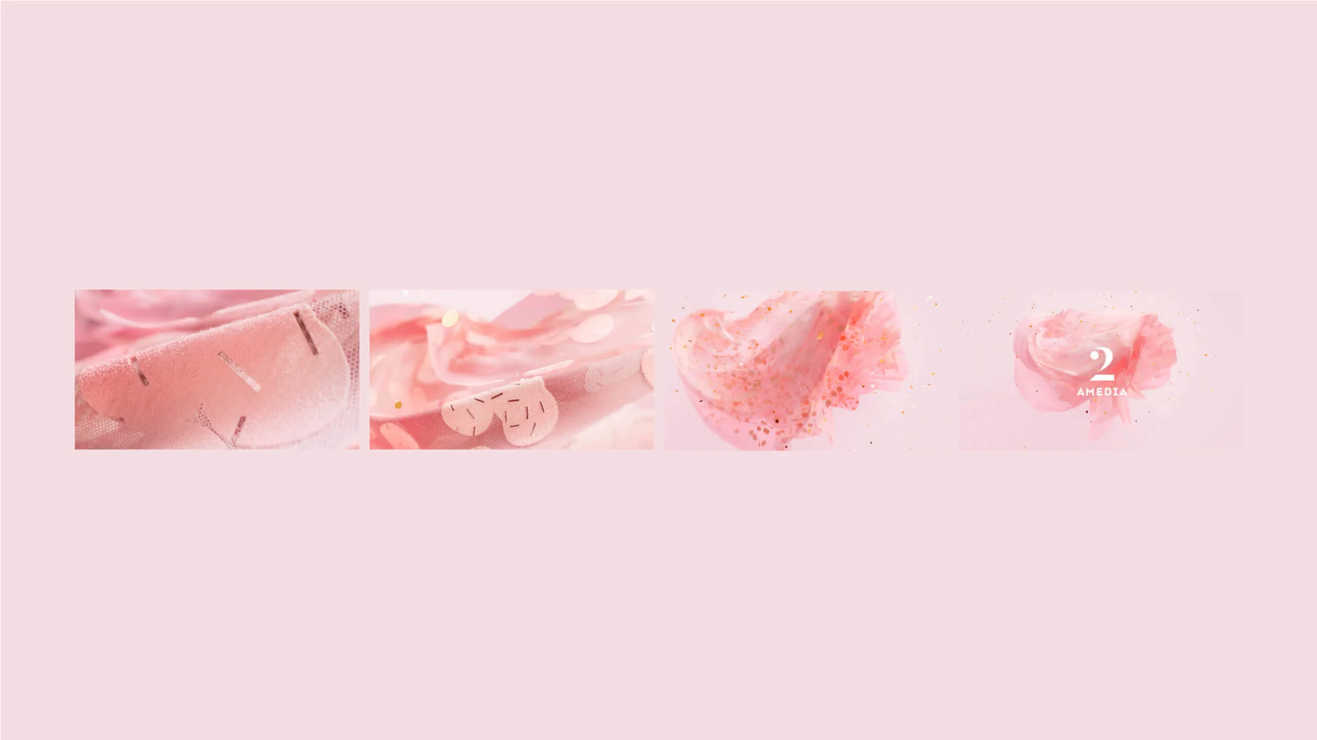
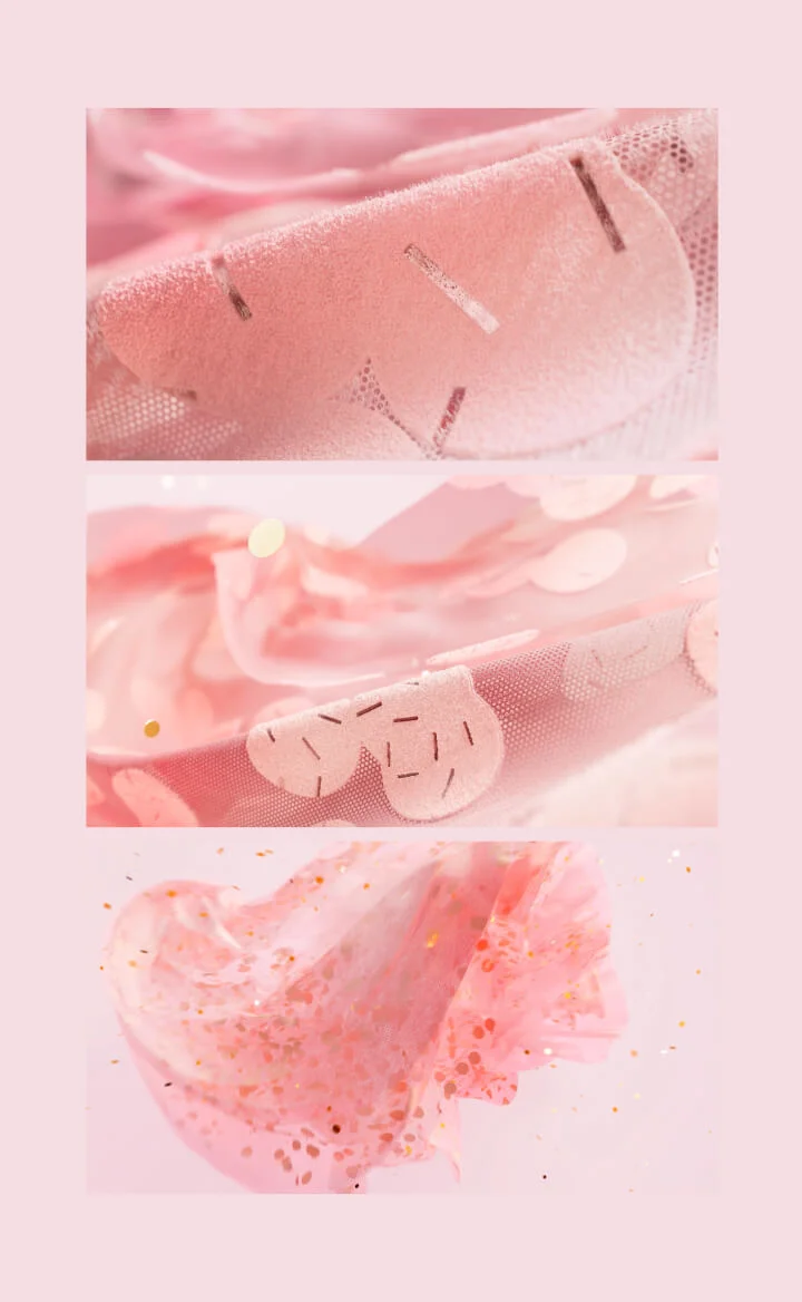
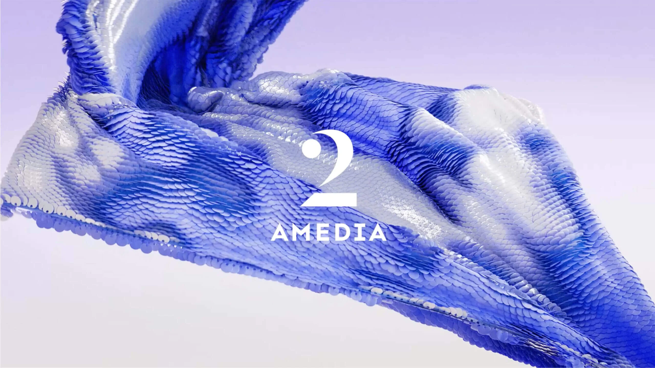
A2 stands in complete contrast to A1. Here we employed smooth, playful shapes, fluid movements, and lightweight materials reminiscent of fabric, confetti, and sequins. The animation conveys lightness and weightlessness—creating a world where elements twirl, shimmer, and float effortlessly.
Premium: immersion in content
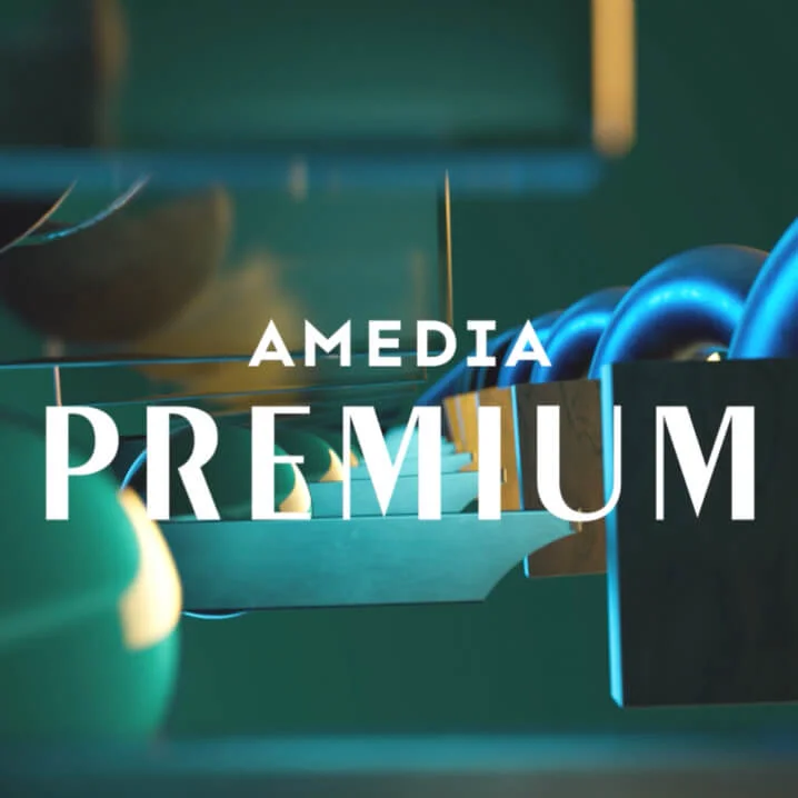
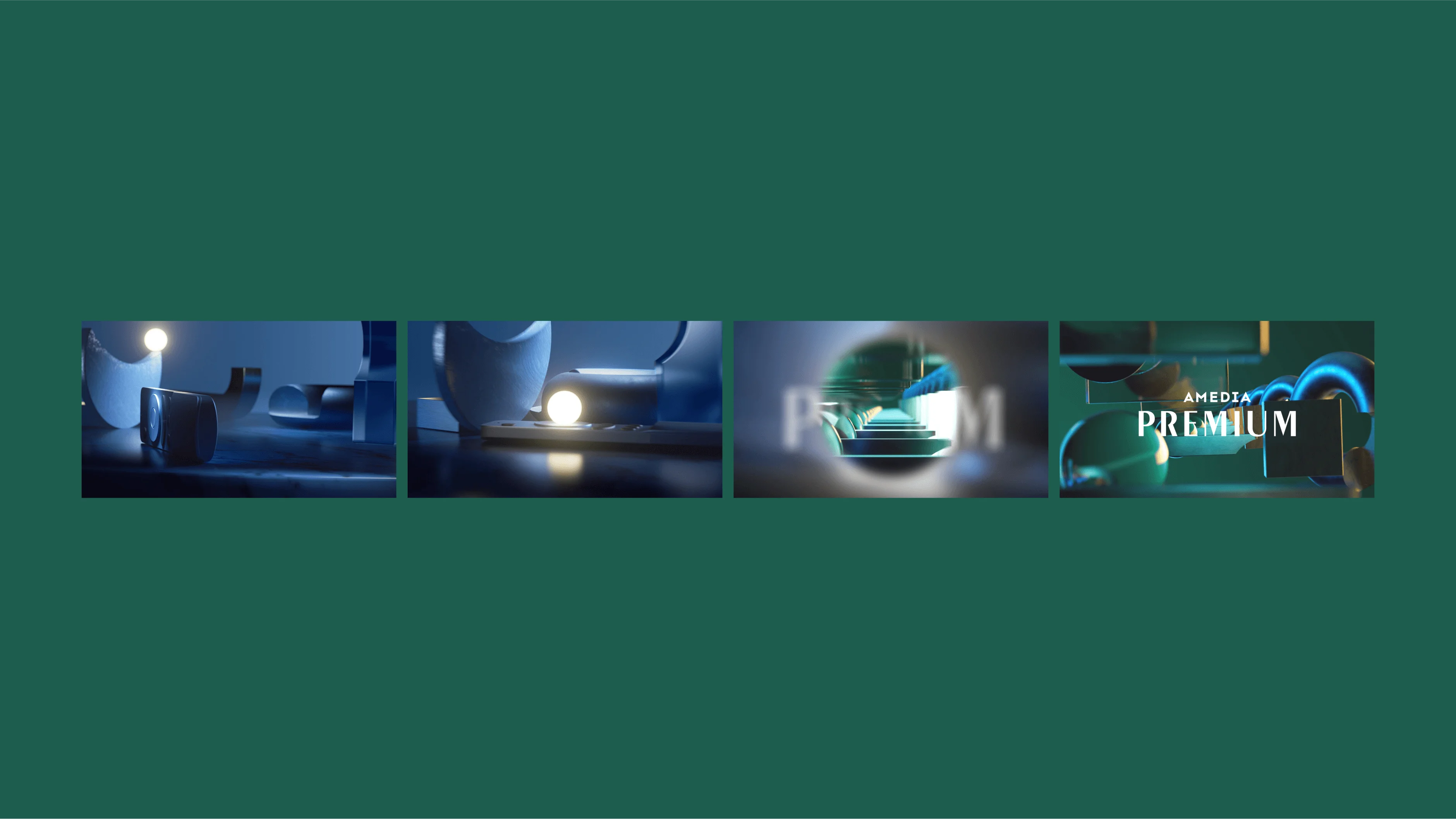
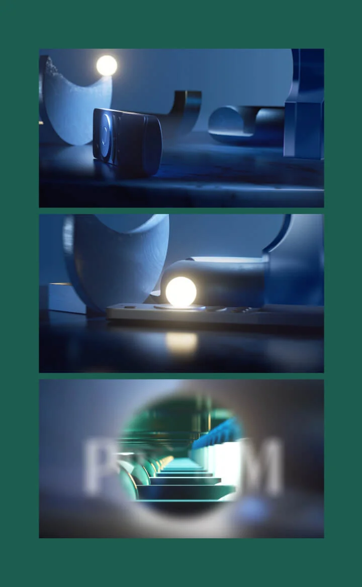
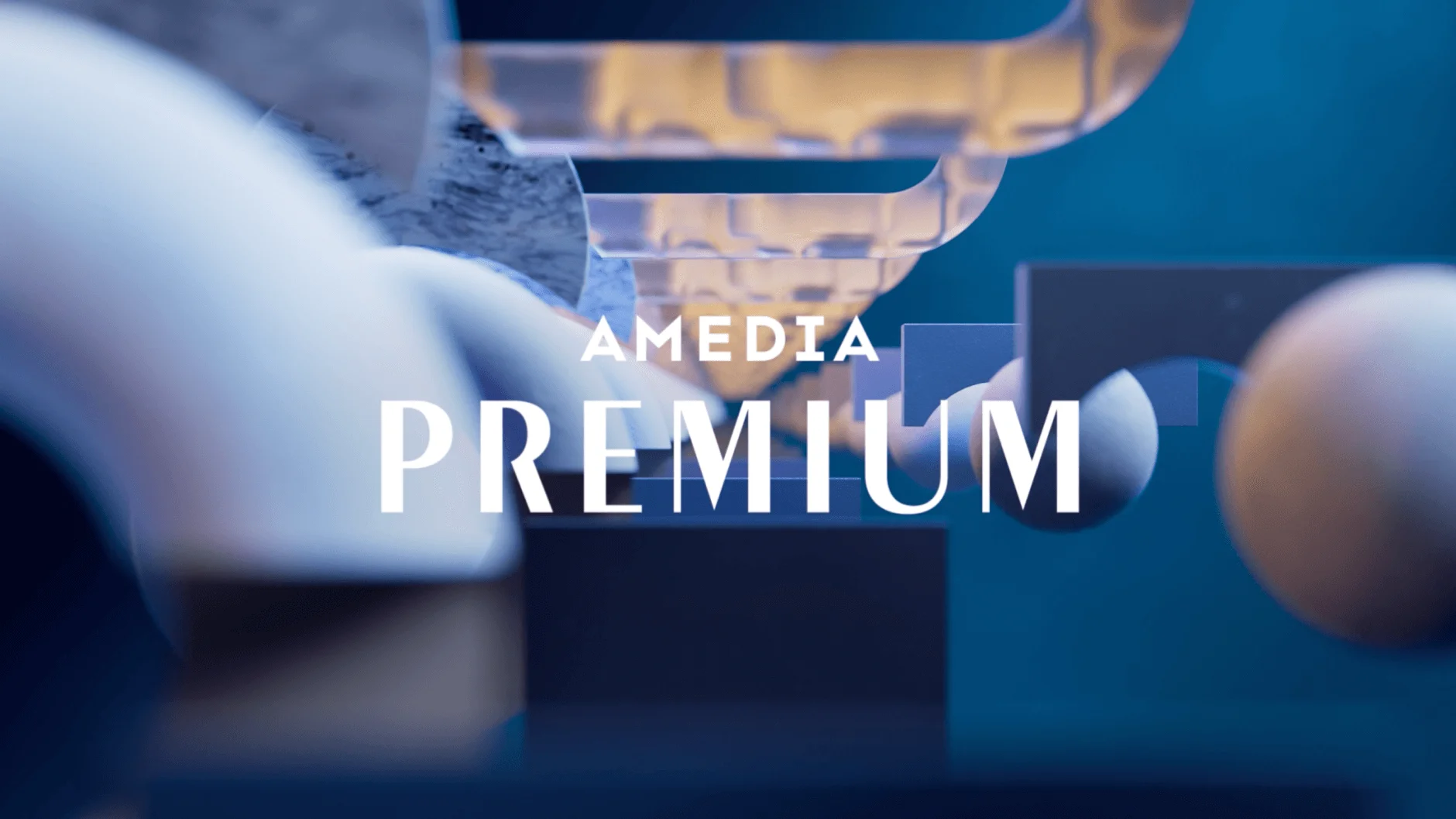
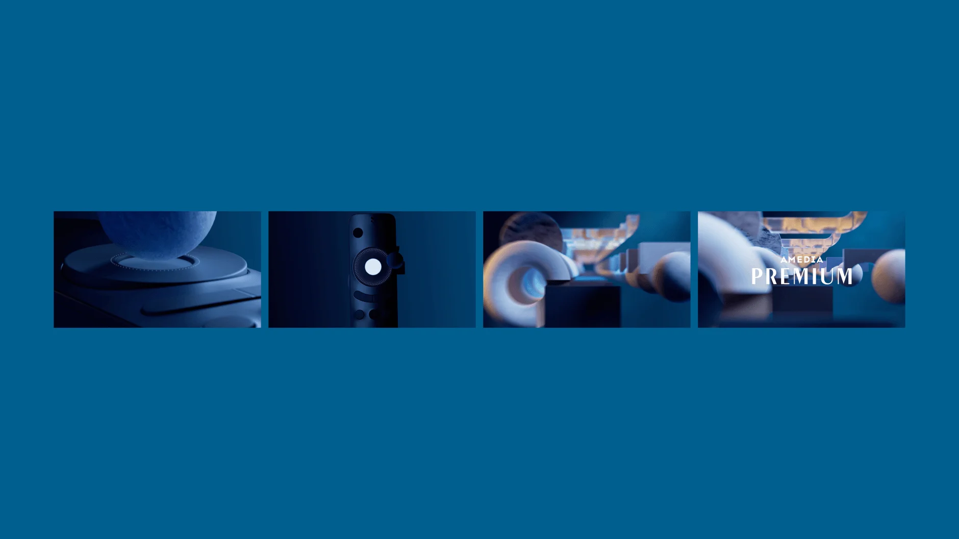
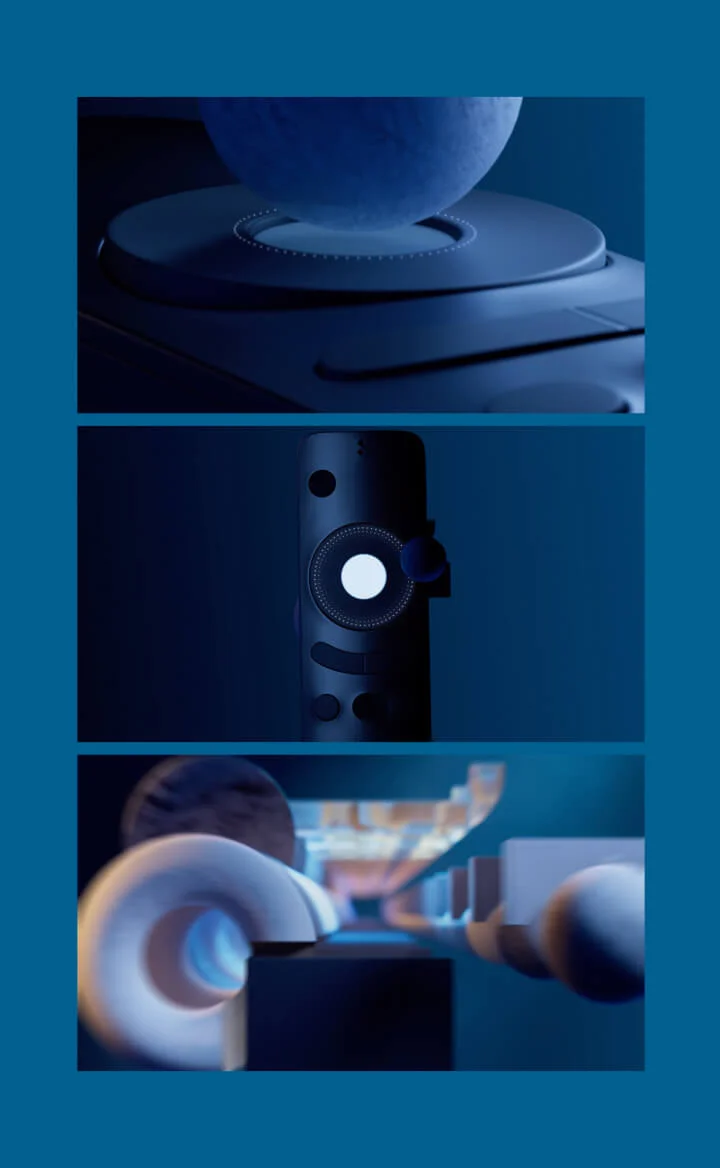
For Premium, which showcases major premieres, we chose immersion as our central metaphor. Animations build on depth progression—logos emerge as if materializing from darkness. We utilized fractal forms that multiply and envelop each other, creating an infinite absorption effect. Subtle references to home viewing elements appear—remote controls, popcorn trays—though they remain abstract and barely recognizable.


Hit: genre variability
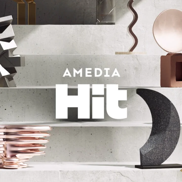
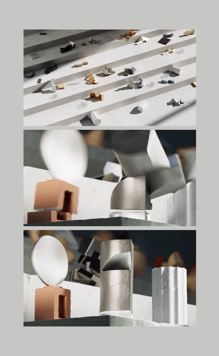
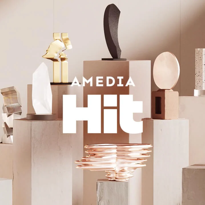
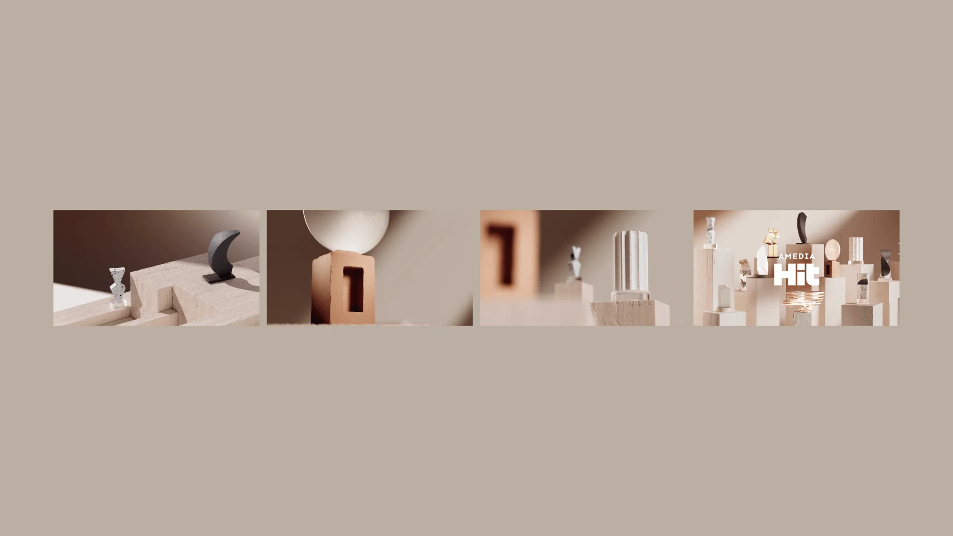
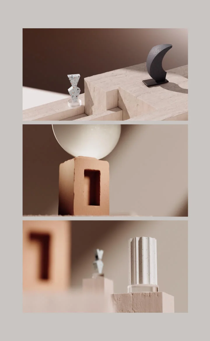
The Hit channel presents a carefully curated collection of time-tested films and series. We reflected its multi-genre nature through assemblages of various typographic styles. The intros feature abstract trophies, each referencing specific genres through distinctive forms and materials—metal, dark tones, and sharp lines for action films; pink, airy textures for romantic comedies, and so on. This visual variability effectively communicates the channel's diverse content offerings.