Sber. Kids Multiverse
Context
Children's banking is one of Sber's most complex and dynamically active products. Trends change, children change, and their needs and capabilities evolve — building effective communication with such an audience requires a special language.
Until now, Sber has taken one of two approaches. Either it was too formal, communicating with children as seriously as it would with adults. Or it became overly simplified, playful, and condescending, which eroded the trust of young users.
Our task was to develop a friendly and accessible design that would allow Sber to find common ground with children across different age groups — elementary schoolchildren (6-9 years), middle schoolchildren (9-13 years), and teenagers (13-18 years).
Multiverses
Each age group required an individual approach. The way children perceive the world varies. Hence, communication with each segment of this audience needed its own strategy.
This led to the multiverse concept, where each age segment has its own world. These worlds are created from unique elements that reflect the peculiarities of perceptions and interests of each group.
We wanted to emphasize children's ability to combine seemingly incompatible things and soak up everything around them. Instead of a uniform style, we created a multi-layered system of attributes, where each component conveys emotion and helps to interact with Sber's products.
Components
To create a unified visual language, we developed several key components that harmoniously combine within the context of different age categories.
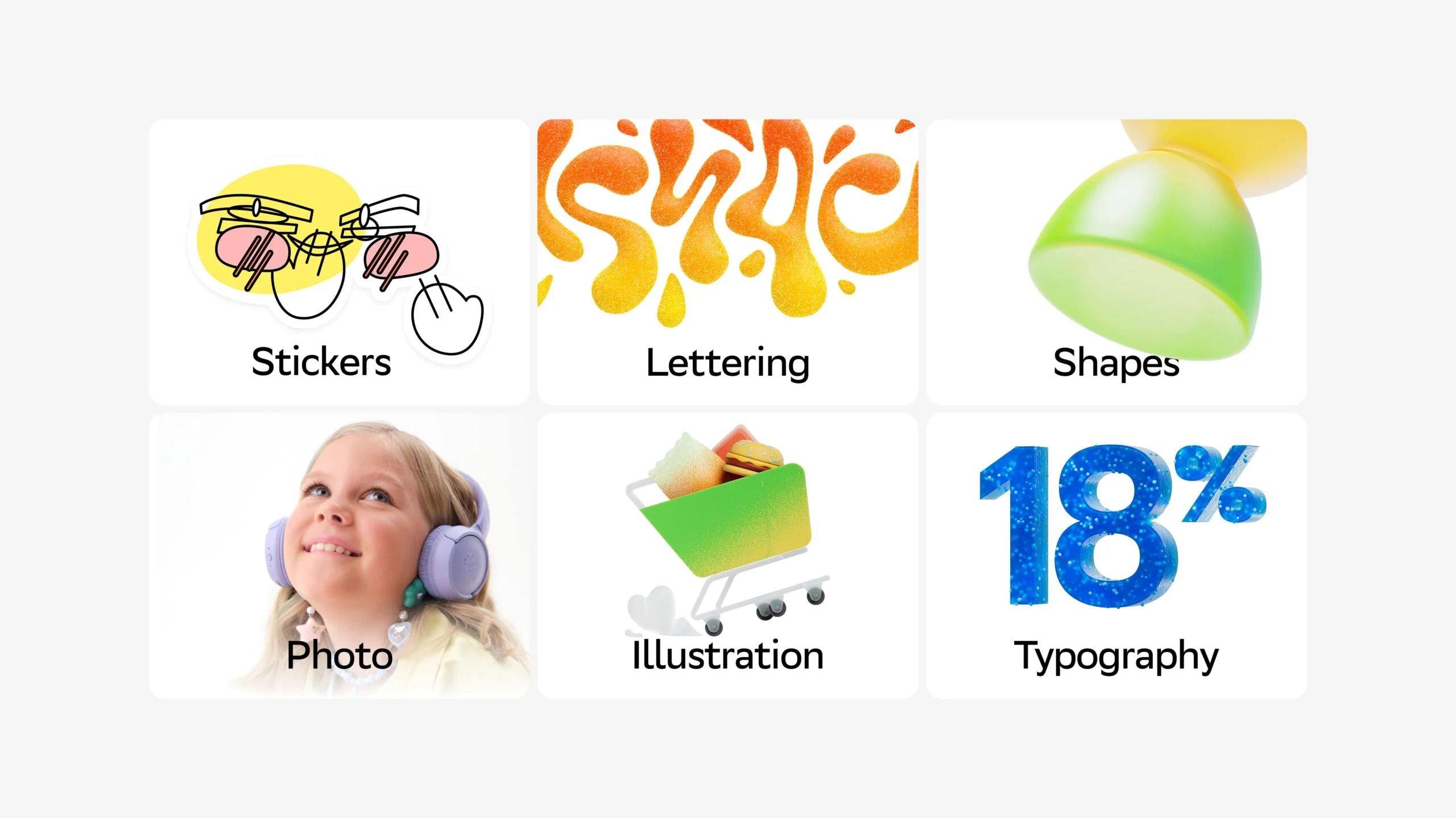
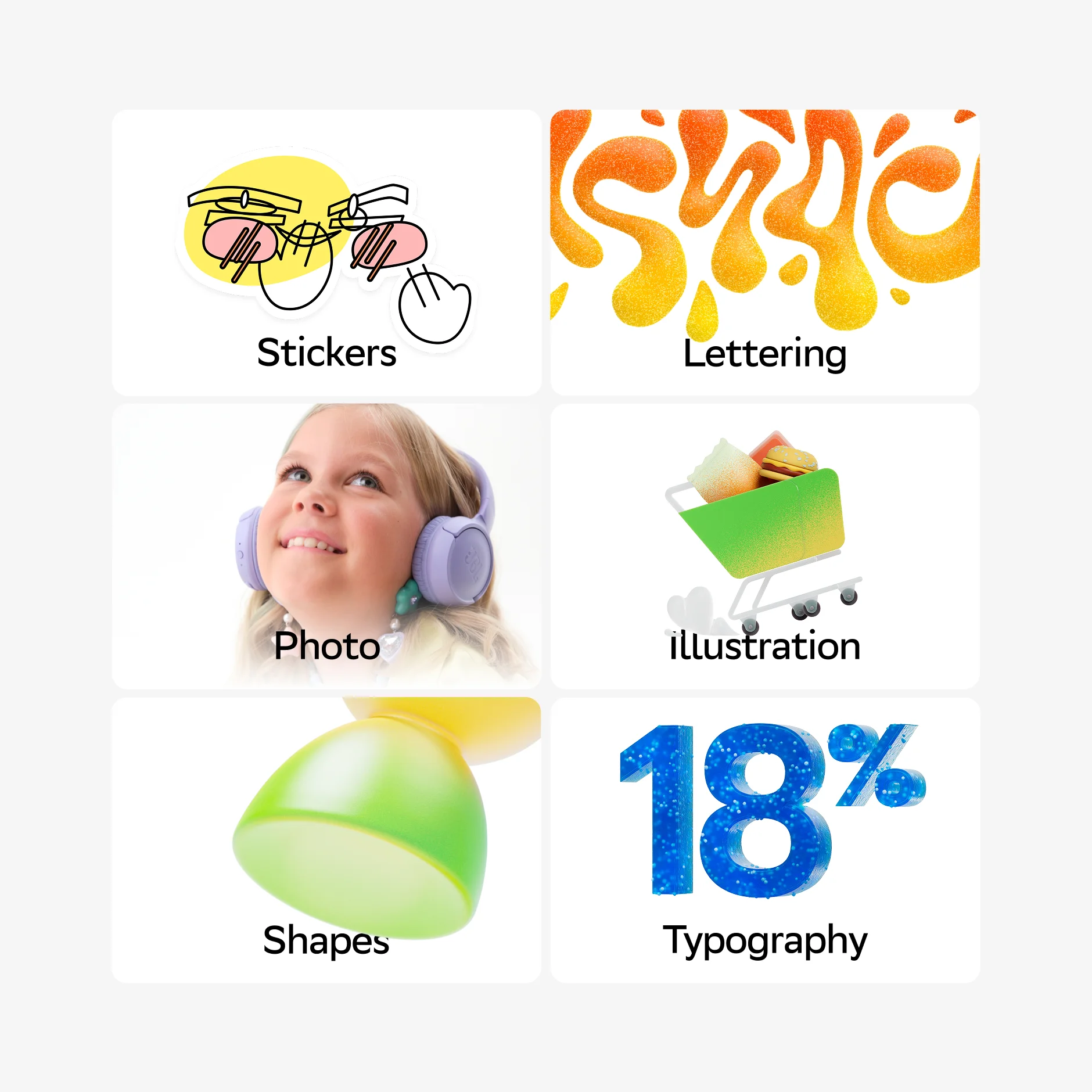
Stickers add casualness, lettering helps create a unique style for cards and other products, shapes define the character of scenes, photo elements reflect the real personas of young users, and illustrations complement interfaces with appealing 3D objects.
Stickers
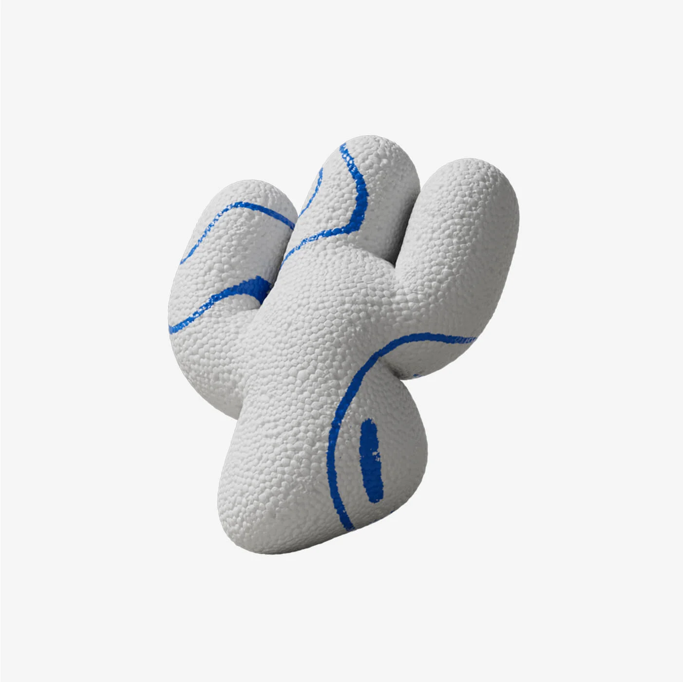
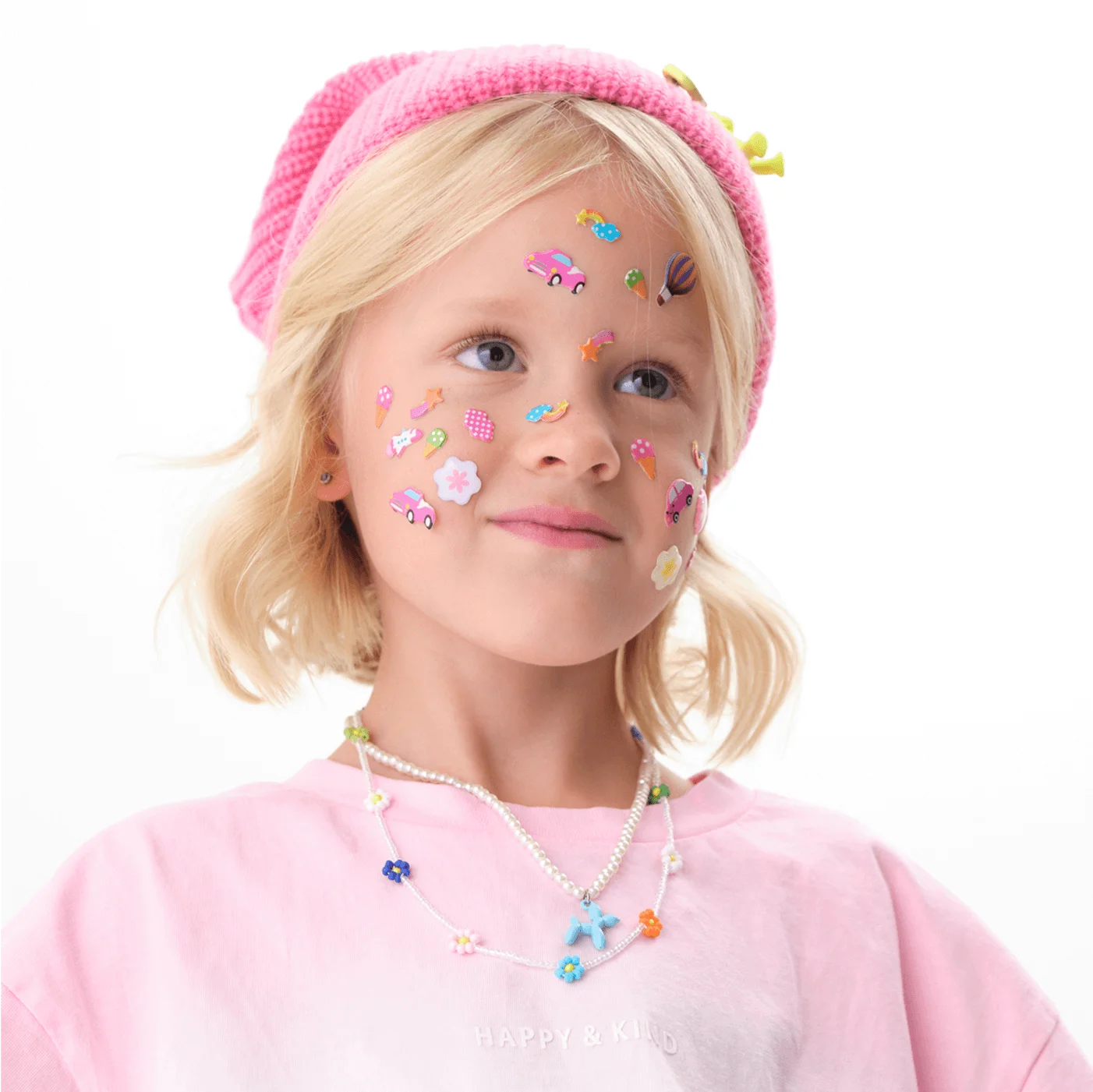
Stickers allow for designing scenes imbued with a child's presence — just like in real life, they're randomly placed on surfaces, creating an informal and creative environment.
Sticker sets differ for each age group. For younger children, we use soft shapes and bright colors, while teenagers get popular slang and more complex images.
Lettering
We wanted to create a universal design for basic cards. This meant no anime characters, superheroes, or other narratives—such approaches are more suitable for special collaborations and limited-edition cards.
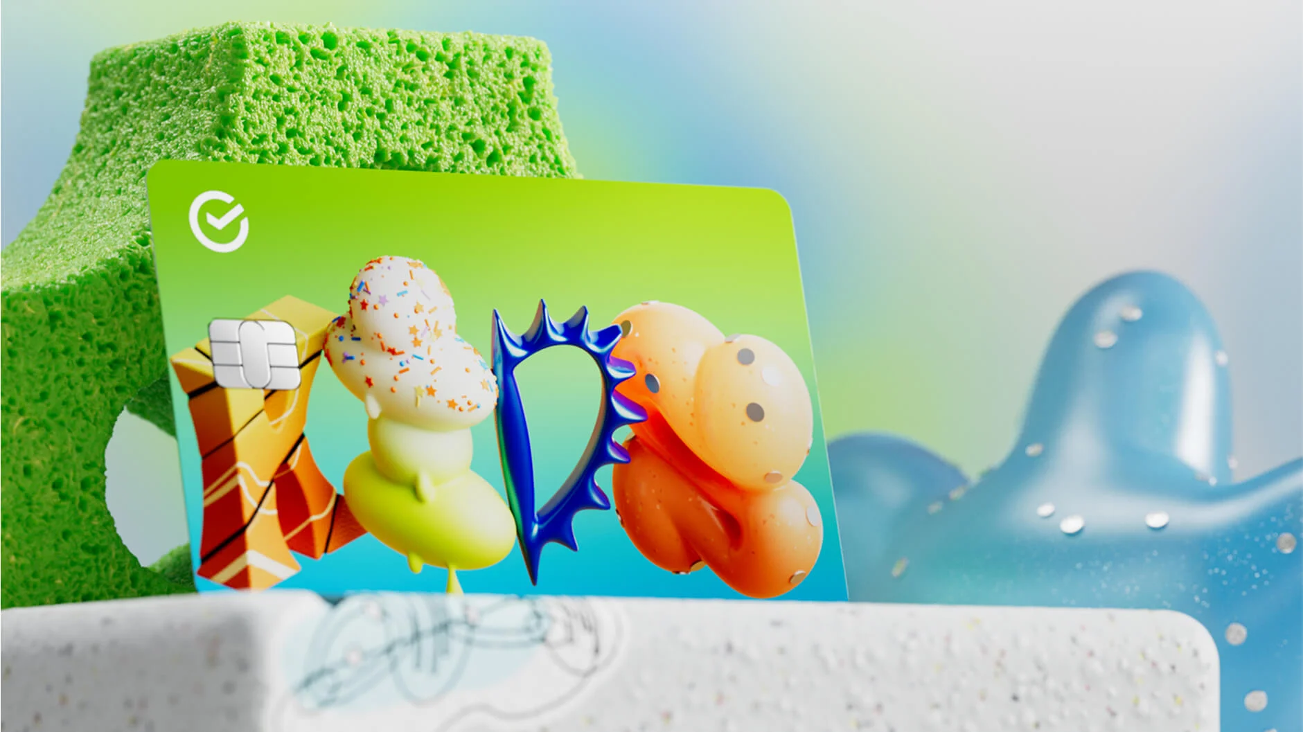
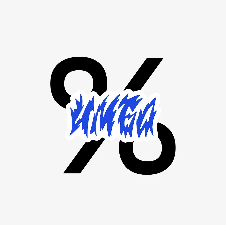
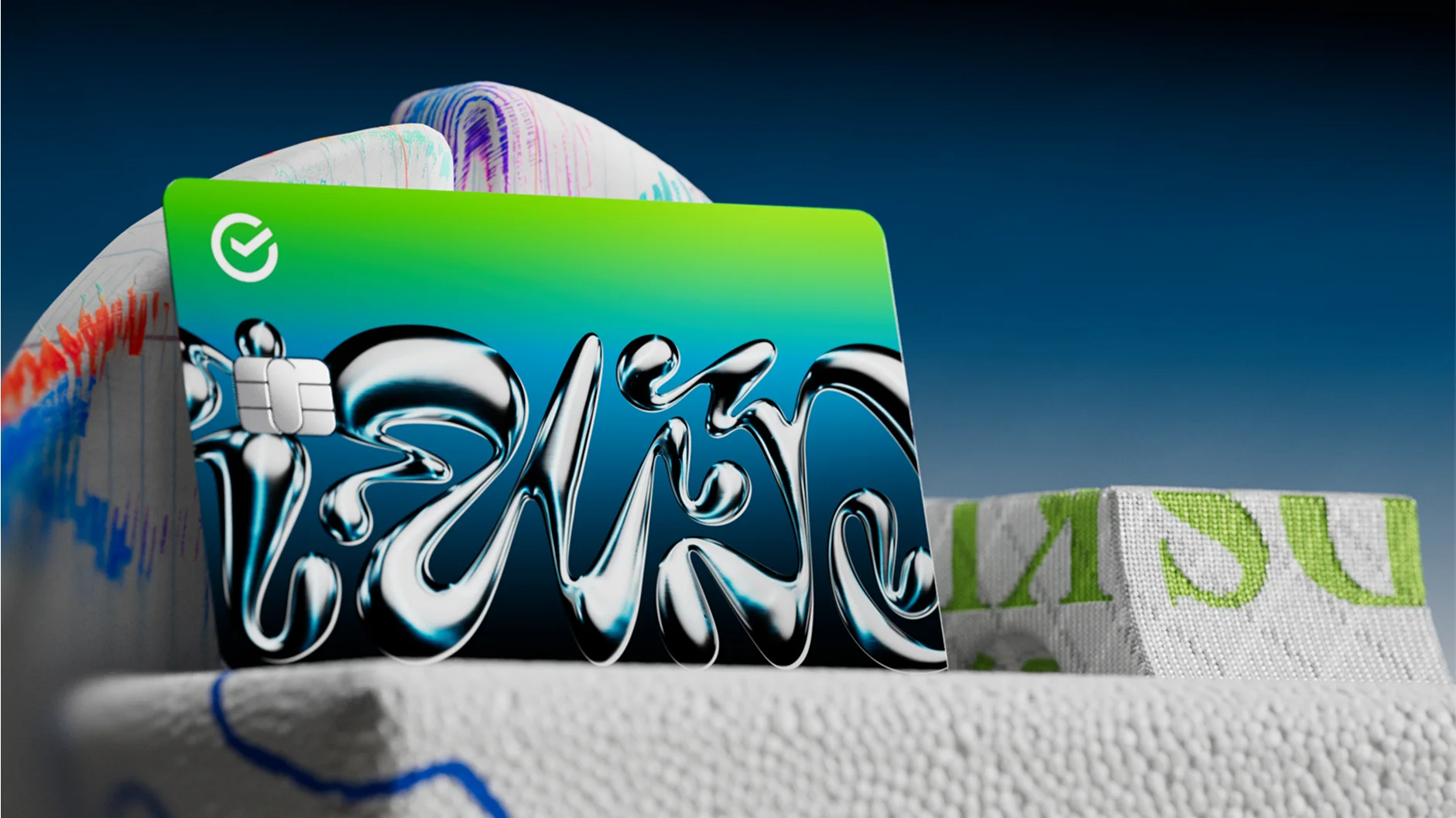
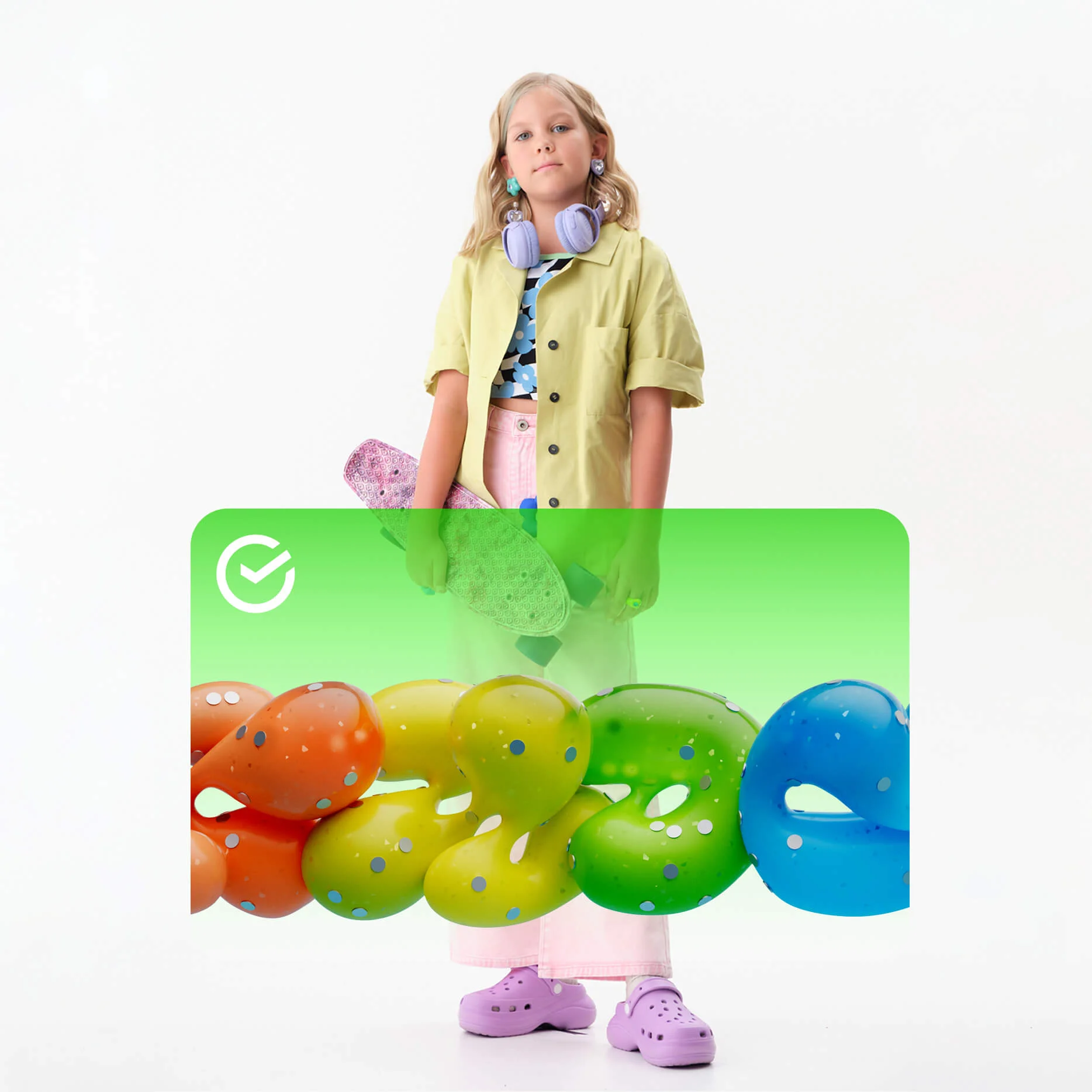
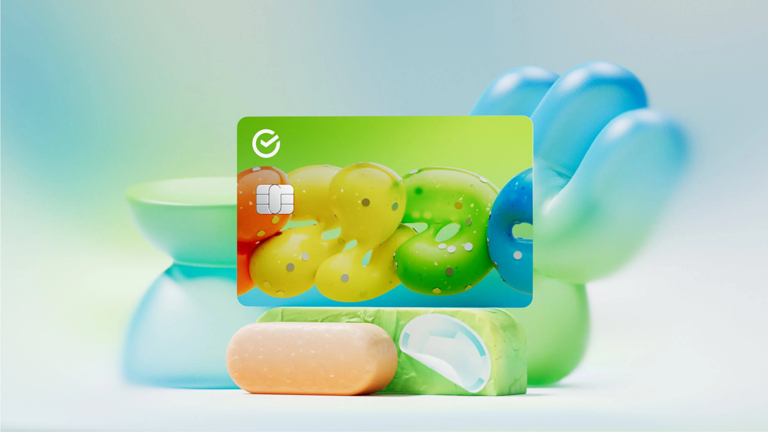
We needed something with depth but not boring, something that captured children's inner worlds and interests That's how we developed the concept of dynamic typography, where passions and aesthetics familiar to various age groups come together.
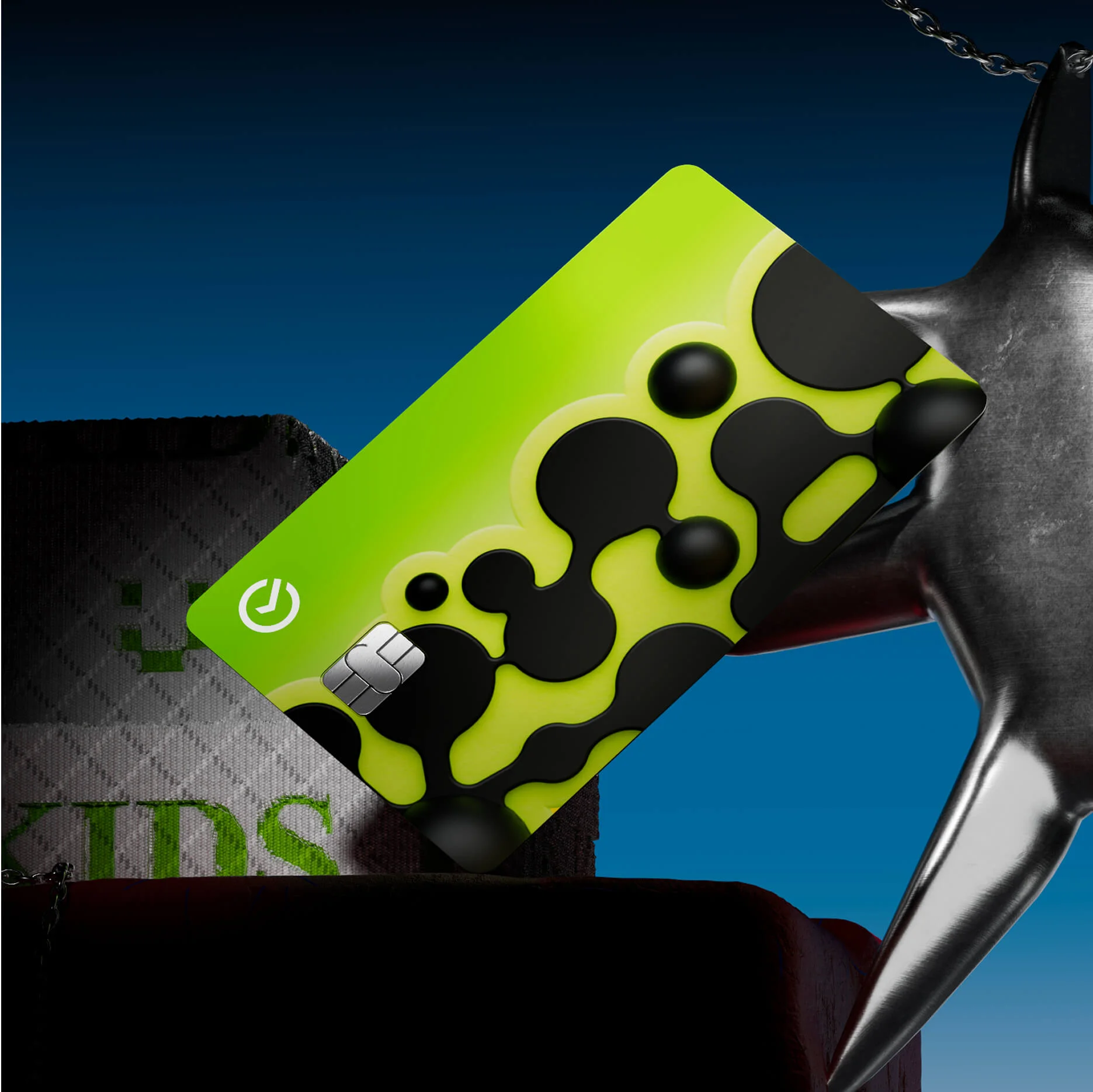
Words in futuristic green shades seem to fly out of a blaster, referencing gamecore. Or they form compositions resembling hieroglyphics, creating associations with Asian culture and anime. For older teenagers, angular letters cast in metal convey a spirit of independence and rebellion.

Shapes
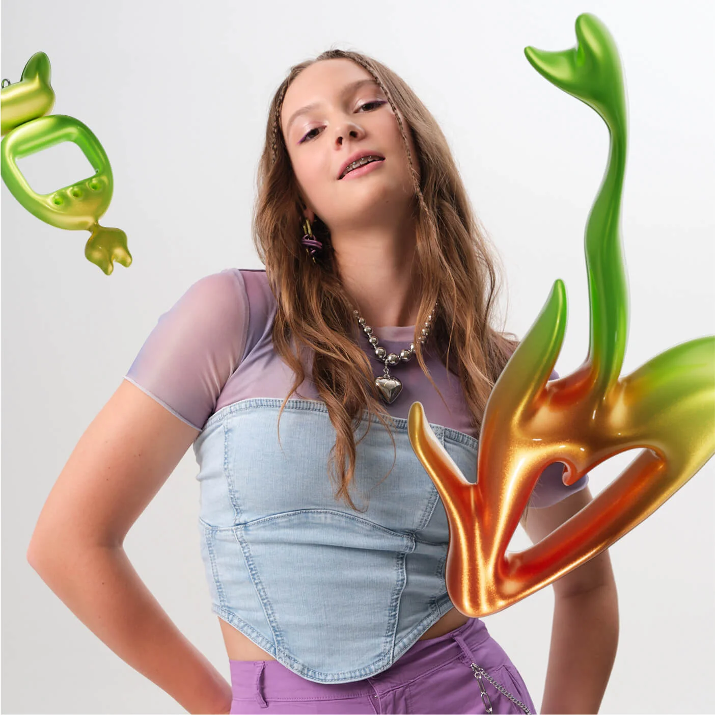
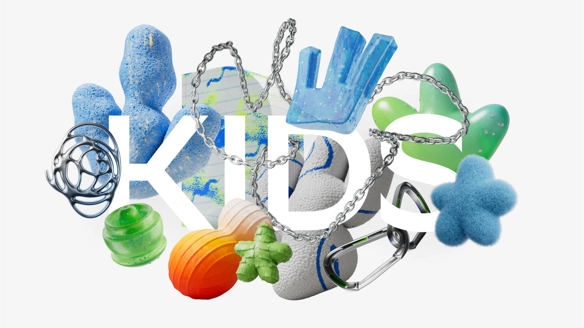
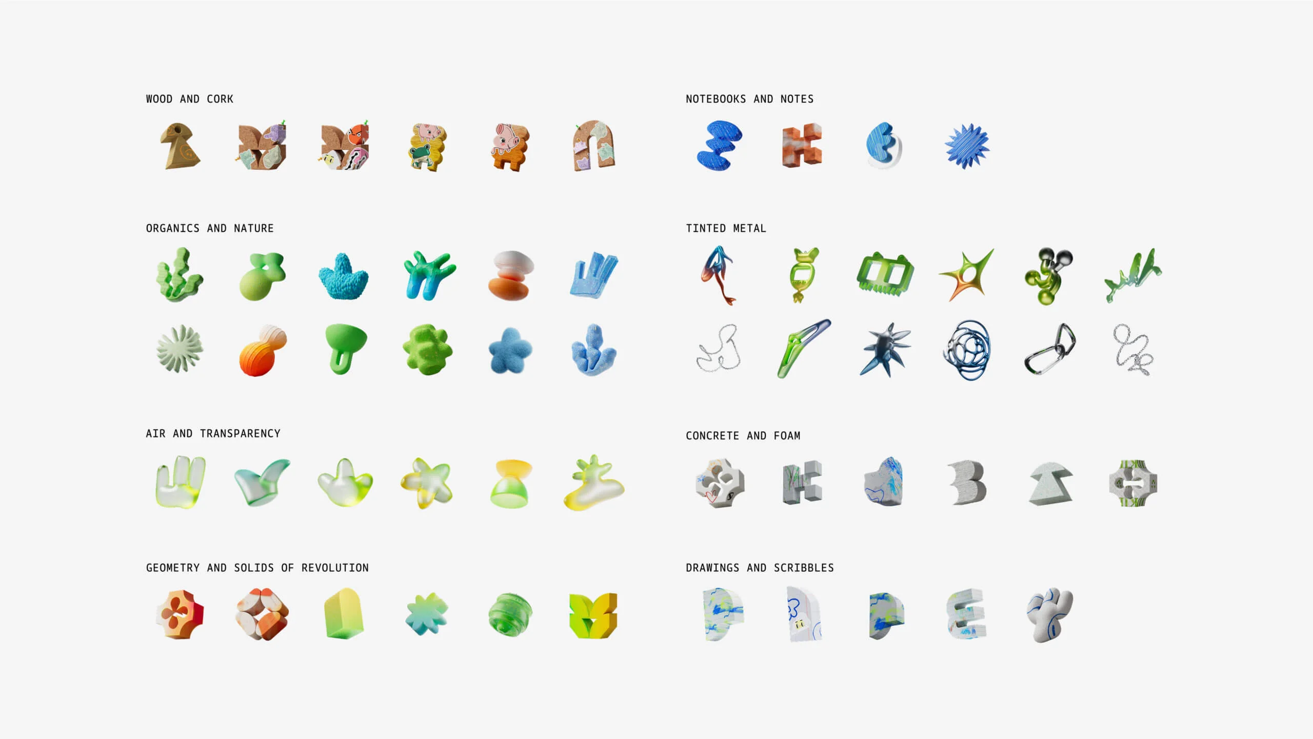
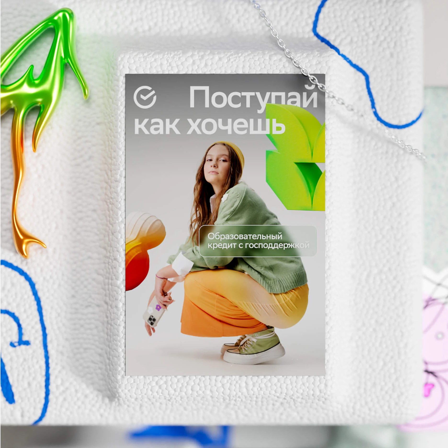
Shapes serve as a toolkit that helps us infuse scenes with intuitive meanings and convey mood. Abstract objects composed of visually tactile materials effortlessly fit into photographic creatives and shape the environment around the characters.
For each of the three age groups, we designed distinct objects and compiled them into a bestiary — an encyclopedia of shapes. One can easily trace the transformation from light and airy shapes to metallic and concrete ones — each responding to the emotional needs of the varying audience segments.

Photo
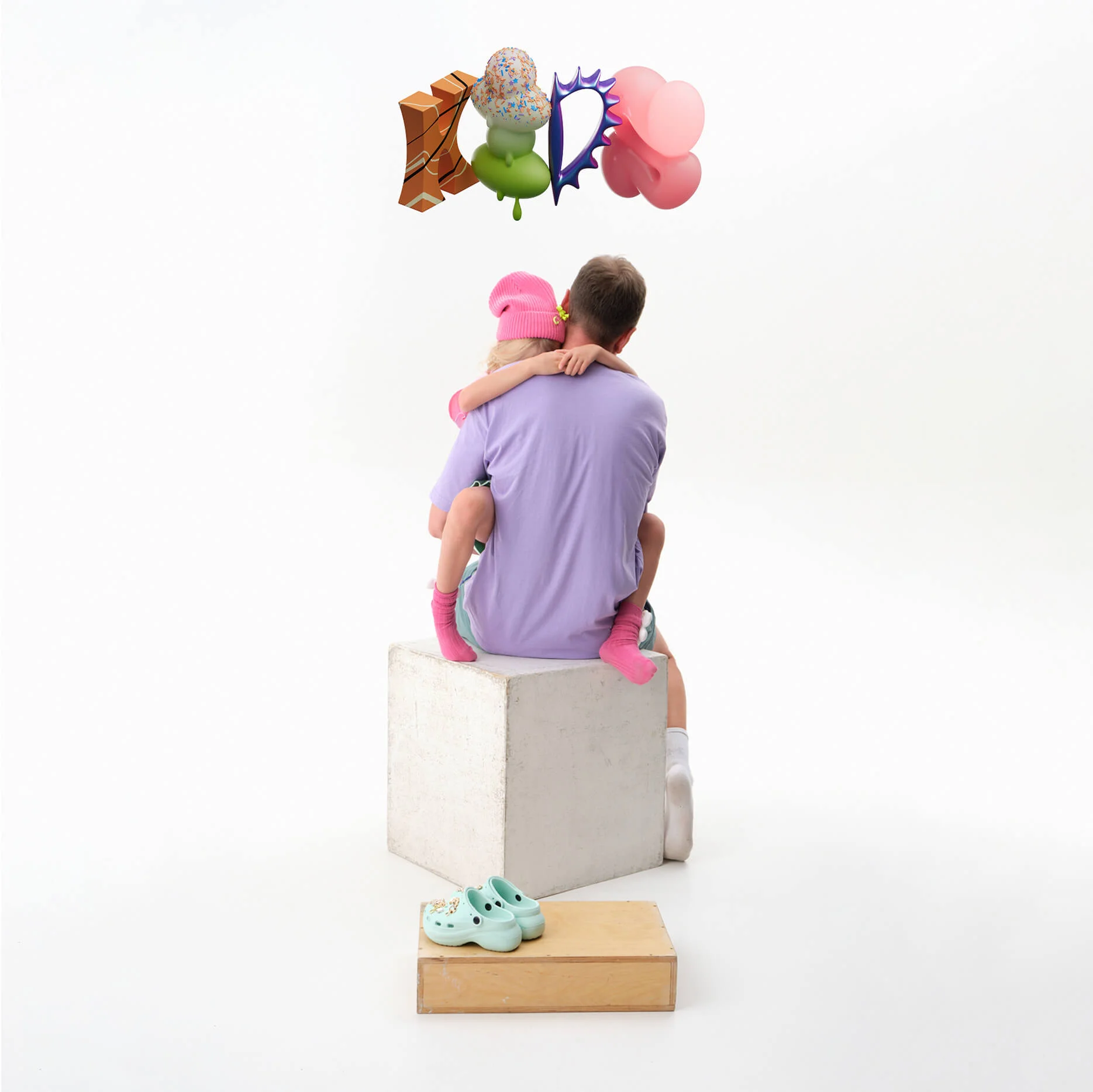
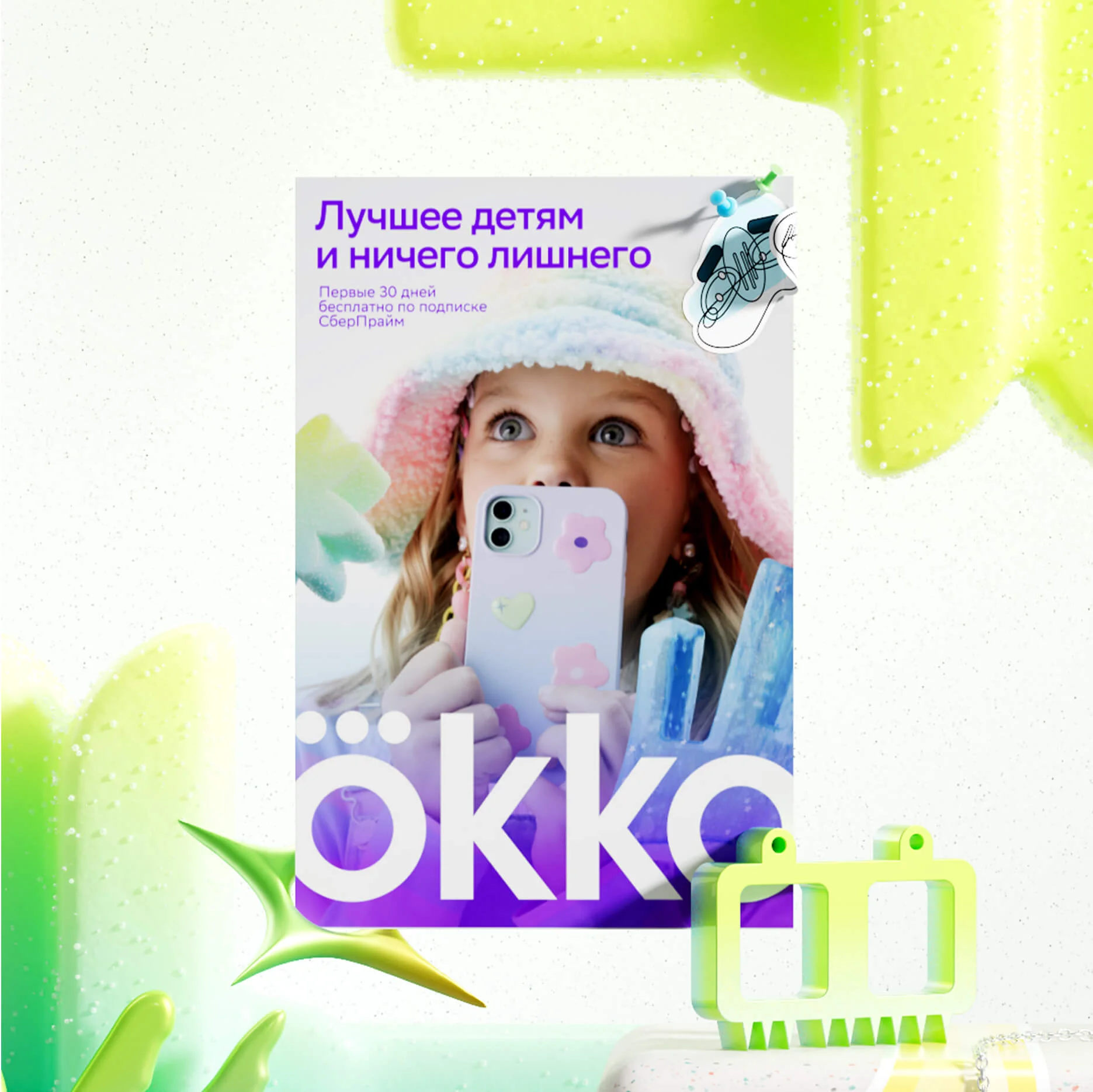
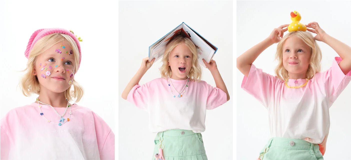
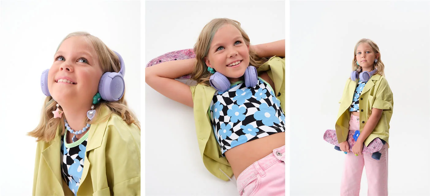
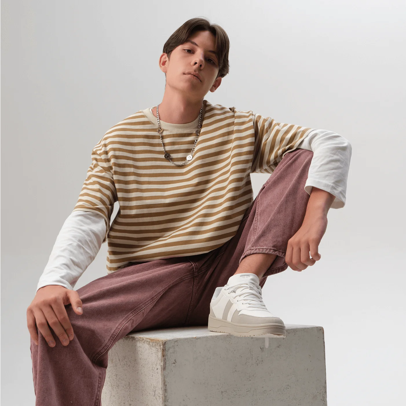
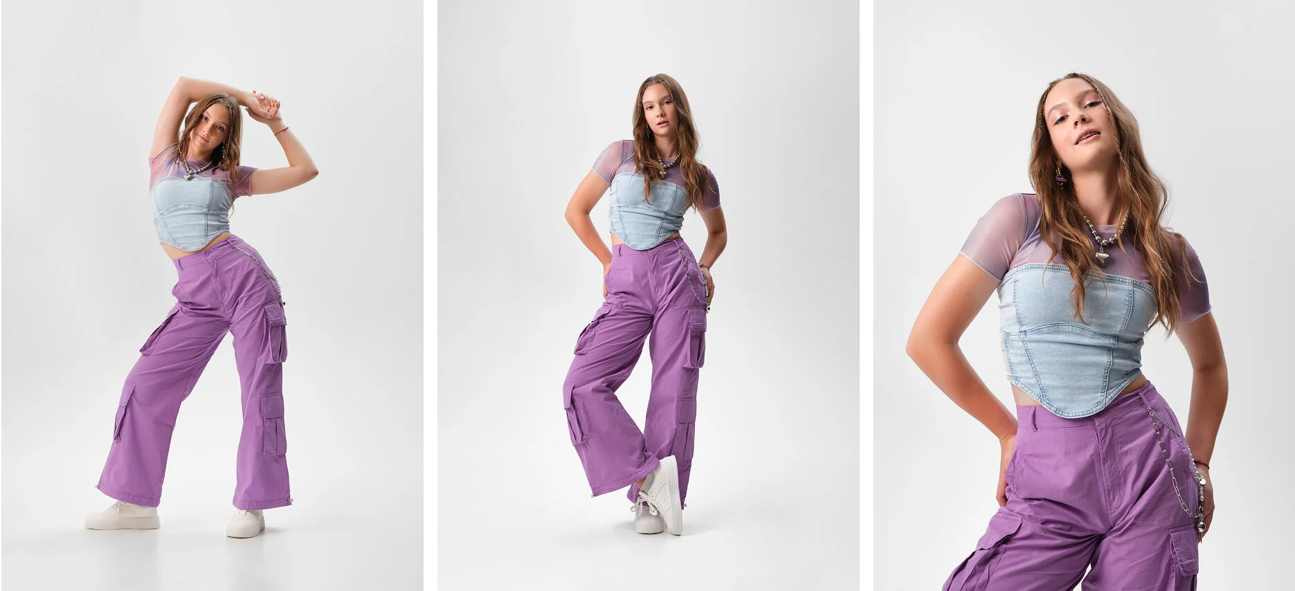
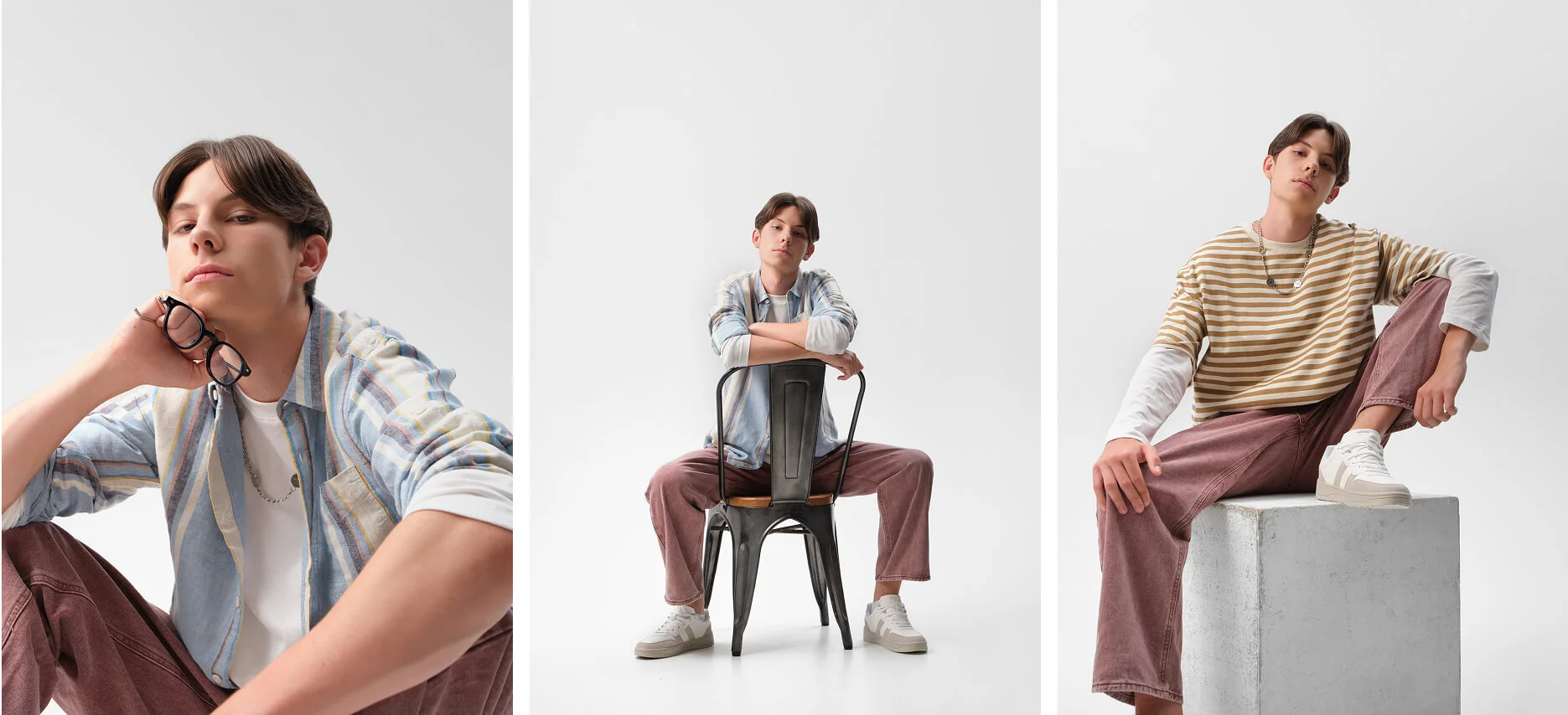
We arranged photoshoots with real children to capture images that align with the brand's visual style and convey the authentic spirit of our heroes, while avoiding anything that feels artificial or stock-like. Each age group's photos were customized using different lighting approaches, camera angles, wardrobes, and makeup styling.
For the youngest group, we employed soft, diffused lighting that creates a sense of warmth and safety in the images. For the teenage segment, we implemented more dramatic lighting and heroic camera angles to highlight maturity and autonomy—these subjects wore relaxed clothing styles enhanced with chains and other trendy accessories.
Illustrations
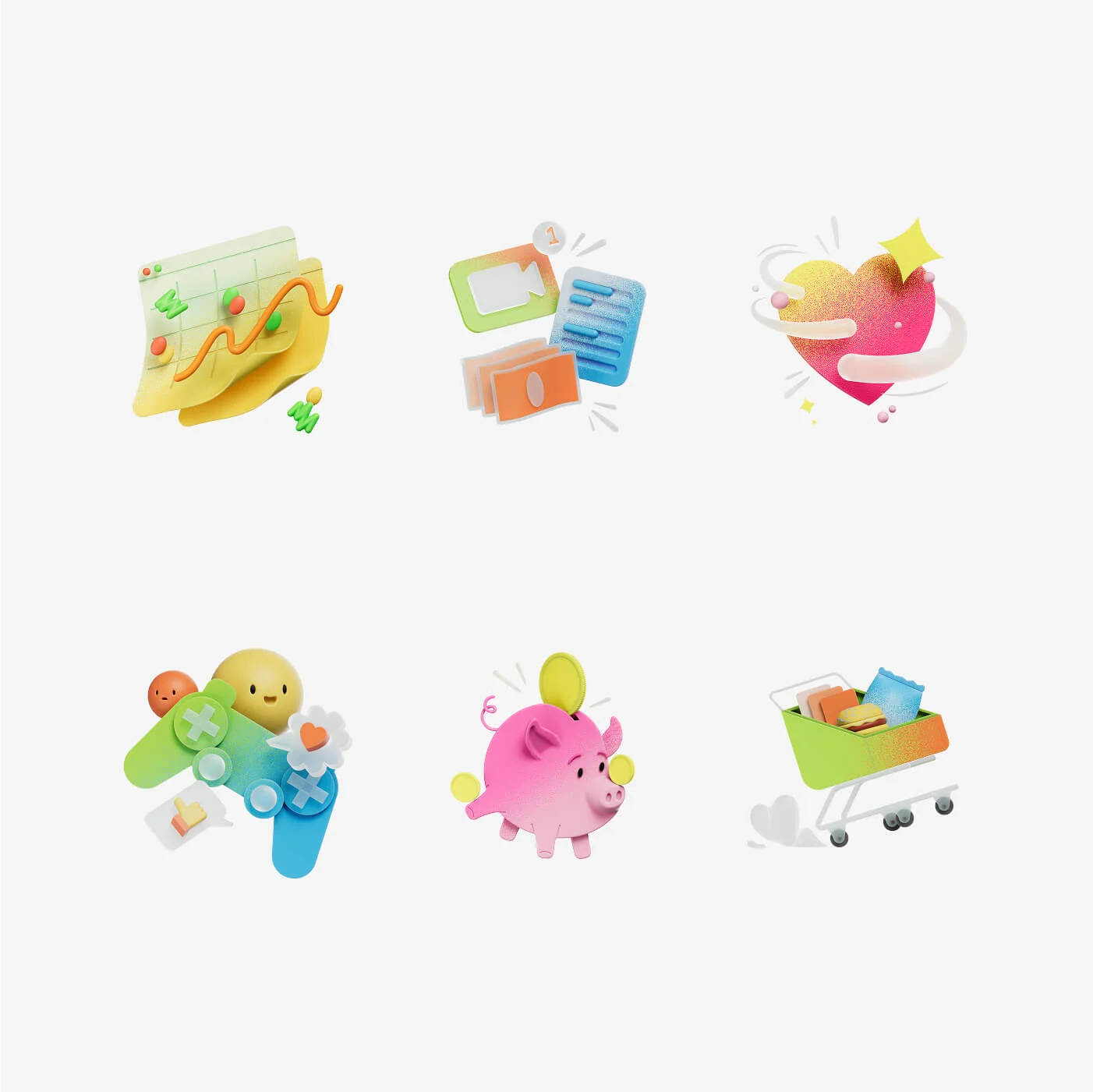
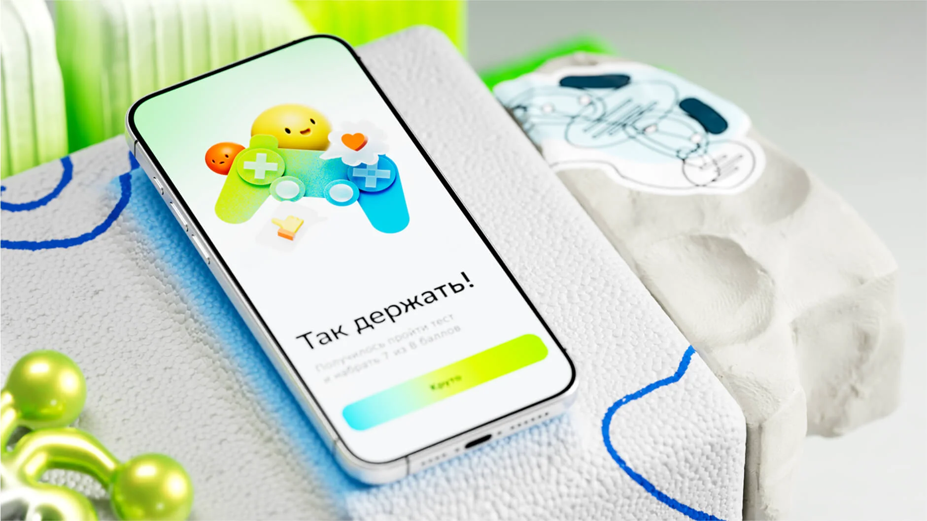
For the Sber Kids application, we developed 3D illustrations that harmoniously fit into the broader visual identity. These illustrations feature an captivating combination of flat and volumetric forms, creating a lively effect. Contrasting colors applied using a spray technique, like from a paint can, are accessible and intriguing to children, while also improving their information comprehension.
Sber Cards
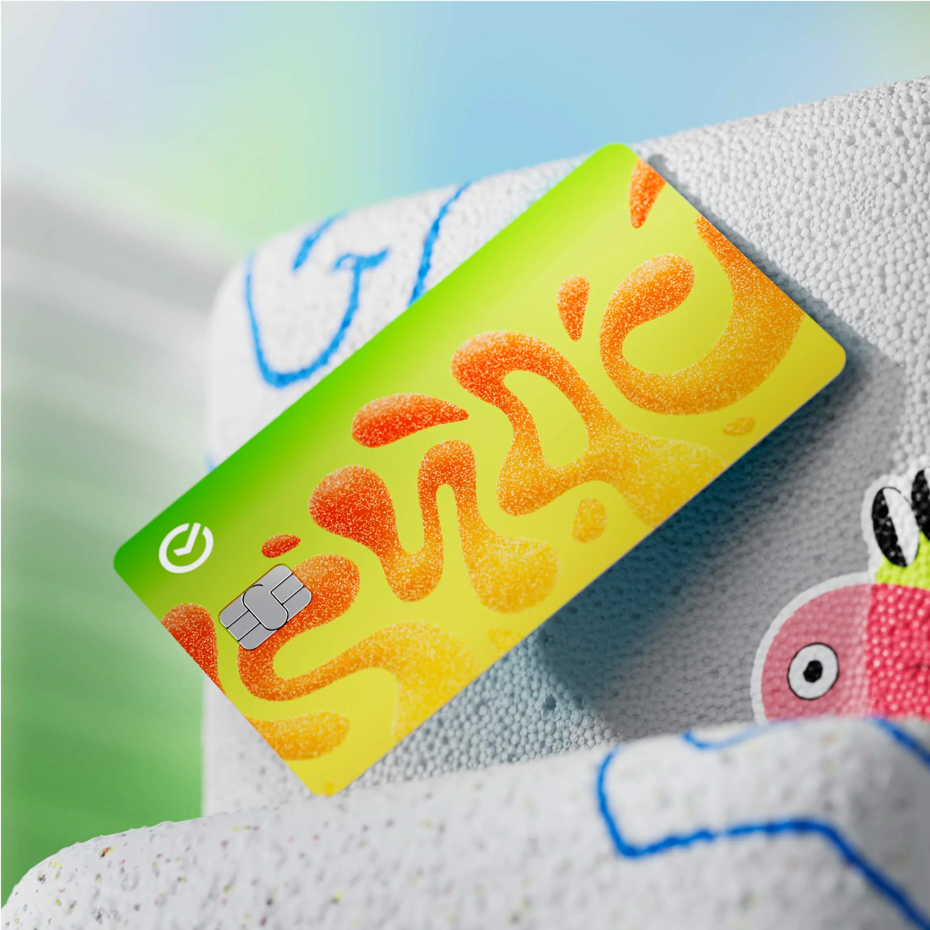
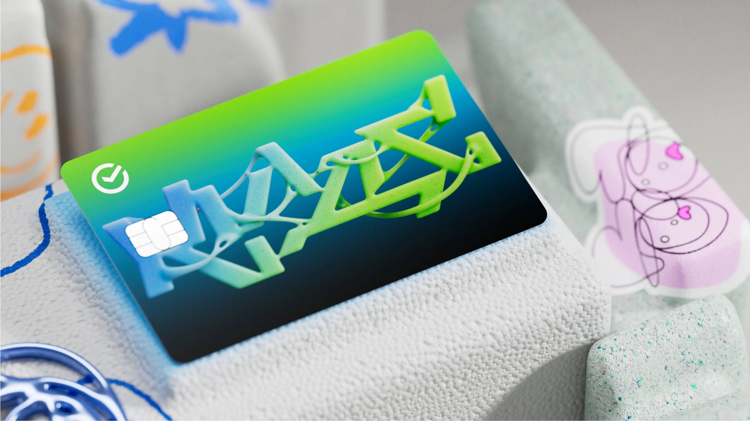
Sber’s cards are seen belonging to a child’s natural habitat, alongside pop-its, key fobs, stickers, chains, and hair ties and other everyday objects. This way, the cards appear as a yet another integral part of a child's daily routine.
Beyond the standard card collection, we also explored custom designs — such as cards with anime-inspired aesthetics. Staying true to minimalist principles, we chose not to feature specific characters, instead employing the classic anime technique of emphasizing emotions and distinctive eye styles.