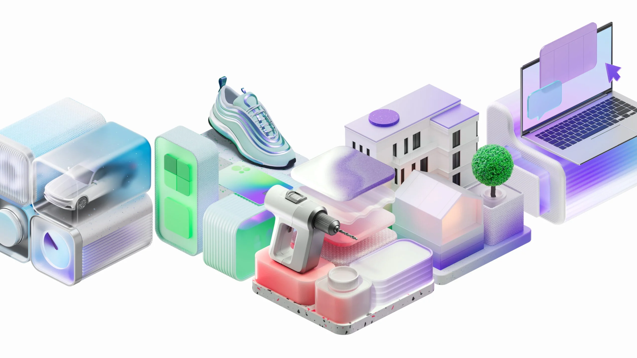
Avito. Visual boost
Context
This project began as a request from Avito’s product team. Throughout its 18 years in business, Avito’s users have formed a strong association of the service with a flea market. Flamboyant colors, overly cheerful — sometimes even carnivalesque — communication, and simple design elements created a sense of chaos that no longer reflected the service's true identity.
In reality, the company’s range of services has long evolved beyond that of a mere bulletin board. Our mission was to revamp the design language and shift brand perception, preserving its friendly tone while injecting a sense of professionalism and user-friendliness. The visual update focused on Avito’s digital communication channels — its app, website, and social media — but did not extend to its marketing efforts.
The Graphic Collider
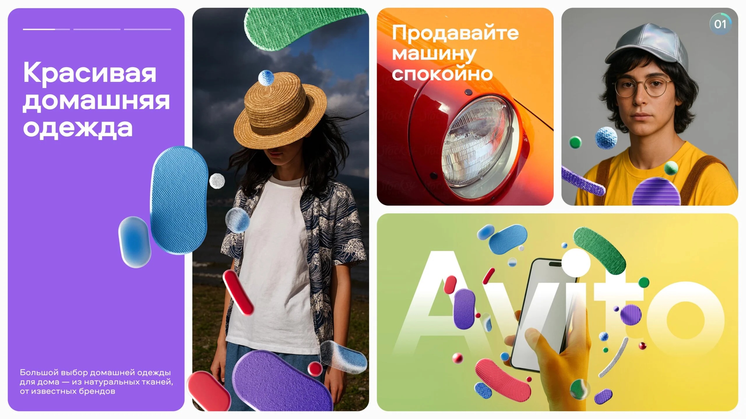
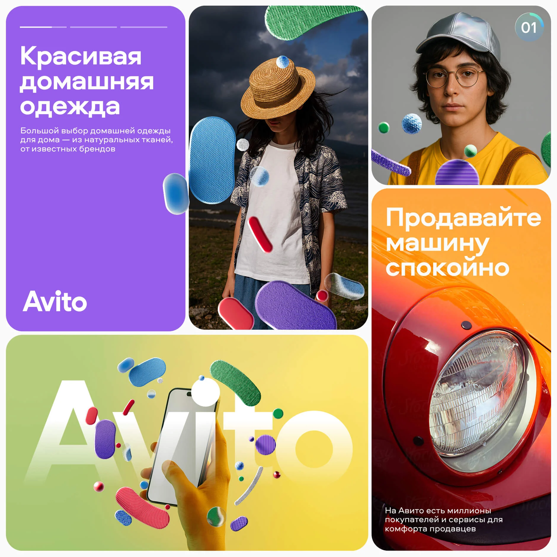
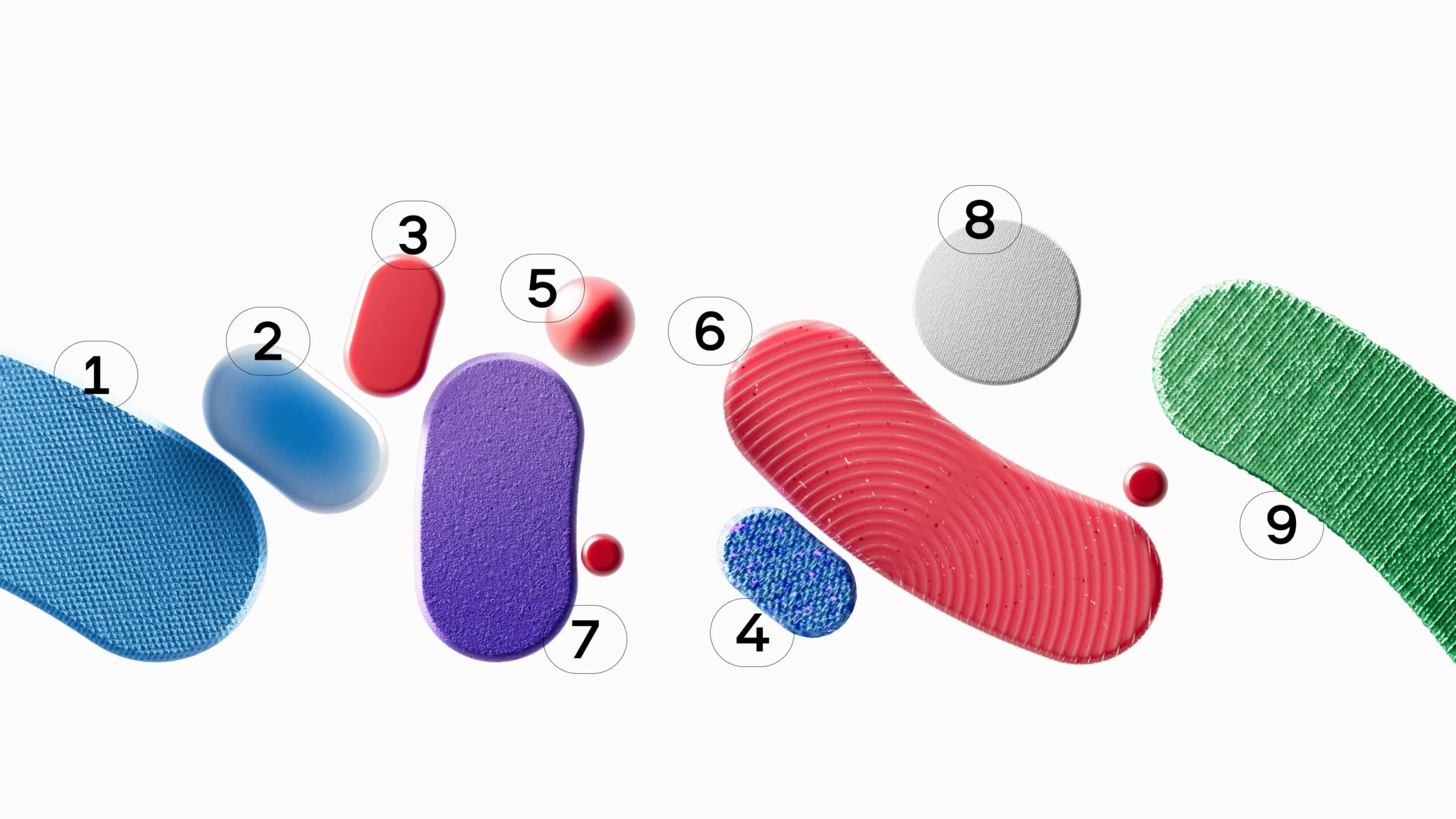
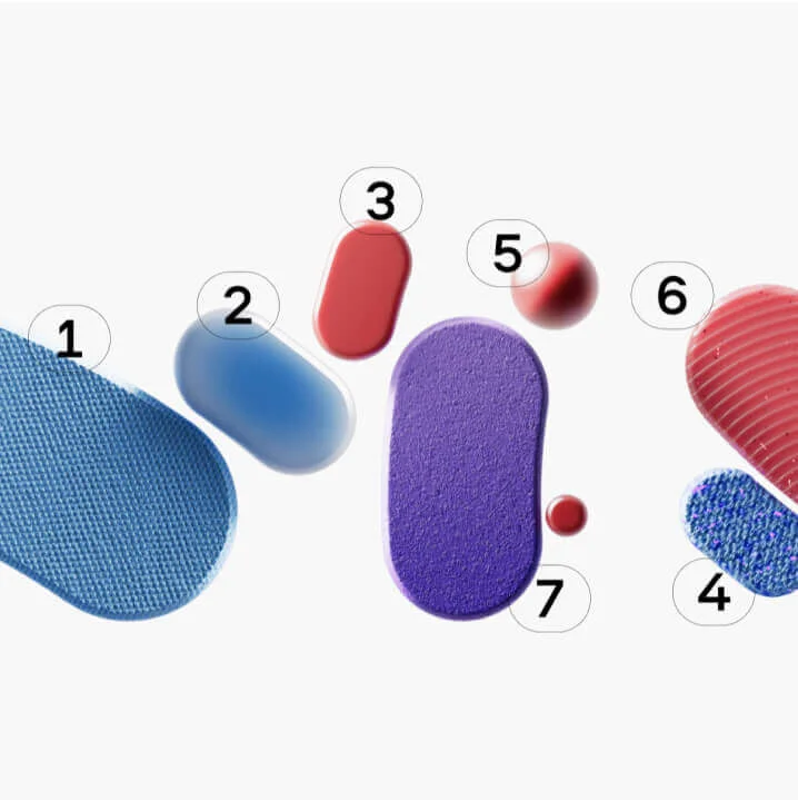
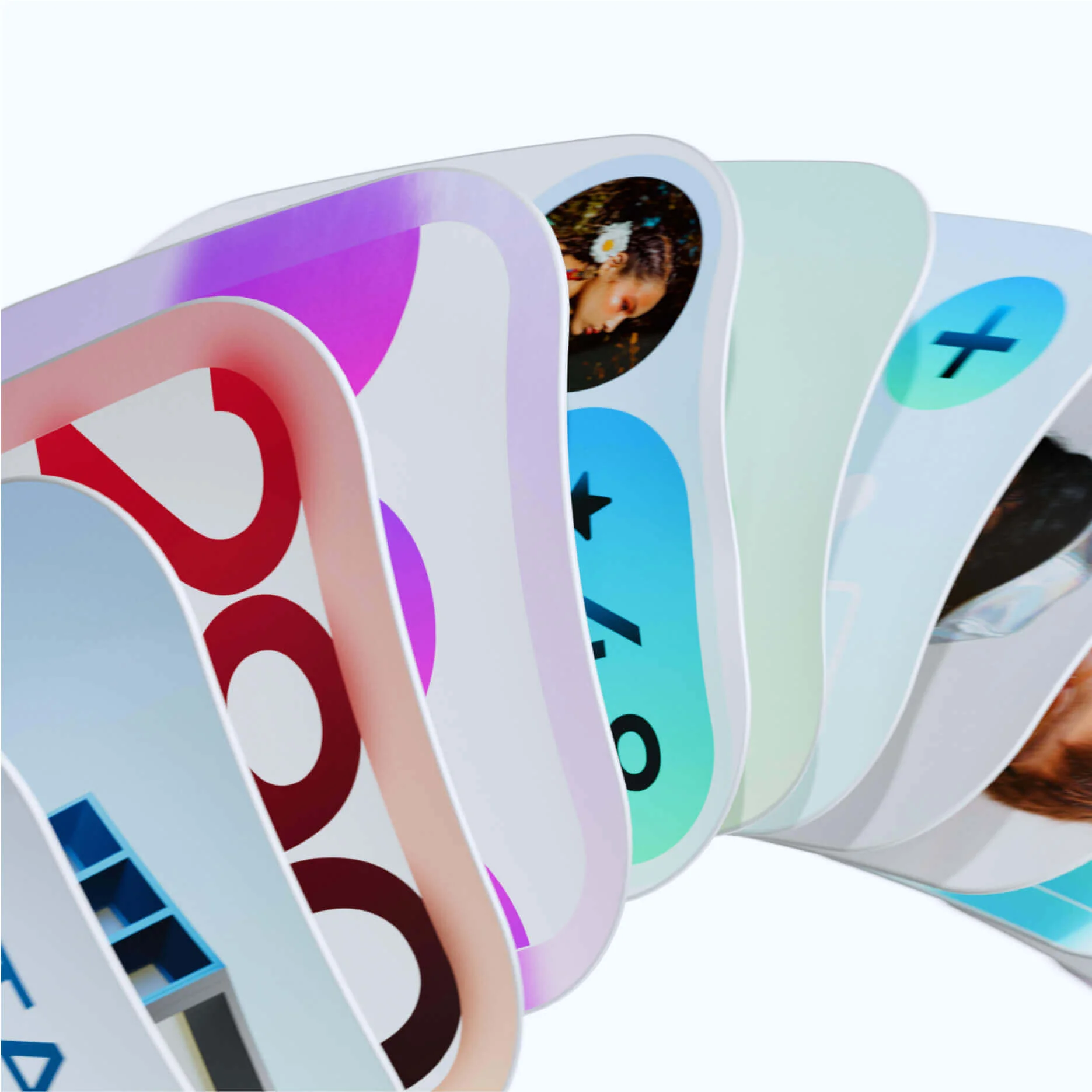
We began by reimagining the existing graphic elements. The core idea was to move away from flat visuals in favor of more dimensional and material ones. Photorealistic elements allowed us to seamlessly blend brand components with both photographic imagery and more abstract settings, creating a sense of depth.
The team internally referred to this solution as the “Graphic Collider.” The concept is built around radial motion, reminiscent of particle acceleration. This dynamic motif not only injected energy into the visual style but also metaphorically captured the very essence of Avito — a platform where users interact with multitudes of goods and services.



Iconography
One of the key elements of the redesign was the creation of new icons for the platform’s category navigation. These icons are a crucial part of the interface, helping users easily navigate through Avito’s diverse offerings.
As part of developing the new icons, we introduced a set of principles designed to help Avito’s team scale and adapt them to any requirements. These principles, specifically three implementation models for icons and objects, are described in the style guide.

Widgets
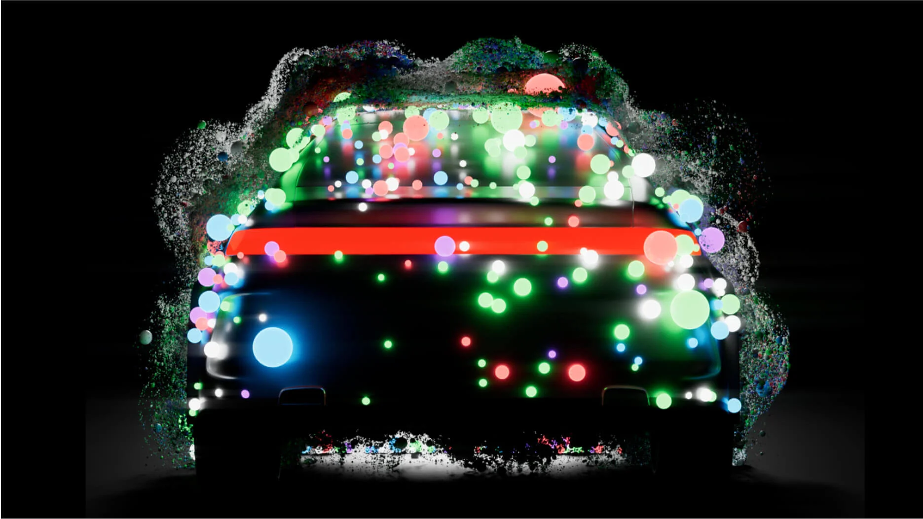
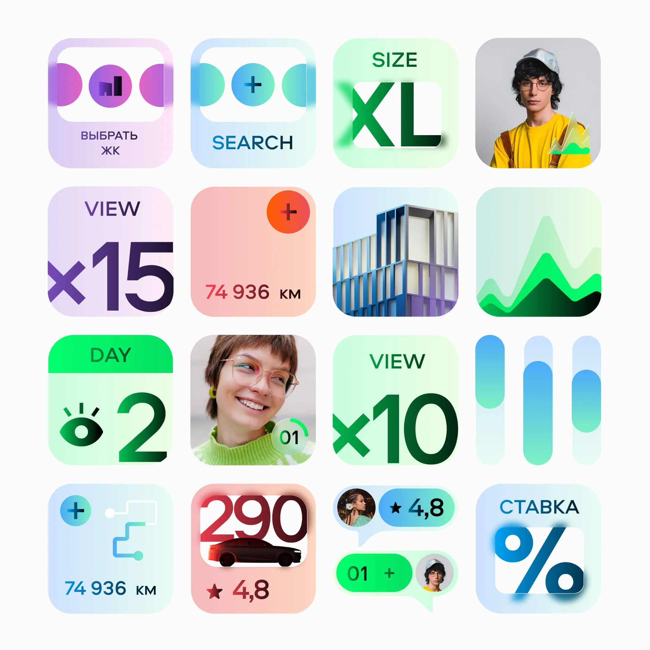
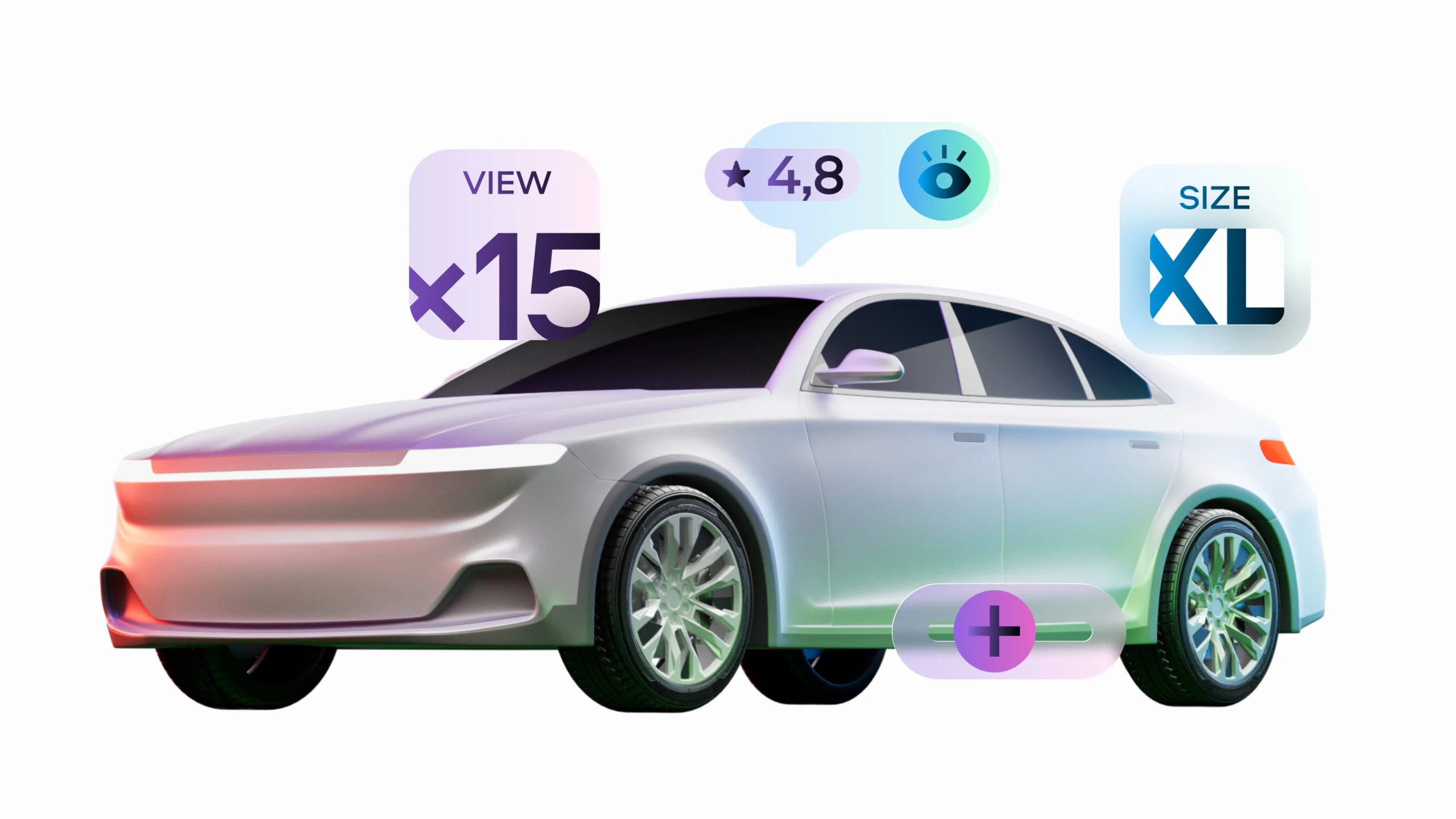
Widgets were introduced as a completely new feature for Avito’s platform. They help users better understand how the service works by combining stylized 3D objects with interface elements. For example, an image of a car might be surrounded by floating tags displaying views, price, and other details — creating an impression of interactive engagement with the product.
Illustrations
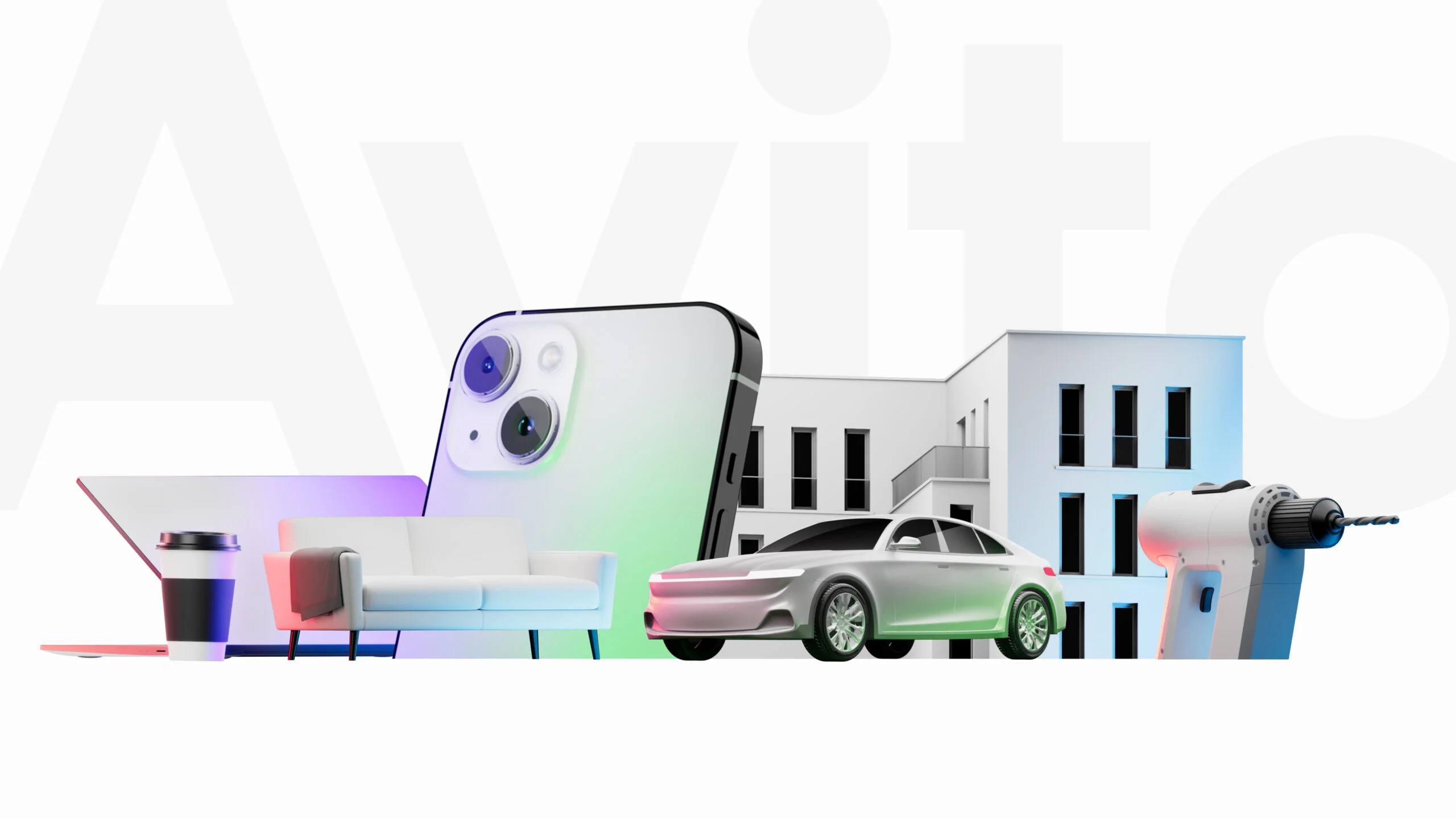
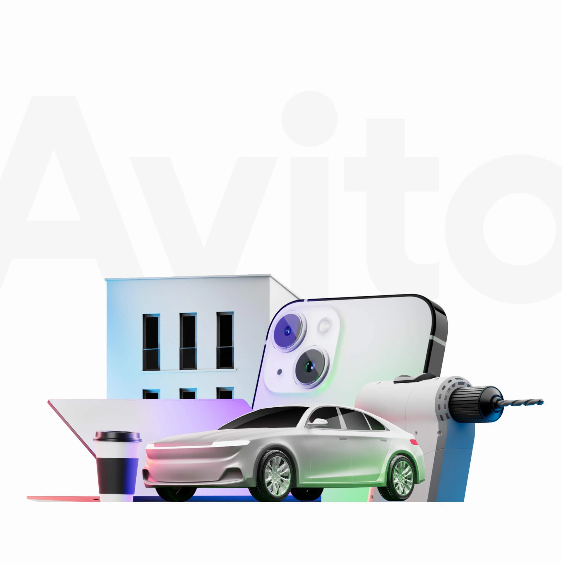
Illustrations are another lively element of the updated design. They appear in a pop-up format in the app, wink from social media pages, and highlight current service offerings. It's important to note that these illustrations constantly change — this way the user grows accustomed to this style of communication without becoming bored by repetitive visuals.
The main principle behind these illustrations is to combine a detailed central object with abstract supporting elements. For social media use, this approach was simplified slightly to allow Avito’s SMM team to quickly produce creative assets and adapt the visual language to diverse content needs.