Amediateka. Redesign
Context
Amediateka is one of Russia's oldest streaming services with a loyal audience that appreciates thoughtful content and time-tested hits like The Sopranos, Dexter, and Game of Thrones. The platform essentially creates the atmosphere of a "Russian HBO."
The service approached us to update their logo and develop broadcast design—a comprehensive visual system for communication across social media, presentation materials, and other formats. As often happens in creative work, this project evolved during the process into a full-fledged identity update.
Logo: the card catalog metaphor
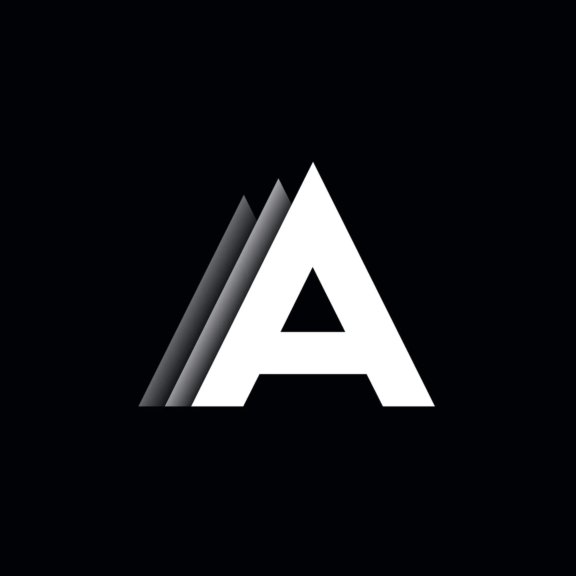
We preserved the logo's essential character while making it more concise and expressive. We played with the three "a" letters that appear at the beginning, middle, and end of the name. This rhythm suggested the metaphor of a card catalog—a perfect symbol reflecting the essence of streaming as a curated collection of films and series.
In the animation, the letters stack like film covers, transforming into a dynamic grapheme that references the content collection.
Animation: from flat to volume
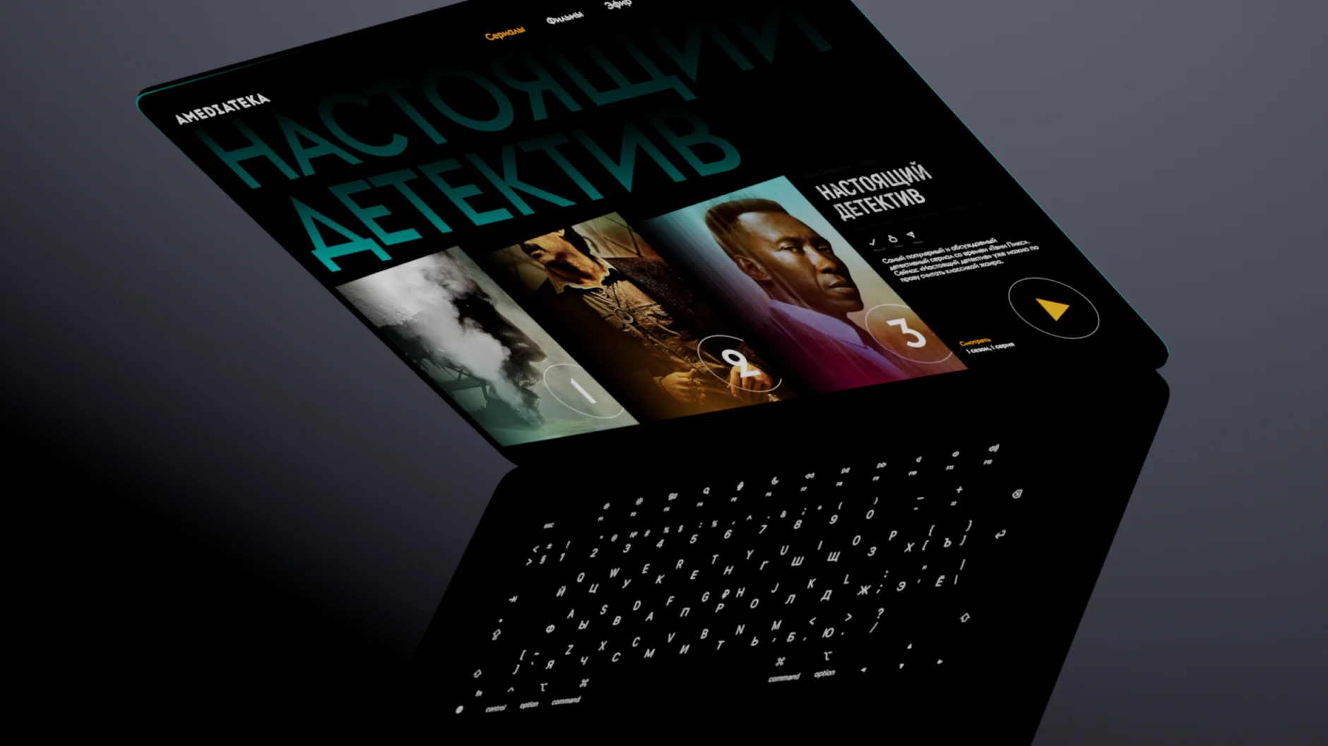
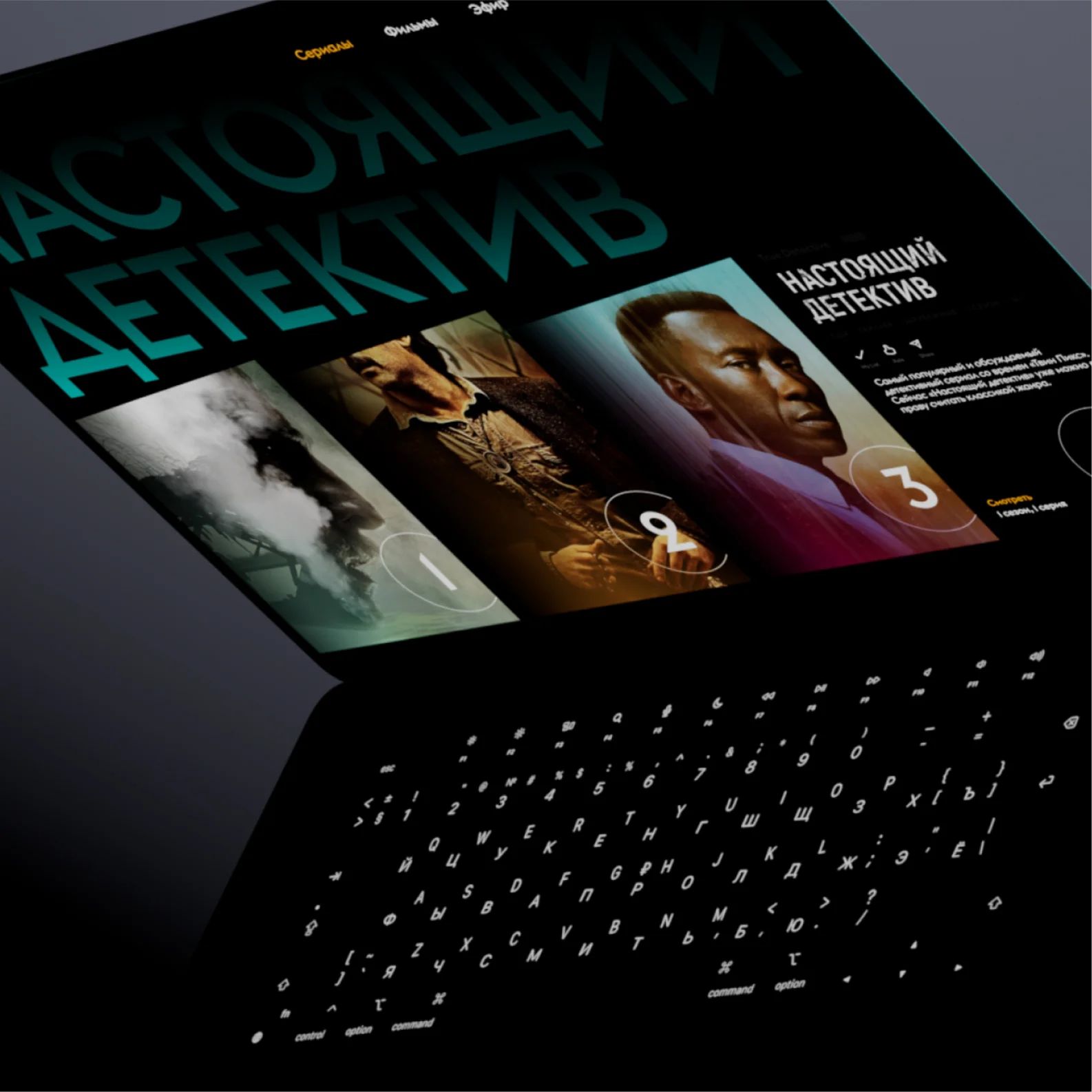
The primary material we worked with was the service's content: posters, titles, and movie placards. Since modifying the covers themselves wasn't possible, we transformed their presentation by giving them perspective, turning flat images into three-dimensional artifacts.
For this, we employed a simple yet expressive technique: cutting one corner of each rectangle to create a trapezoid effect. This visually transformed titles into cards that extend into space and "look" at the viewer. We applied this technique at all levels—from large covers in promotional materials to compact cards in mobile interfaces.

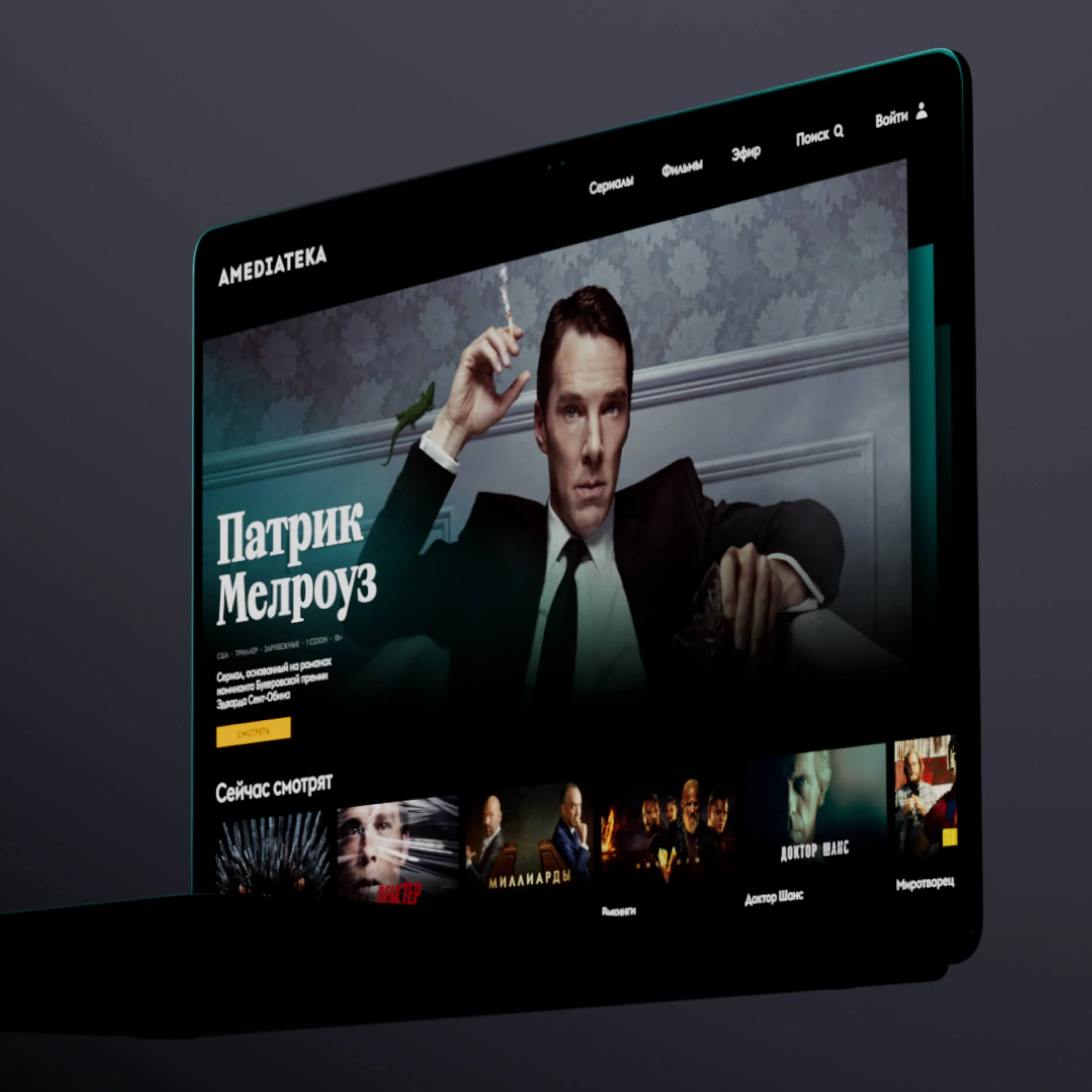
New visual system
We applied perspective effects and dynamic transitions to enhance content immersion. The covers appear to emerge from the catalog, tilt, and gain materiality, creating the feeling that viewers are physically selecting films from a tangible collection.
This approach established a unified visual logic across all communication channels: from social networks to the platform interface. As a result, Amediateka received not just a logo update but a comprehensive graphic system that reflects the platform's character and distinguishes them from competitors.