Yandex Music. Identity
Shapes constructor
The challenge was to create a complete visual communication system for Yandex Music across both product and marketing touchpoints. At the start of the project, the brand had only a logo and its signature flash effect, without a broader visual language that could unify communication inside and outside the product.
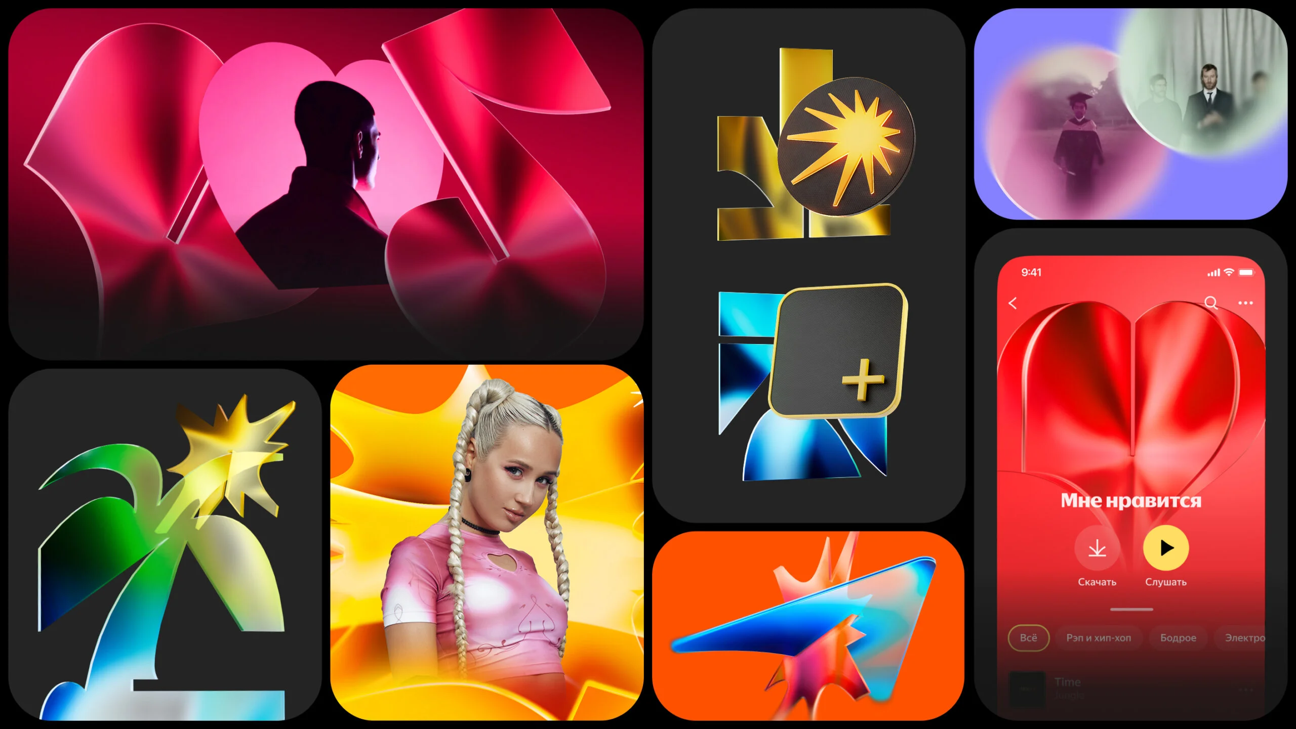
We responded with a modular system built around what we called 2.5D graphics. Simple flat shapes connect like puzzle pieces, forming a wide range of metaphorical images while remaining part of the same visual family. This approach gave the brand a flexible toolkit that could scale across formats, campaigns, and channels while maintaining a consistent identity.
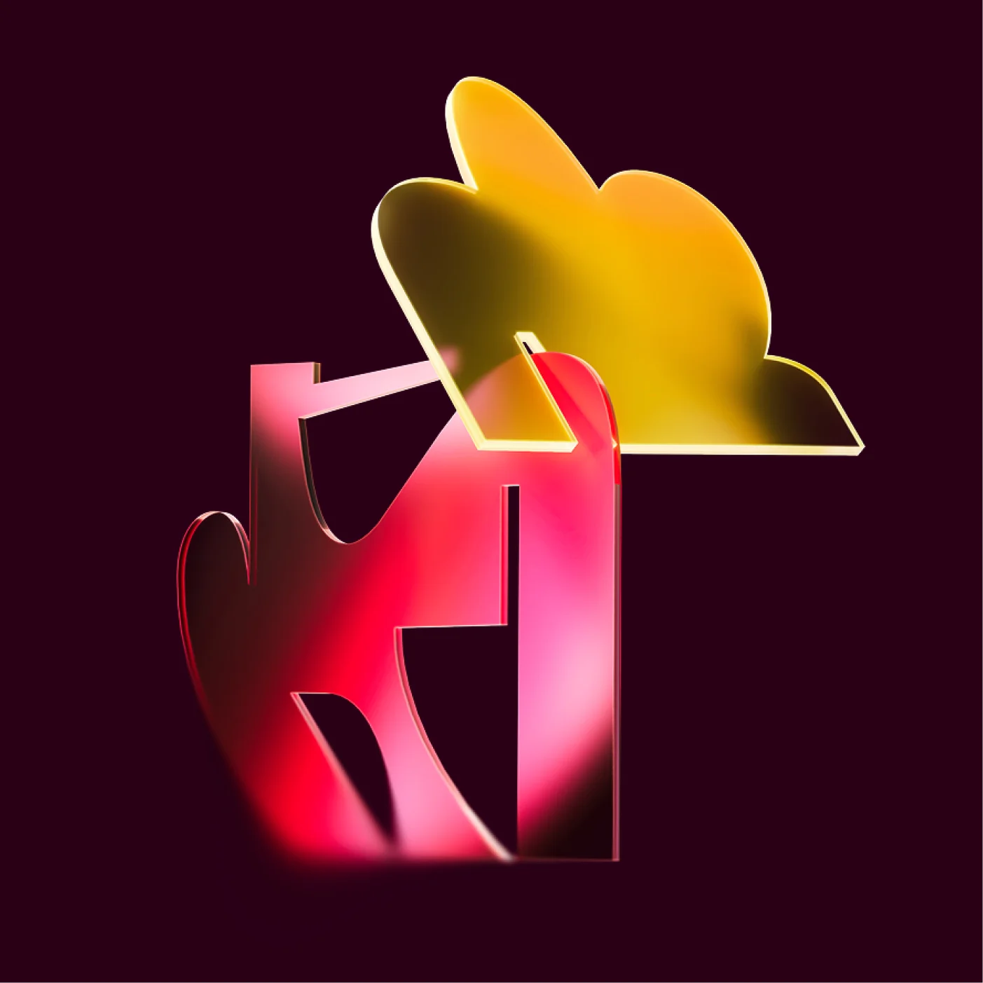
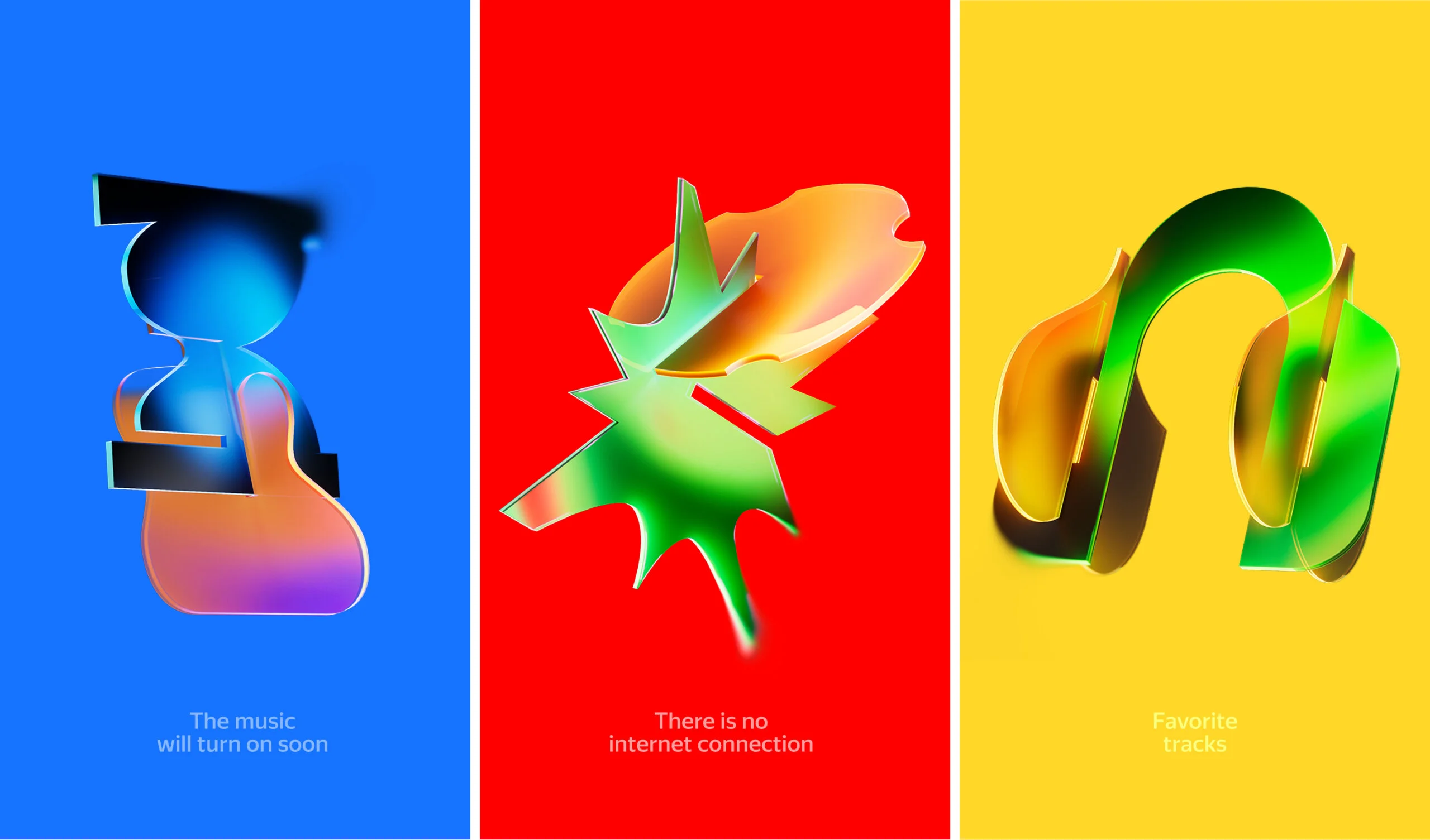
Plastic & Style
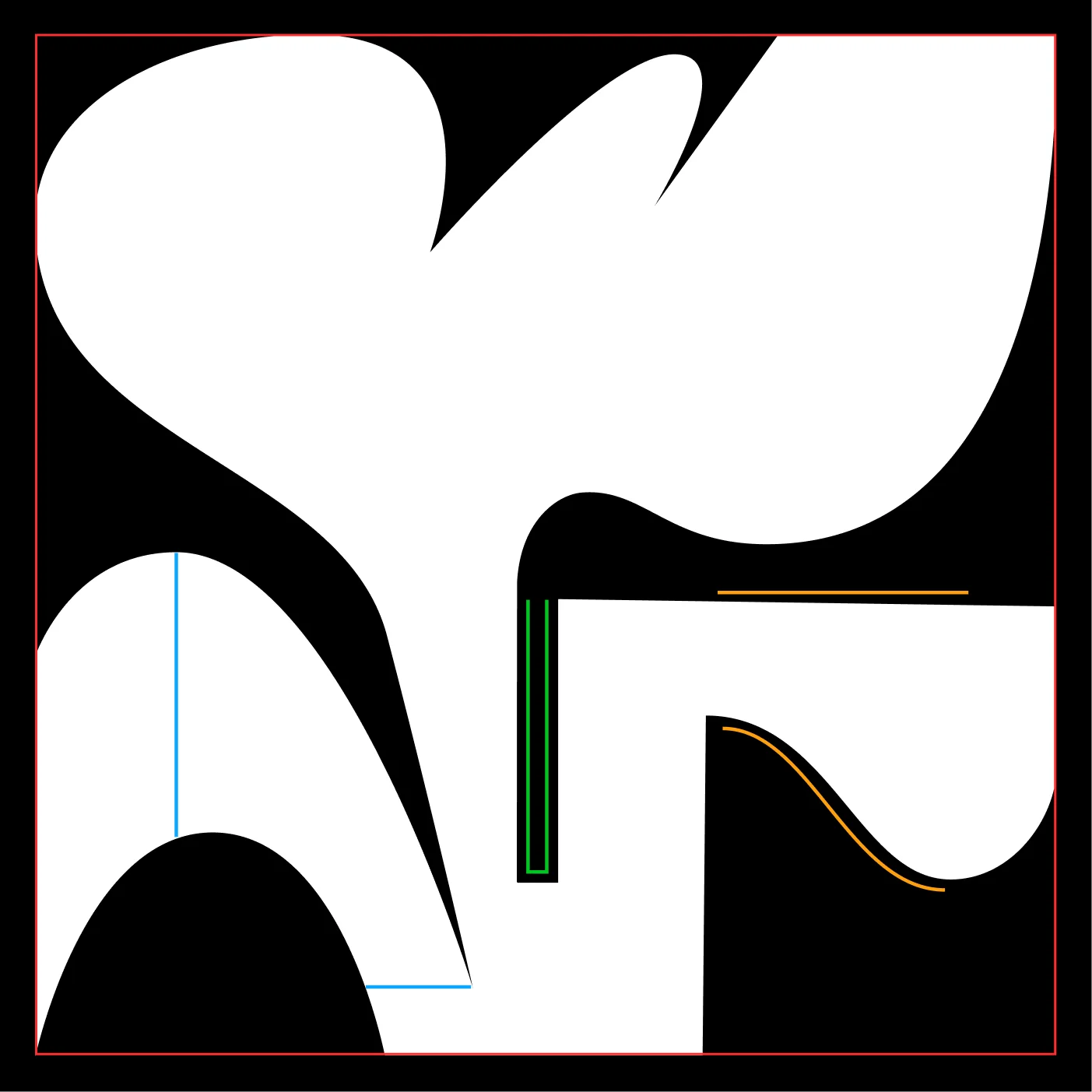
Each shape in the system is built around a distinctive connector that allows elements to interlock and combine with one another. The geometry balances opposing qualities: sharp, cut edges create a structured silhouette, while smooth curves and connecting grooves introduce movement and fluidity.
We developed an extensive library of these forms, designed to work seamlessly with the custom display typeface. Together, they create a recognizable visual language that can generate a wide variety of compositions while preserving a consistent character.

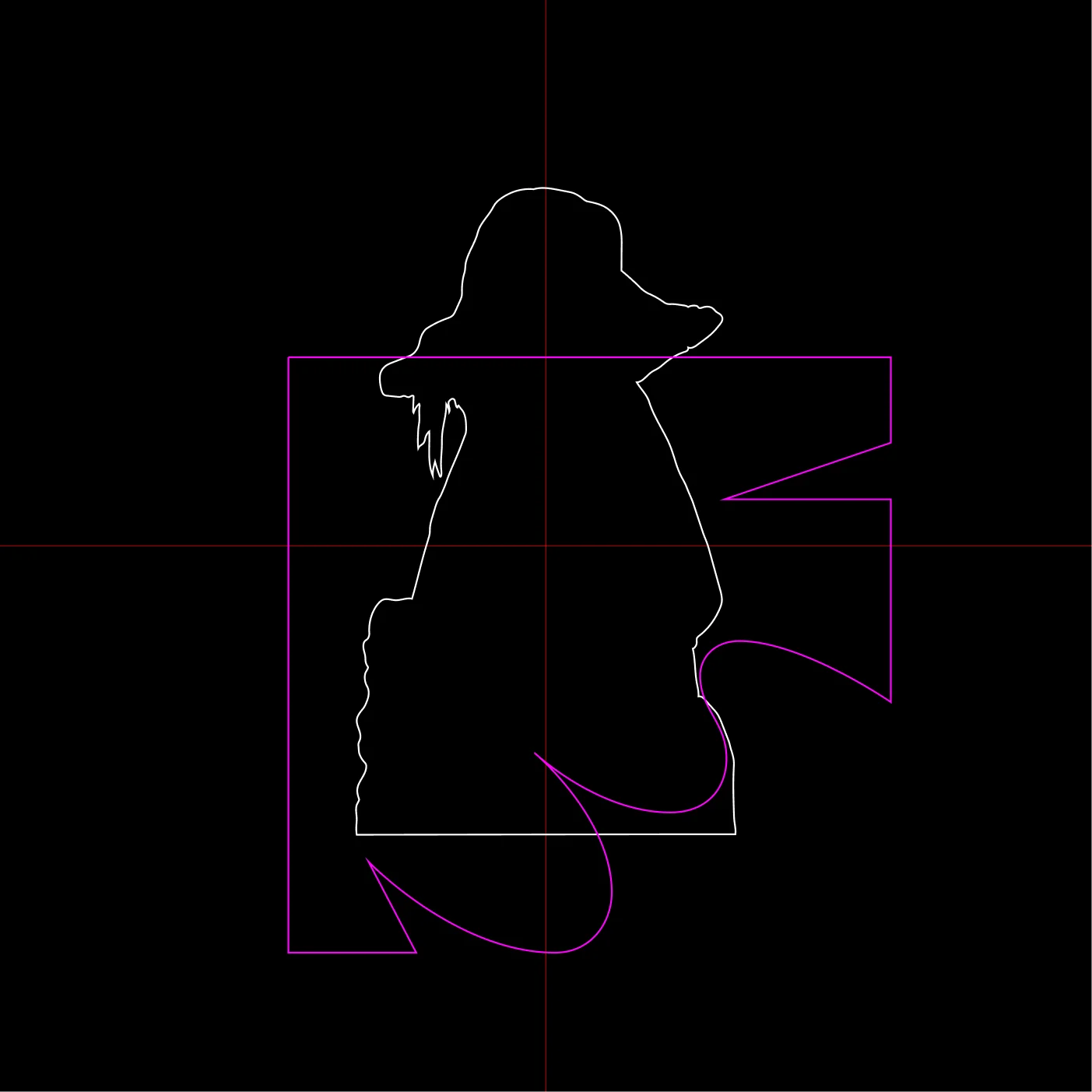
Artist & Shape
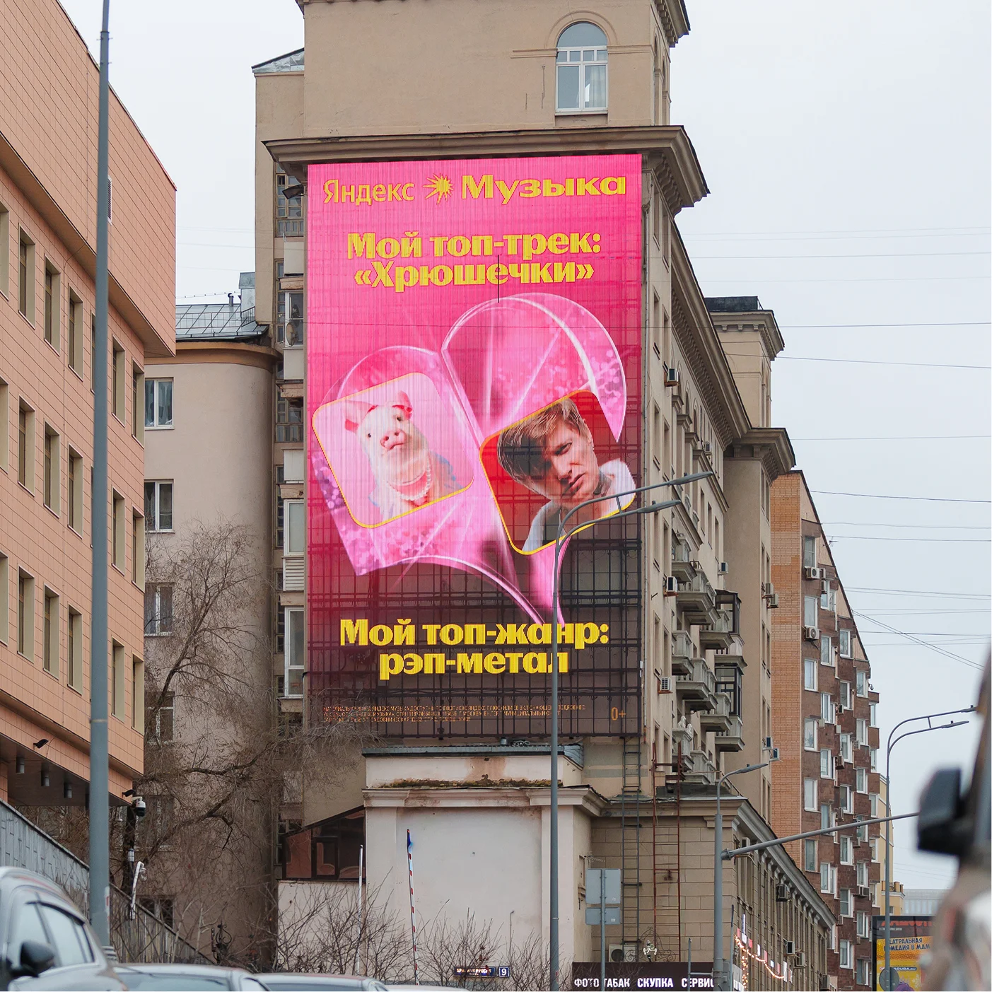
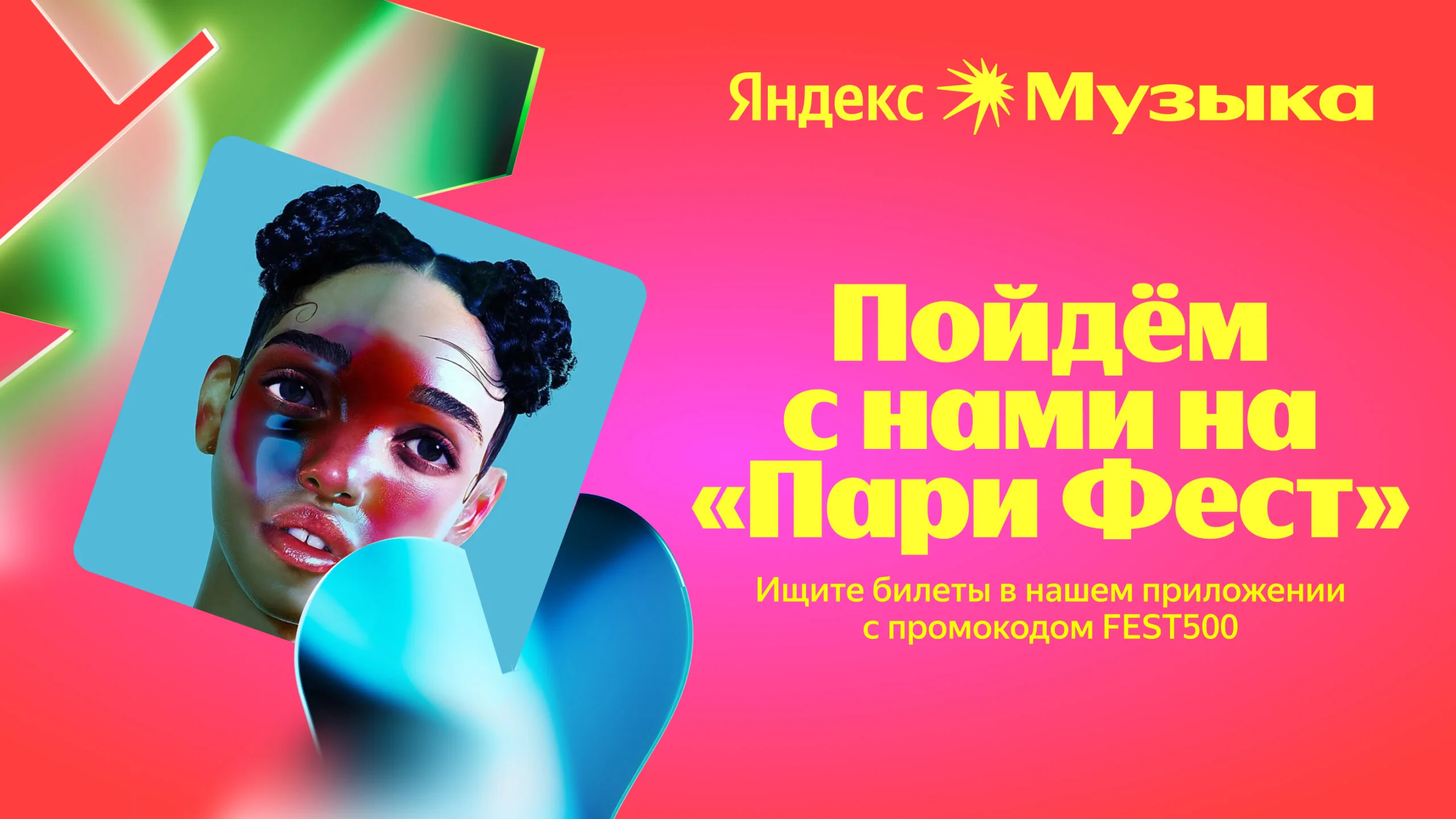
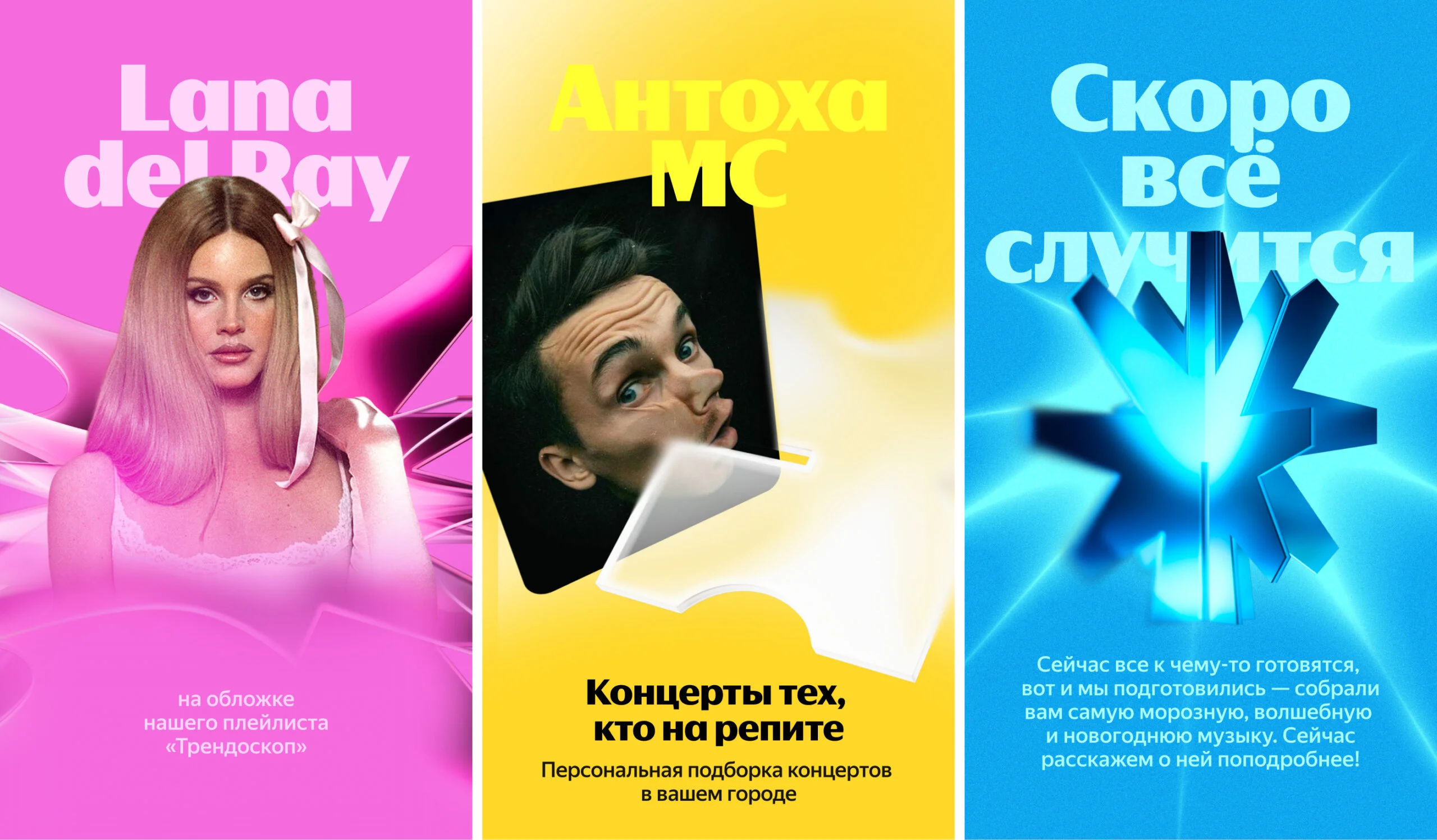
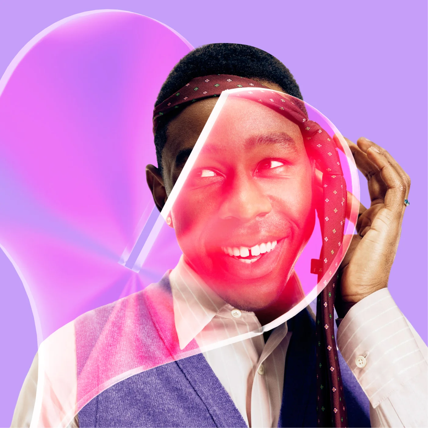
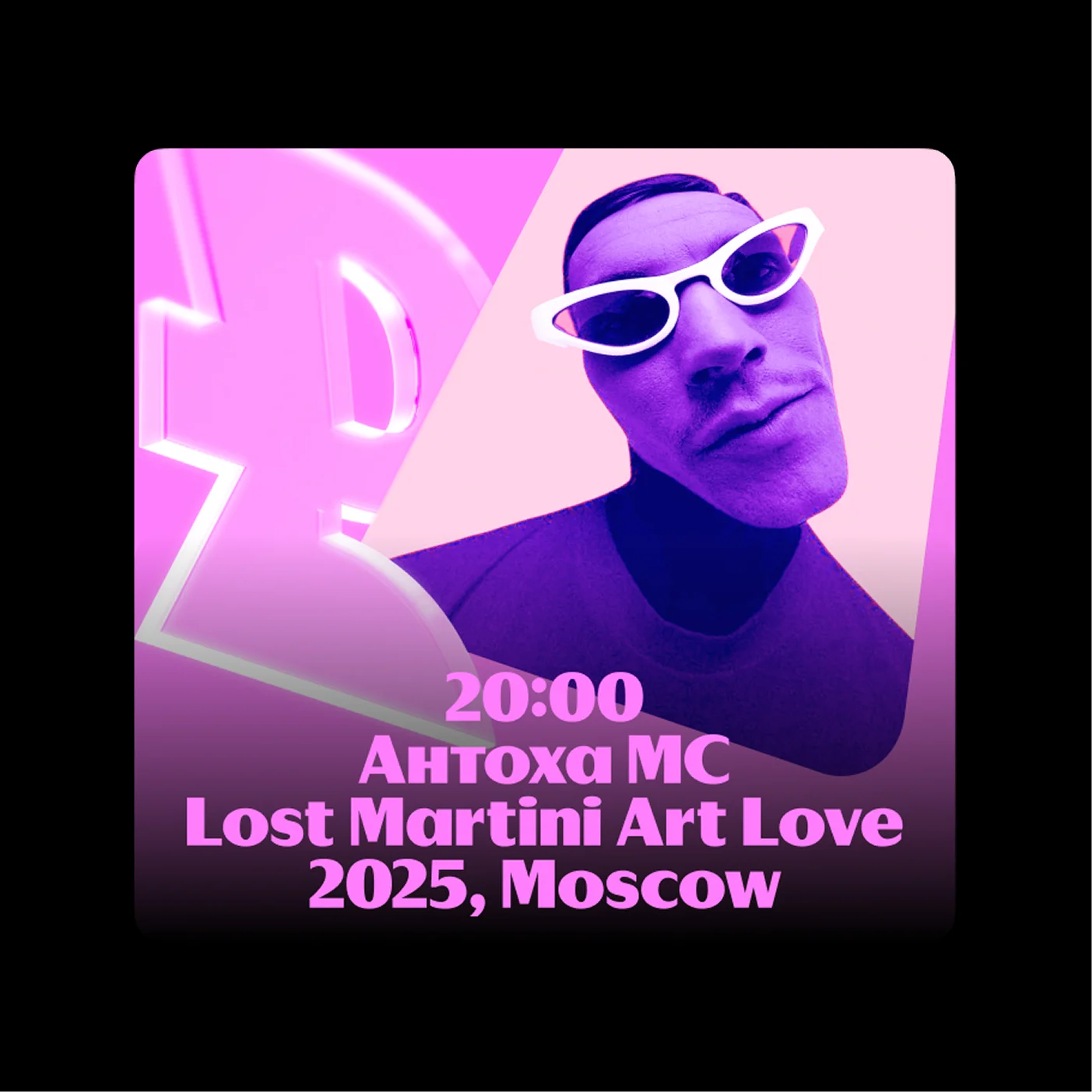
The system was designed to work not only as a standalone graphic language but also in combination with photography. In artist-focused communications, the shapes interact directly with musicians’ portraits, becoming part of the composition and creating a stronger connection between the graphic system and the featured artist.
The same visual principles can also be applied more freely, with shapes intersecting images, extending beyond frames, and creating dynamic layouts. This flexibility helped the identity adapt naturally to campaigns, editorial formats, and outdoor communications.


Materials Variations
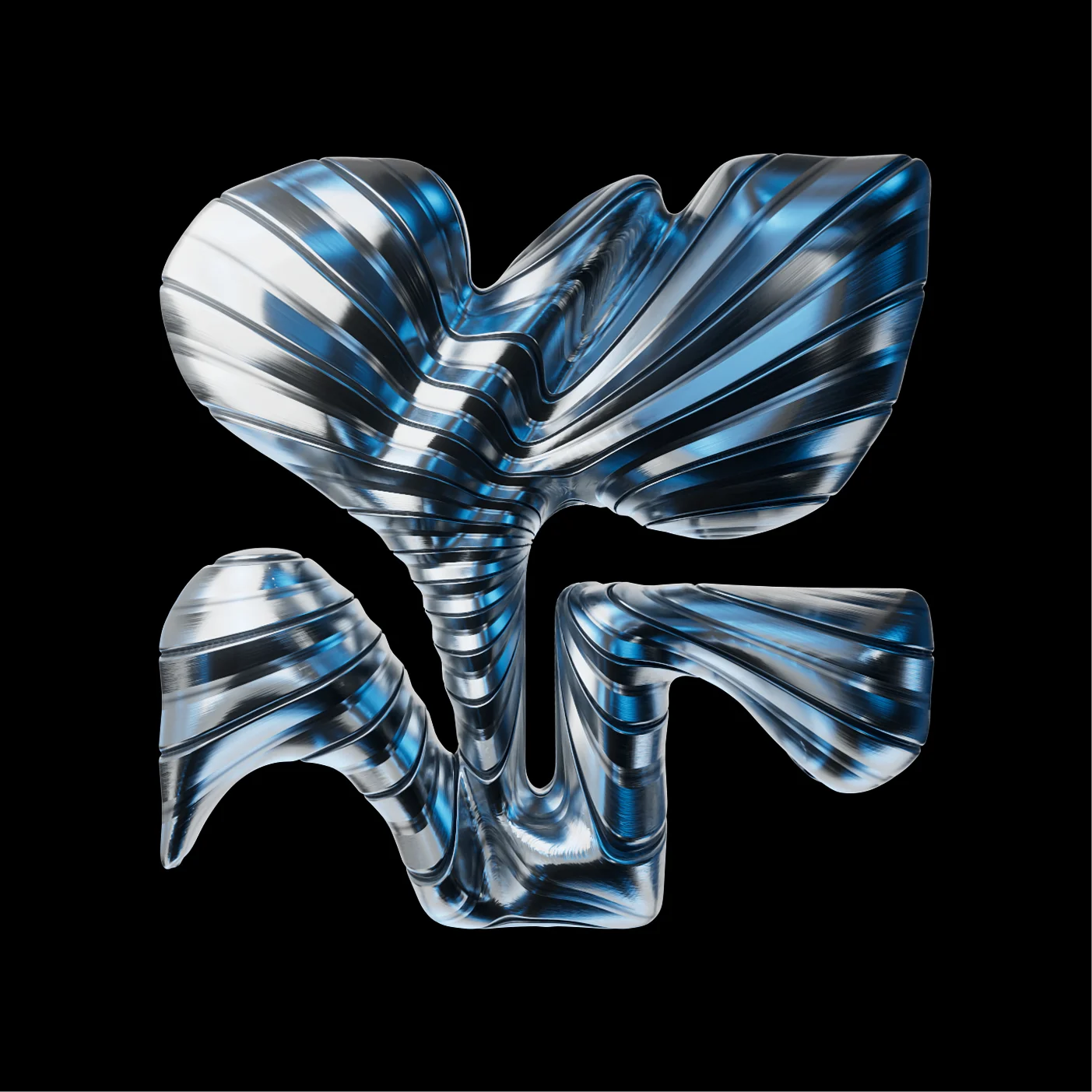
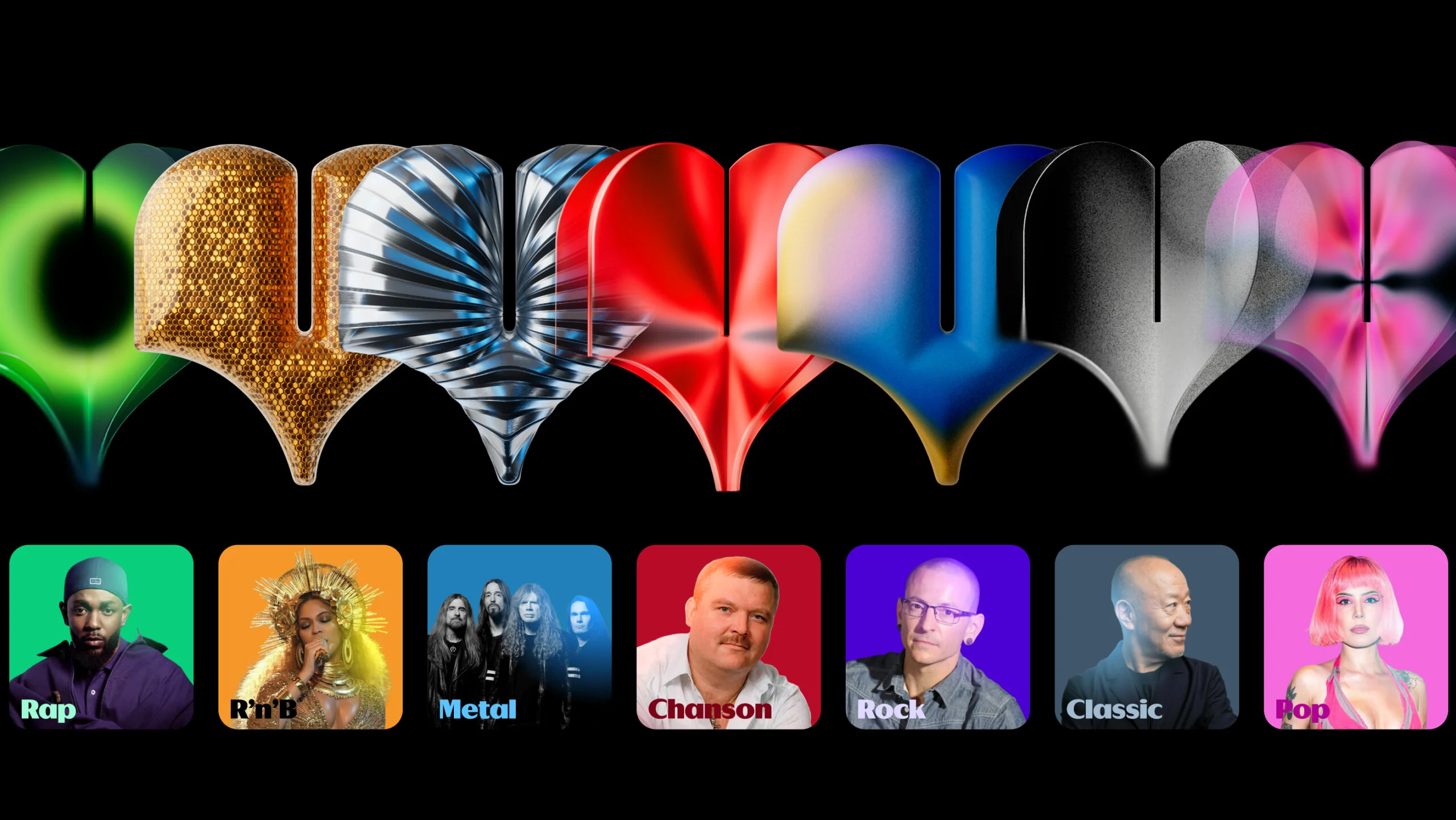
The system was designed to reflect the diversity of music itself. Rather than relying on a single visual treatment, we introduced a range of materials, textures, and shading approaches that allow the graphics to adapt to different genres, moods, and listening experiences.
The same shape can take on a completely different character depending on its material expression.
This creates a stronger connection between the visual language and the content it represents, while keeping the overall identity cohesive.

In App
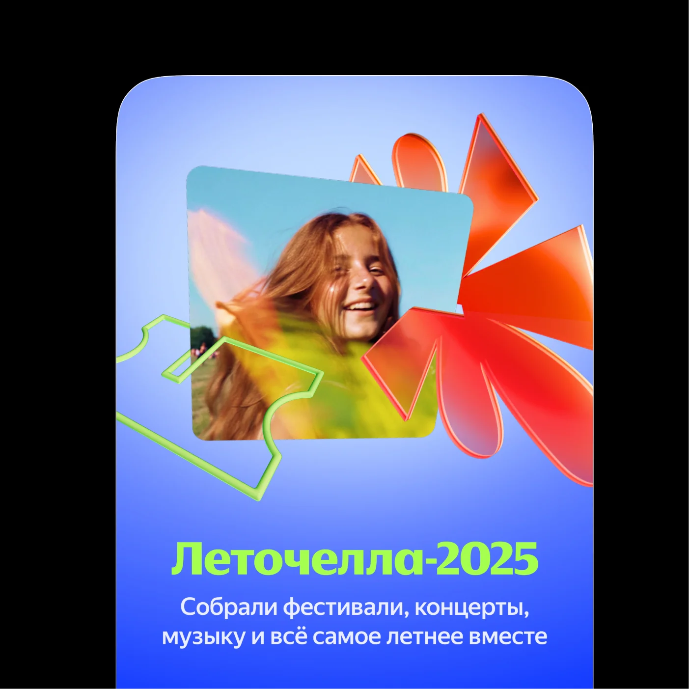
The true test of the system came inside the product itself, where it had to perform across a wide range of scenarios — from large-scale special projects and album promotions to interface elements as small as a 20-pixel icon.
The flexibility of the visual language allowed it to adapt to both large and small formats, gradually becoming a more integral part of the Yandex Music experience over time.
Abstract Forms
Beyond metaphorical imagery, the system can also function in a more abstract mode. Instead of forming specific objects, the shapes preserve the language’s core qualities — rhythm, movement, and plasticity — creating flexible graphic compositions that work across both product and brand communications.
These abstract forms can serve as backgrounds, atmospheric elements, or supporting visuals, helping extend the identity into a wide range of contexts without relying on explicit imagery.
Outdoor
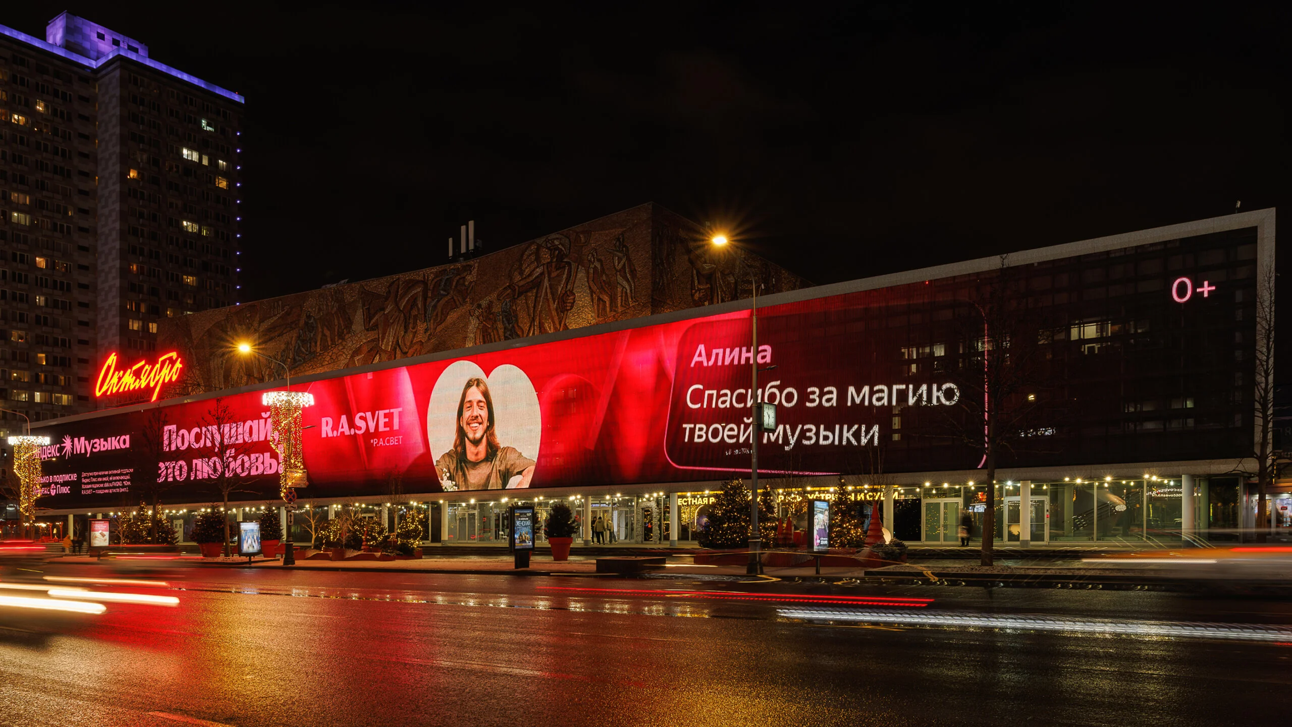
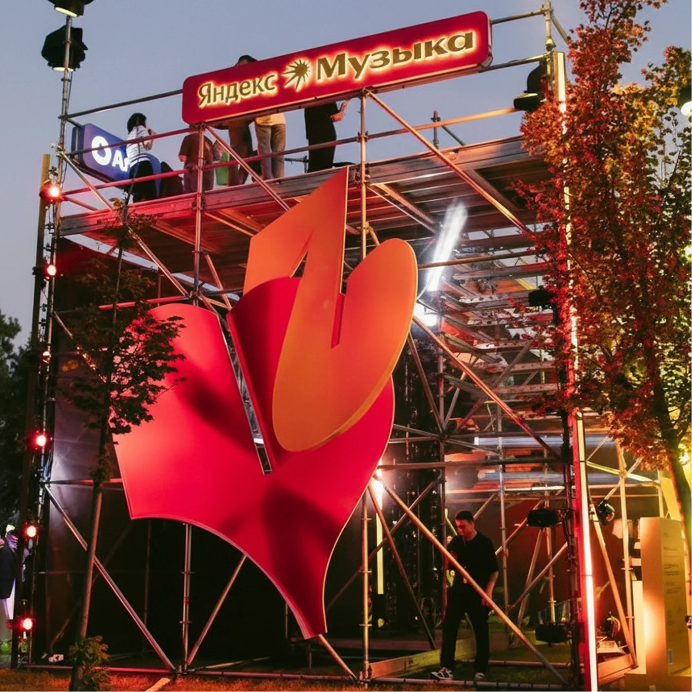
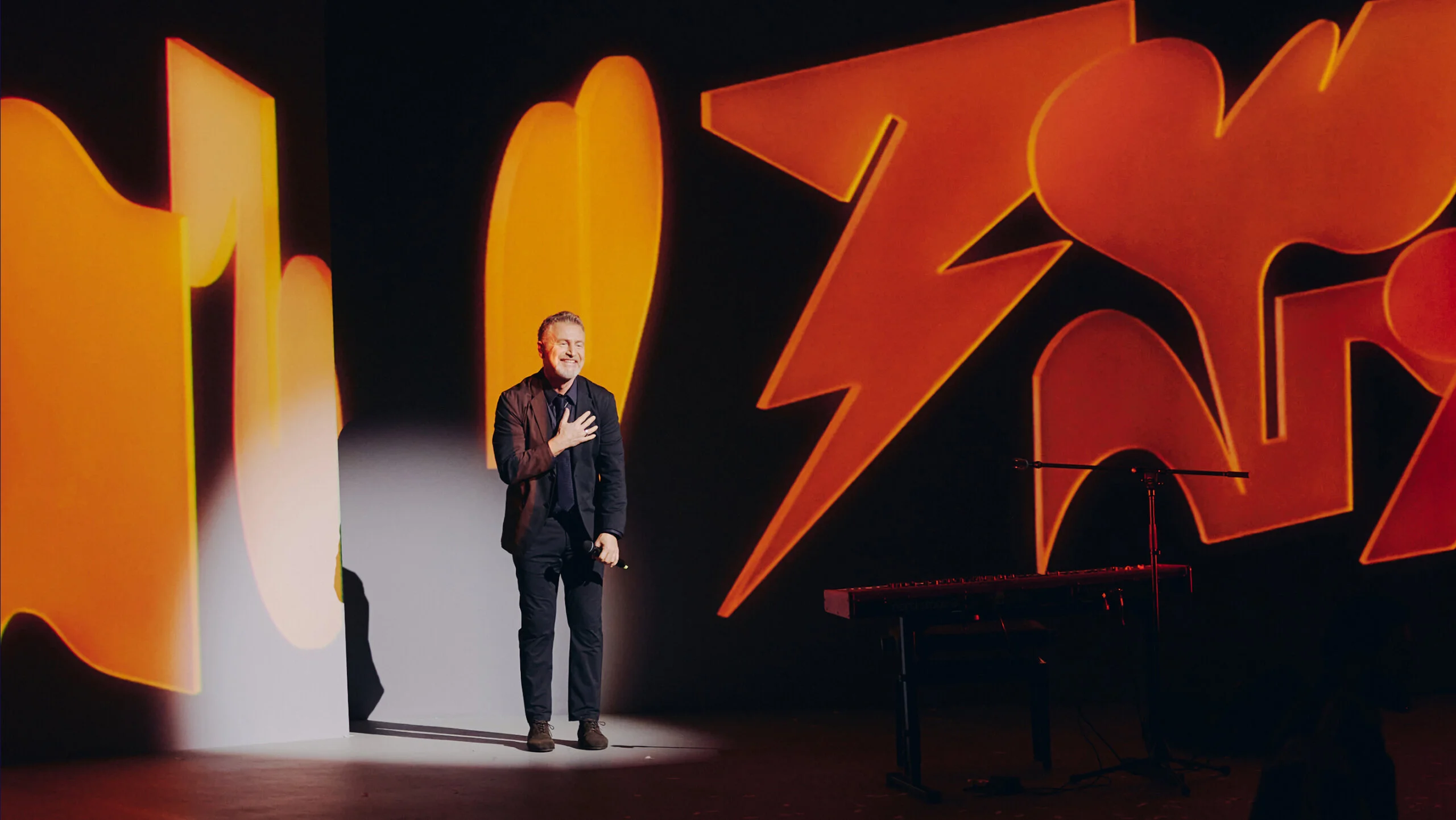
The flexibility of the system allowed it to expand far beyond digital and traditional brand communications. The visual language found its way into physical spaces, event design, and live experiences, proving that the identity could exist not only on screens and in campaigns, but also as part of real-world environments.
This ability to move across different mediums helped turn the system into a recognizable and versatile brand asset, capable of adapting to new formats while retaining its visual integrity.